Zachary A –
A New Identity.
SERVICES
Visual Identity
Art Direction
Web Design
Print Design
CREDITS
Strategist: Tom Mulhern
CLIENT
Zachary A. Studio
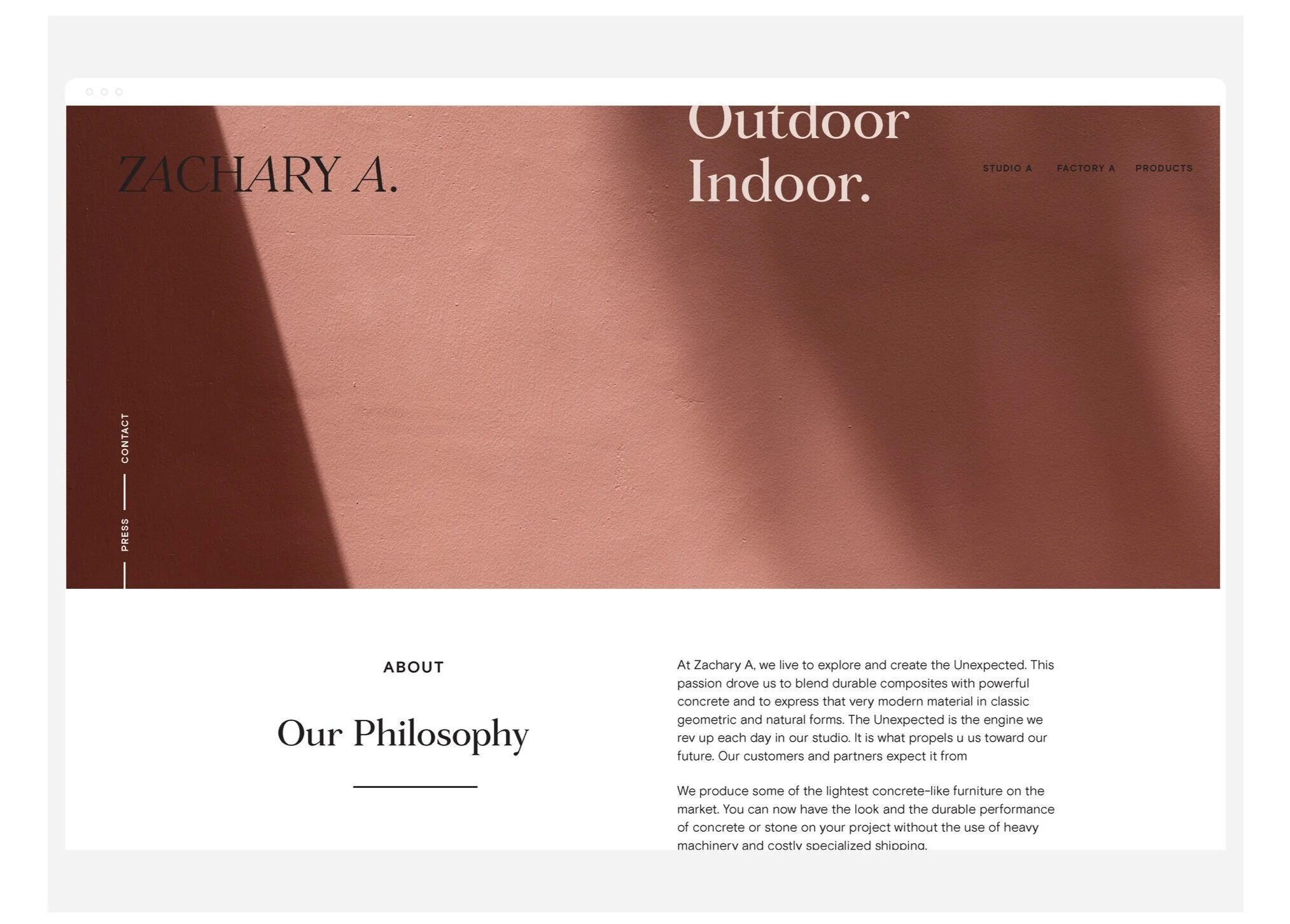
At Zachary A, we live to explore and create the Unexpected. This passion drove us to blend durable composites with powerful concrete and to express that very modern material in classic geometric and natural forms. The Unexpected is the engine we rev up each day in our studio. It is what propels us toward our future. Our customers and partners expect it from us.
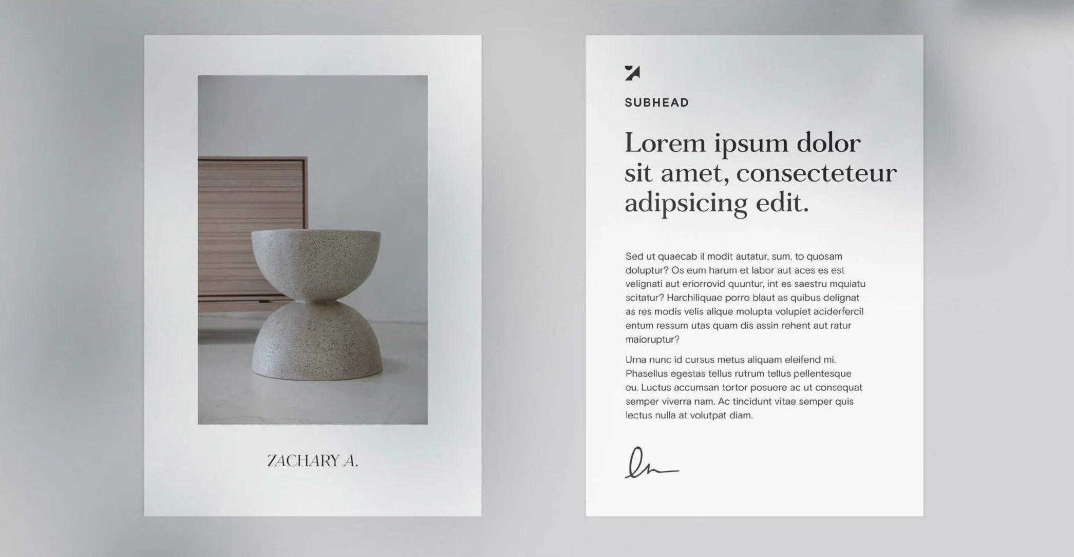
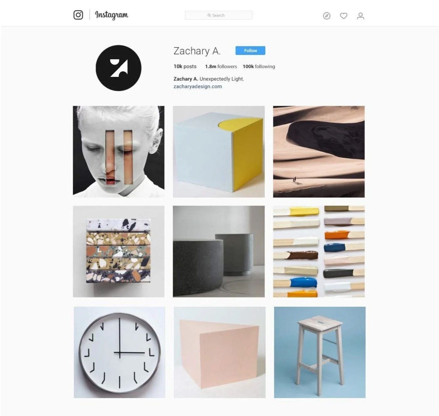
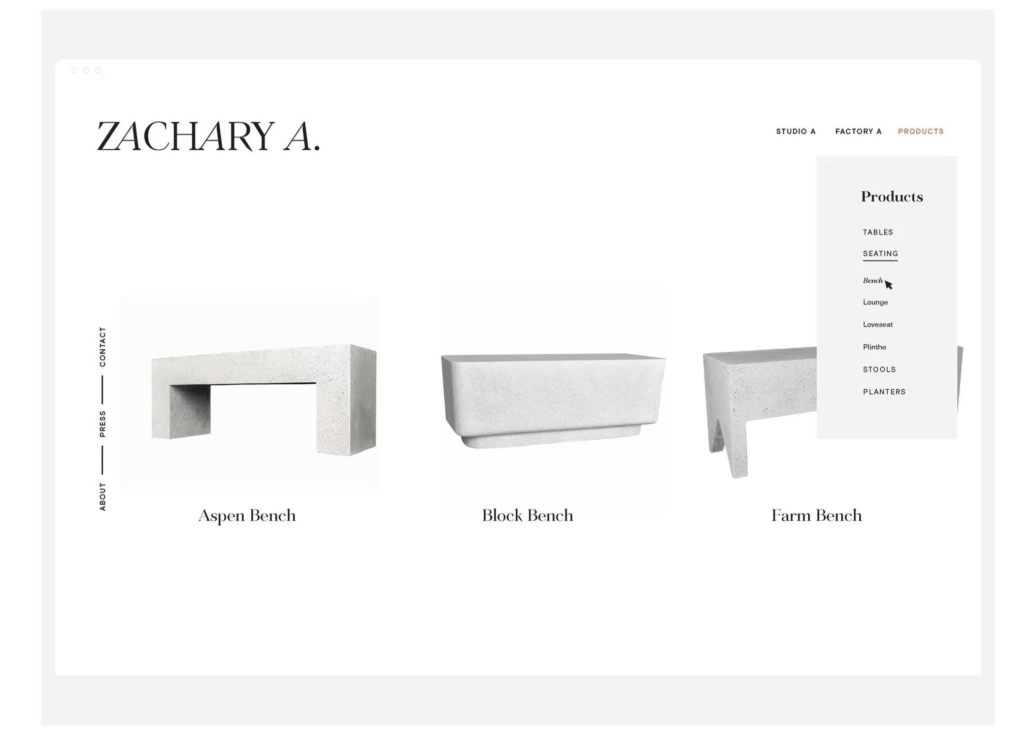
I worked closely with the team at Zachary A to develop a visual identity system–including a logo refresh, color palette, typography hierarchy, photography direction, print and digital collateral, social media sample posts, and an updated website.
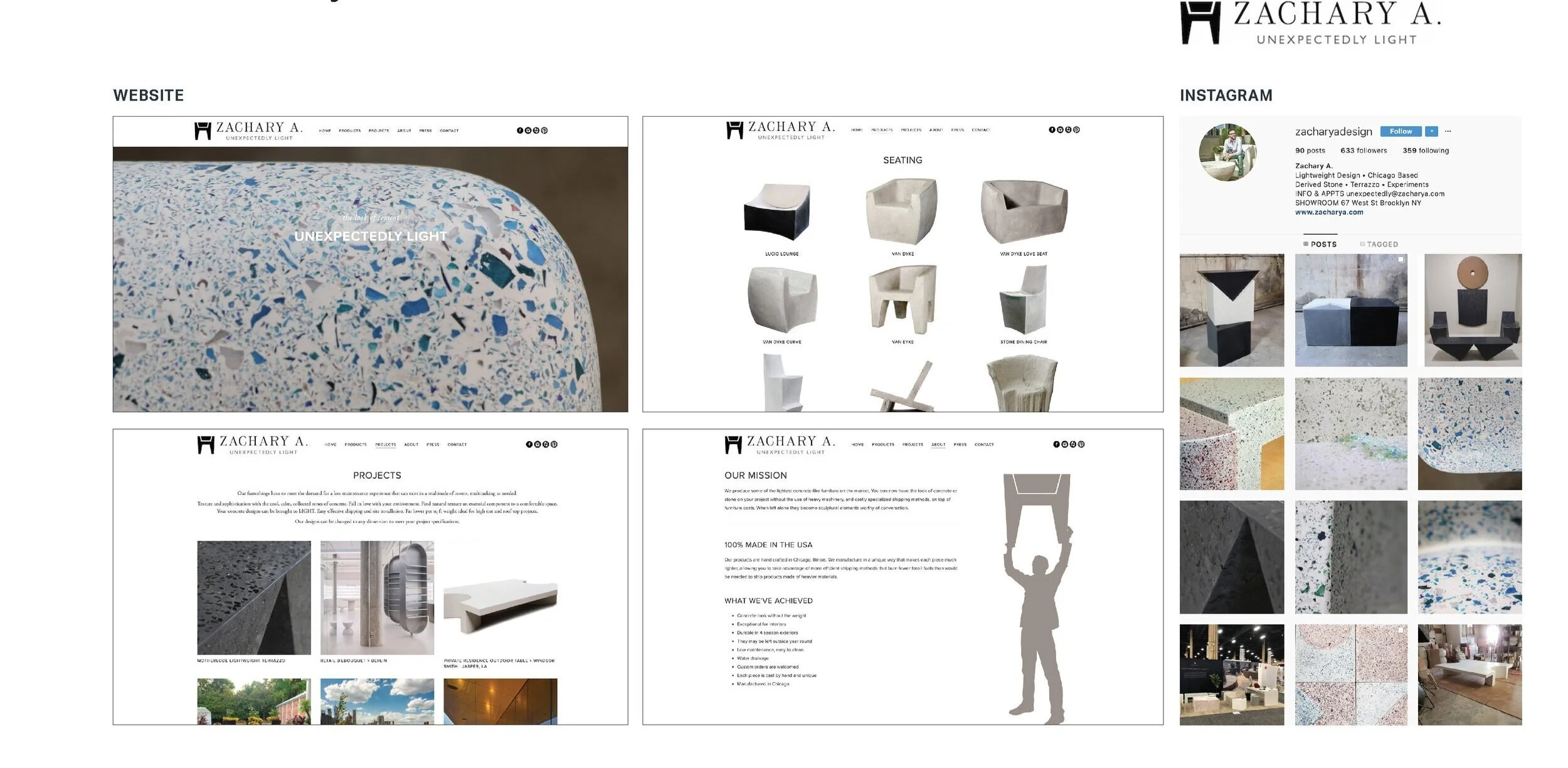
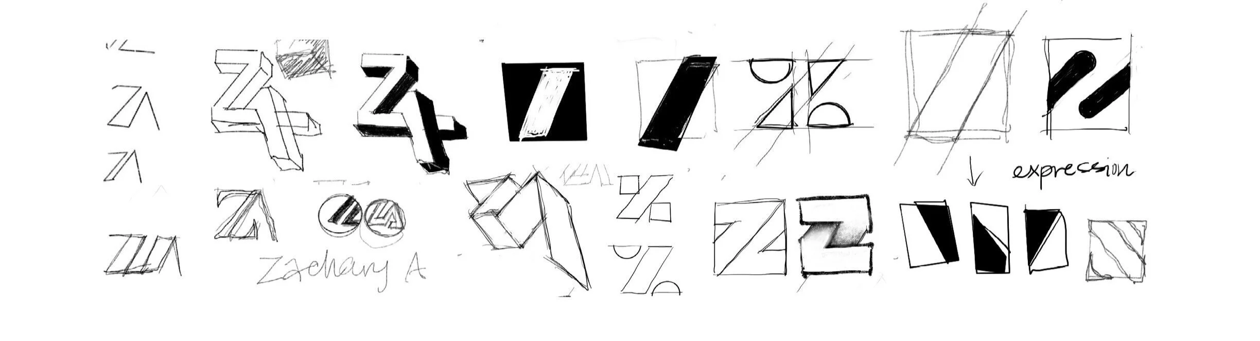
Above is a visual audit of the studio’s original identity and collateral.
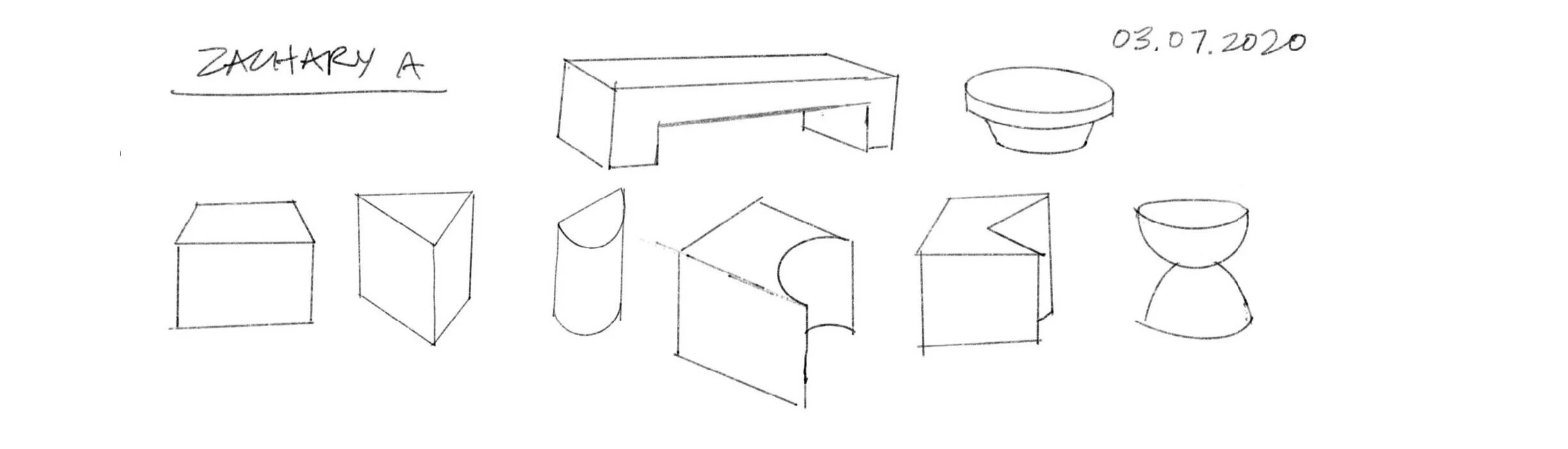
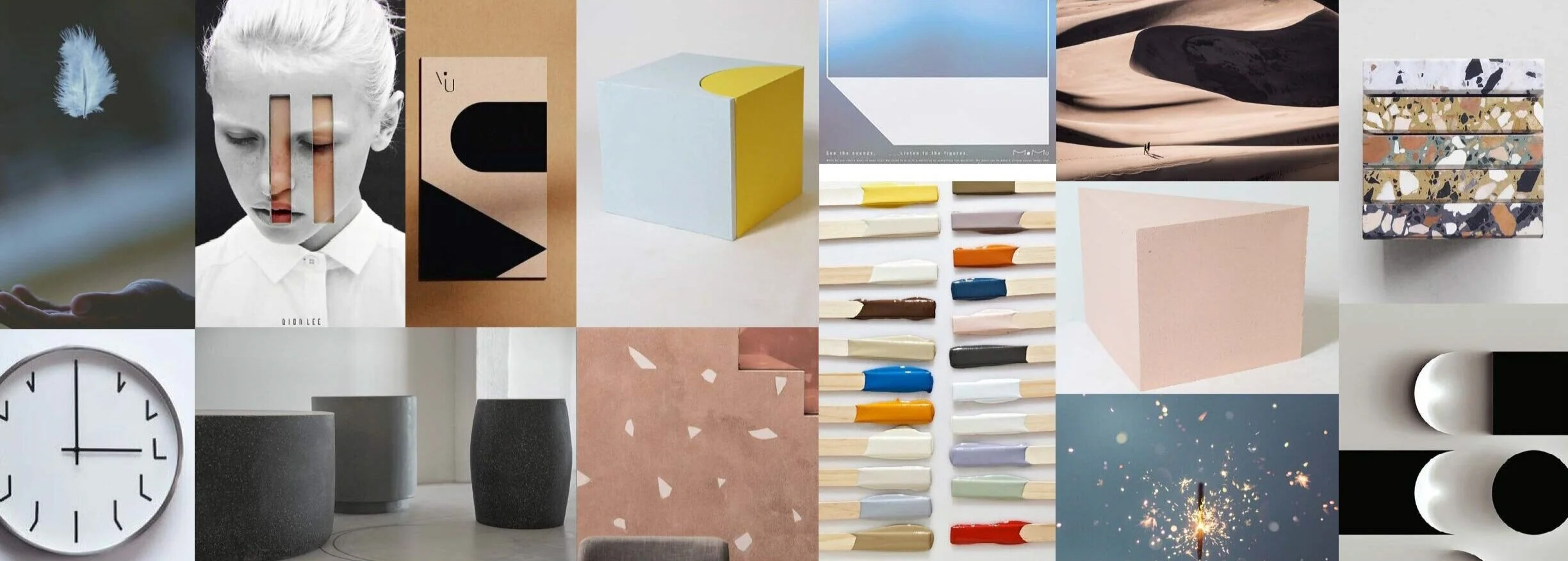
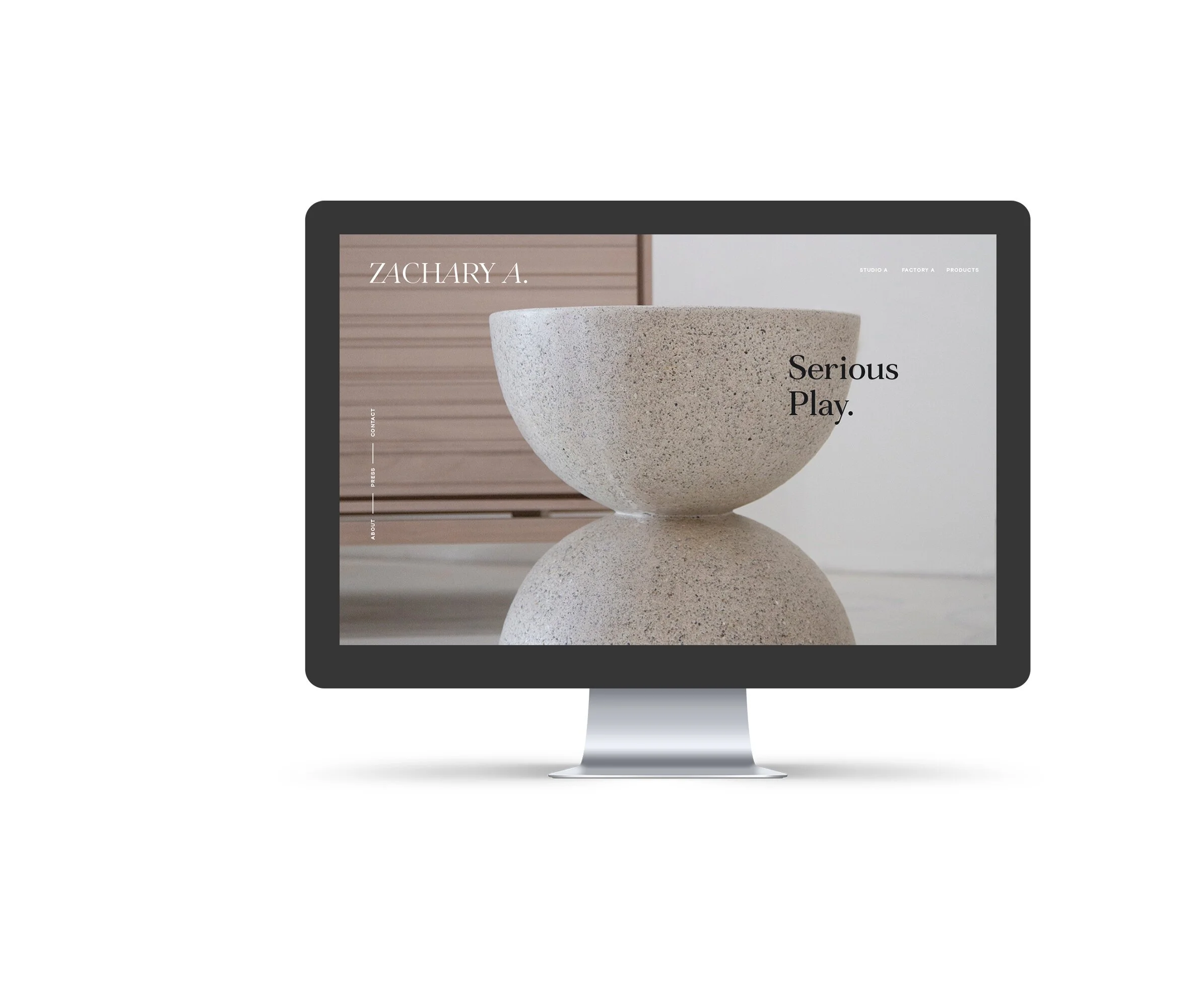
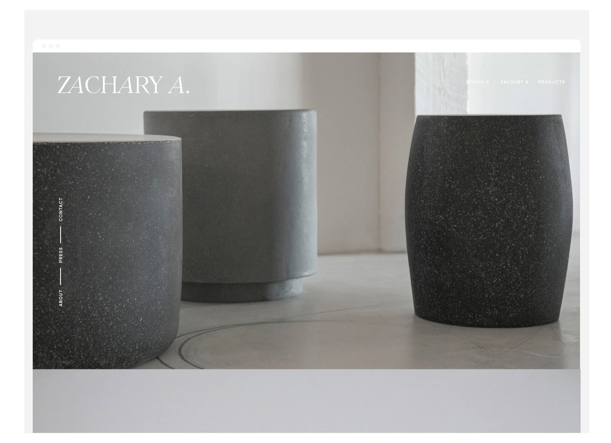
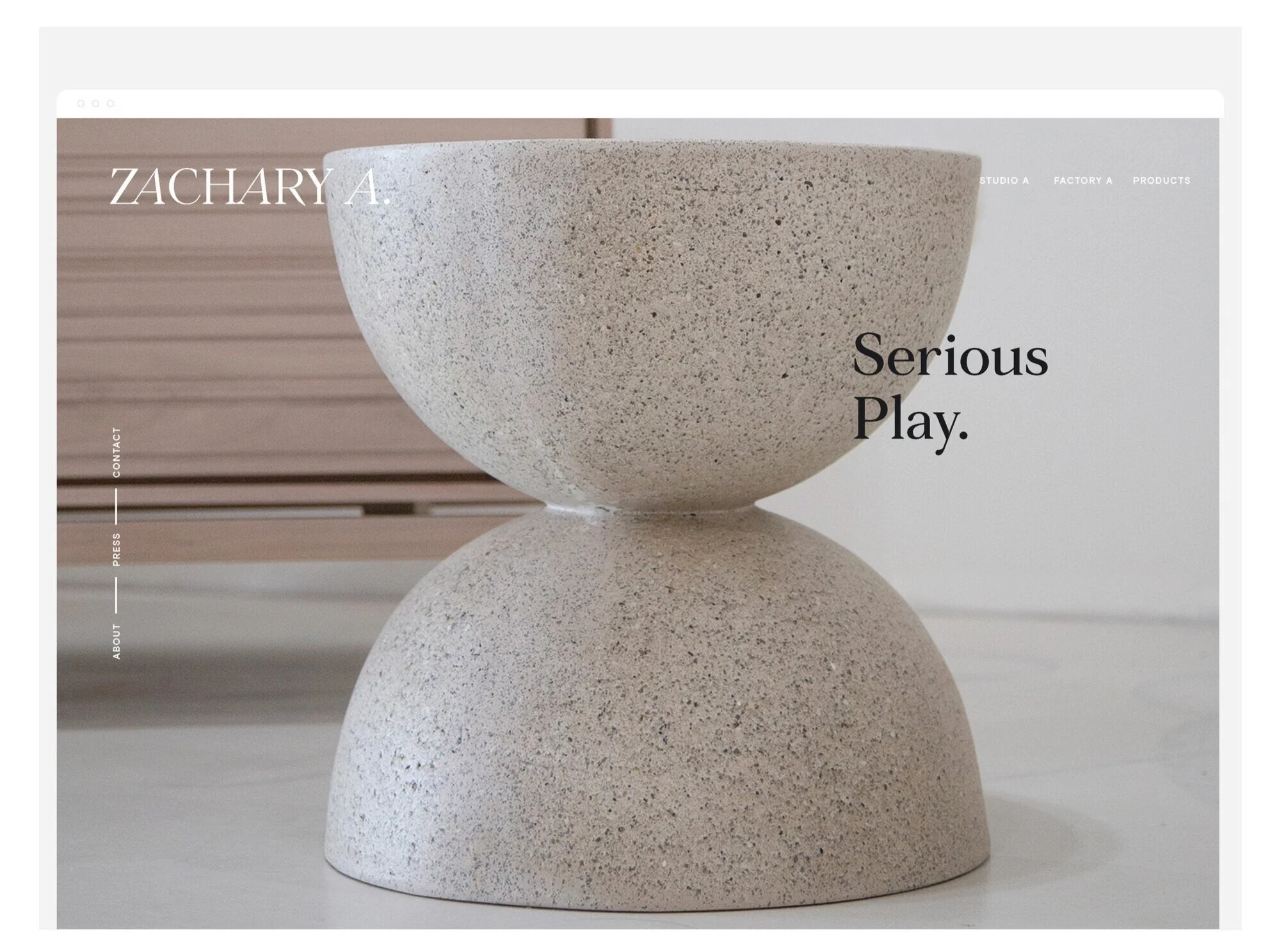
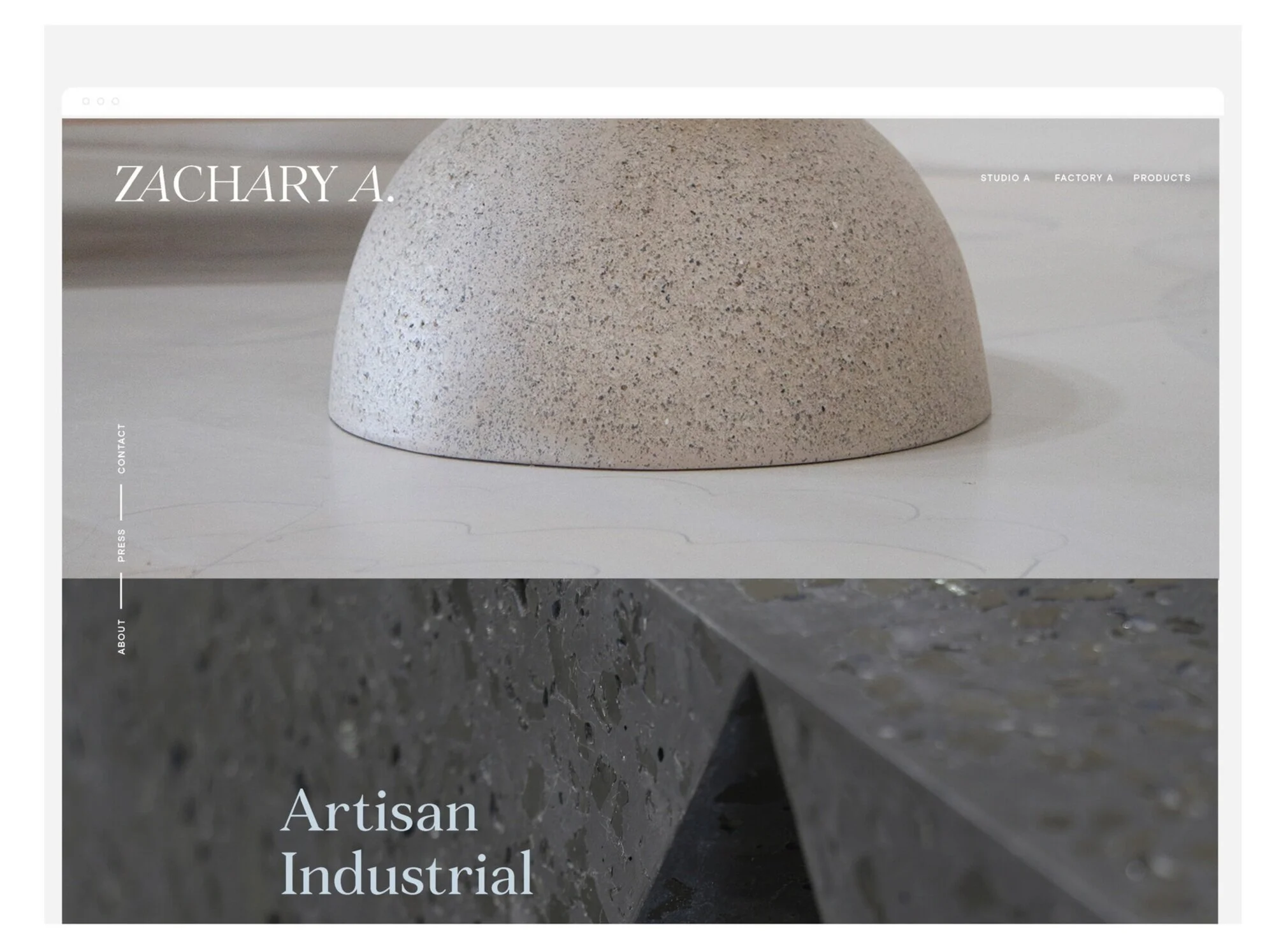
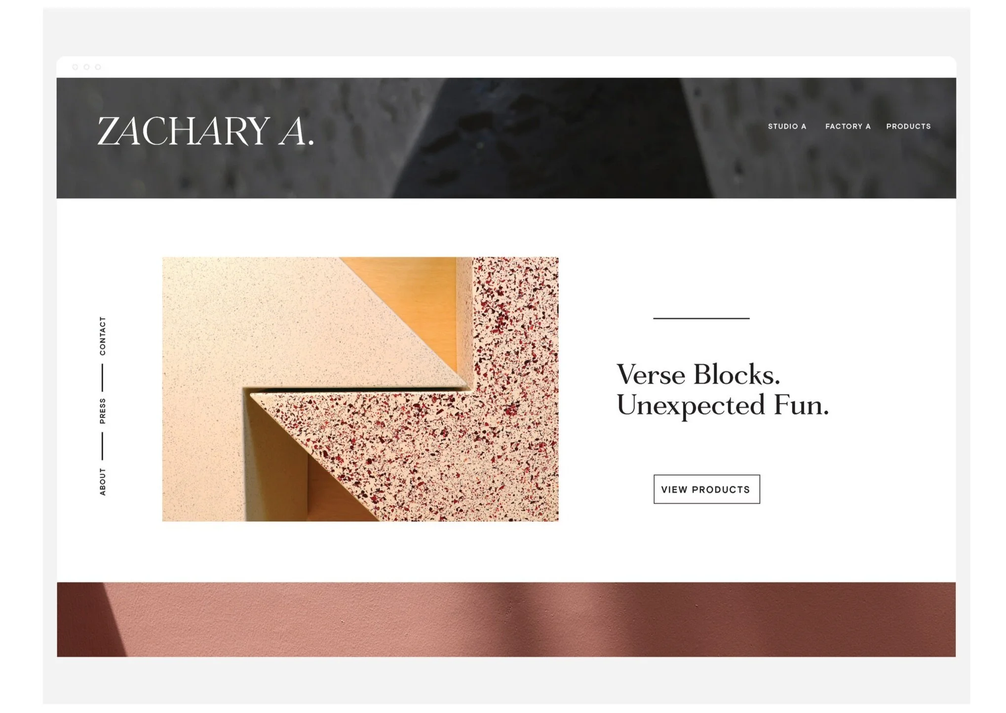
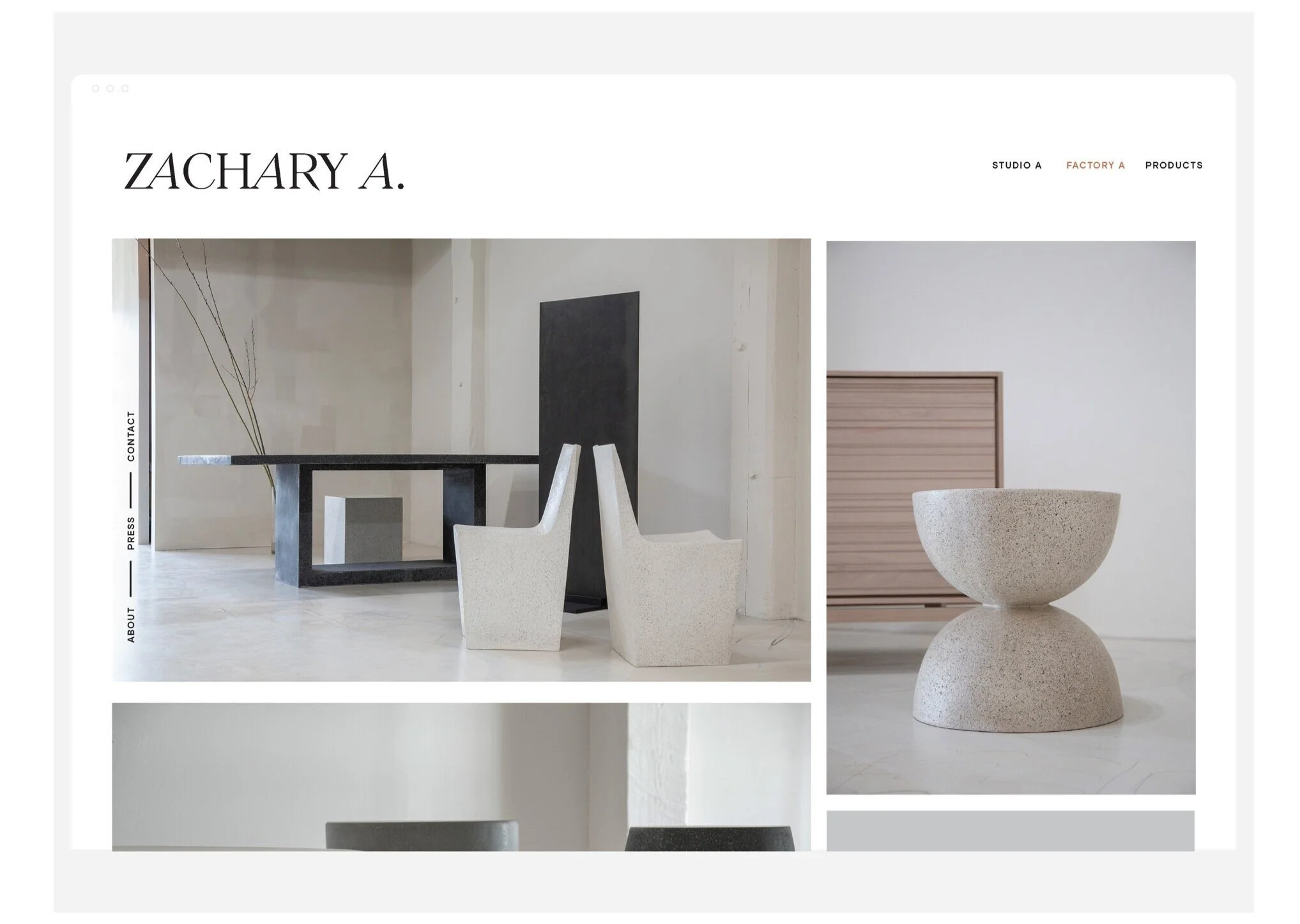
The new brand for Zachary A captures a spirit of play, exploration, and surprise— it’s minimal in form, sophisticated, and confident. Color and form are inspired by the products and the designers' mix of traditional and contemporary methods.
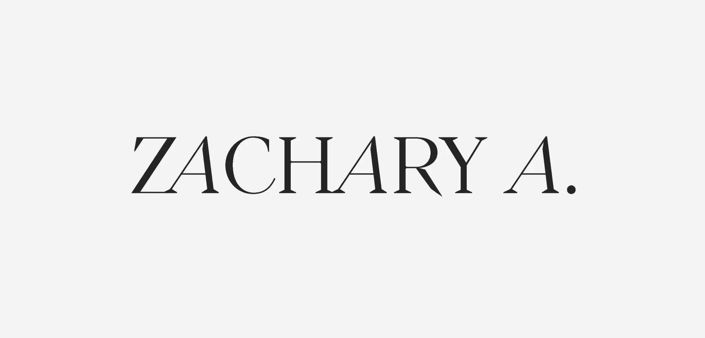
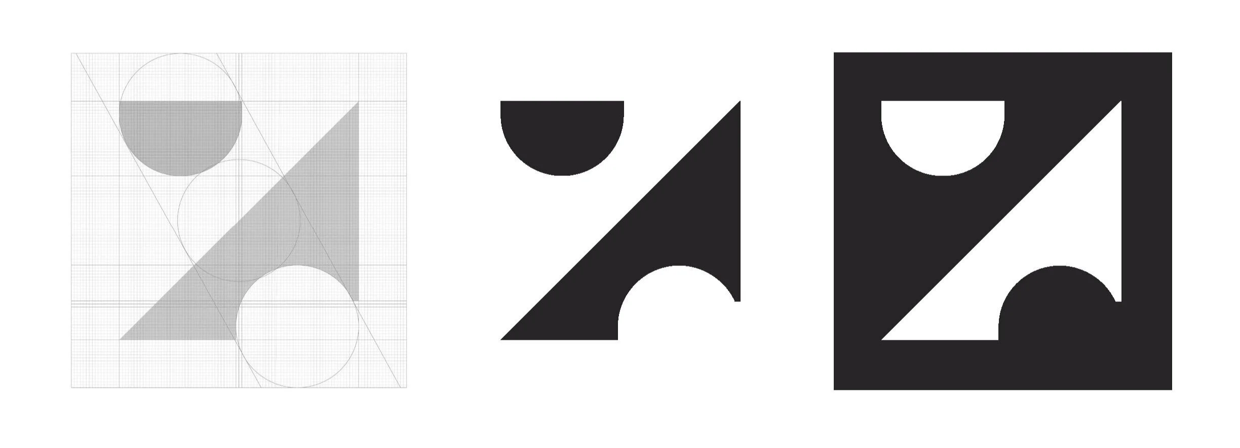
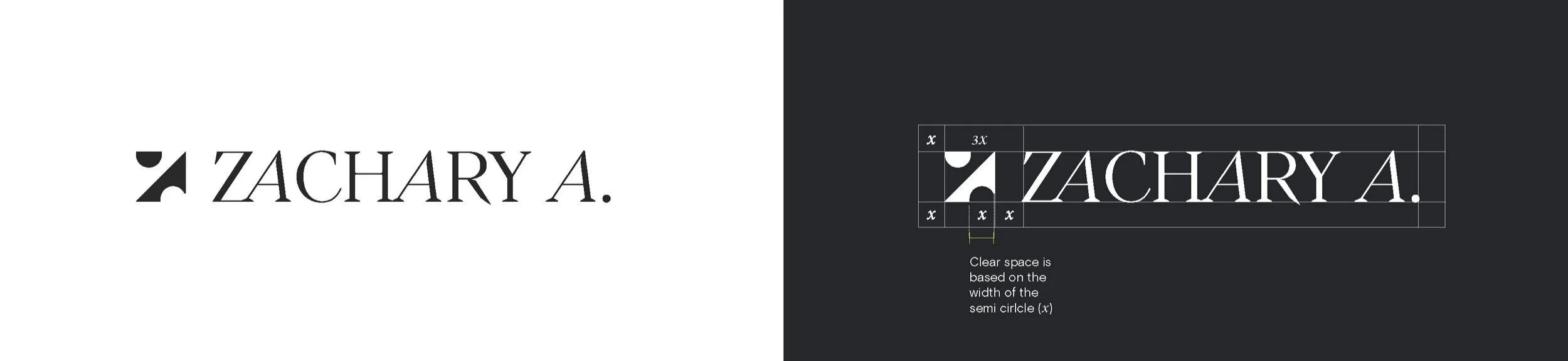
The logotype, with it's elegant and almost-chiseled serifs and strong slanted angles, is evocative of the studio's maker philosophy. With creativity and a forward momentum, Zachary A blends concepts, mixes forms, and tests boundaries to create the unexpected.
The colors are a fresh approach to the many natural elements the designers draws their inspiration from. The palette is refined, muted yet playful, and allows for subtle accents and atmosphere across all communication and collateral. Use primarily black and white paired with product photography to provide color in most uses. Secondary palette is to be used selectively.