Coca-Cola Brand Identity
SERVICES
Design Director
Visual Identity
Global Brand Guidelines
CREDITS
Creative Director: Dave Balsamello
Launch Design Director: André Coelho
Senior Designers: Julia Aguiar, Lisa Rogers, Taylor Ottaviano
Motion: Stubbs Johnston
3D Visualization: Mat Brown
Strategists: Maxwell McBride Peterson, Max Arevuo
Created while under employment of JKR.
CLIENT
Coca-Cola
How do you rebrand Coca-Cola? You don’t.
You take 140 years of what makes it iconic—and amplify it everywhere.
Our Brief
We were tasked with creating a new set of global brand design standards for Coca-Cola: a clear, cohesive system for how the brand shows up across every platform, pillar, and product.
The Challenge
Coca-Cola is one of the most universally recognized brands on Earth. But over time, its visual identity had become fragmented—iconic assets were being used inconsistently, without a singular point of view connecting them.
Rather than reinvent Coca-Cola, we looked back at what had always made it iconic and distilled that legacy into one simple Brand Design Idea:
Iconic, Everywhere.
How do you rebrand Coca-Cola? You don’t.
With a brand this recognizable, the opportunity wasn’t to create something new. It was to bring greater clarity and consistency to what was already there—amplifying the assets that make Coca-Cola unmistakably Coca-Cola.
To define our always-on expression and behavior, Coca-Cola must be true to what we’ve always been.
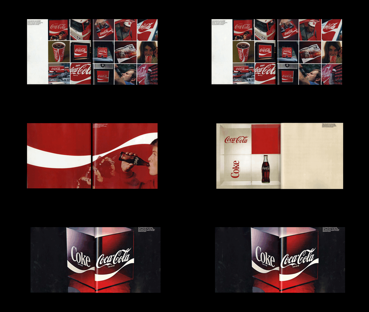
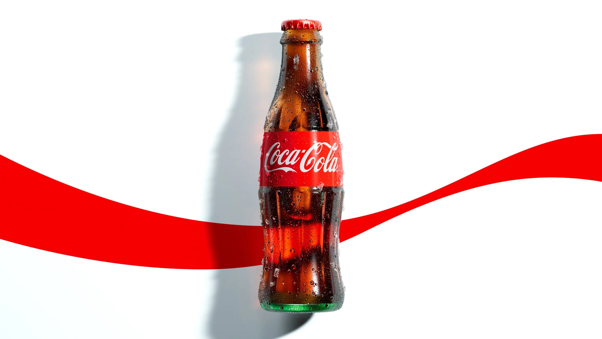
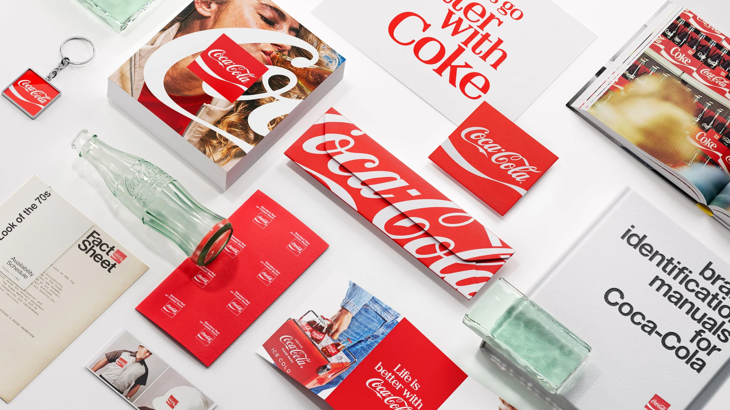
We looked back at Coca-Cola’s first brand book, Meet the ’70s, and the iconic assets that have shaped the brand ever since—from the 1969 birth of the Dynamic Ribbon, inspired by the Contour Bottle, to the Arden Square, which unified Coca-Cola’s most recognizable assets in one place.
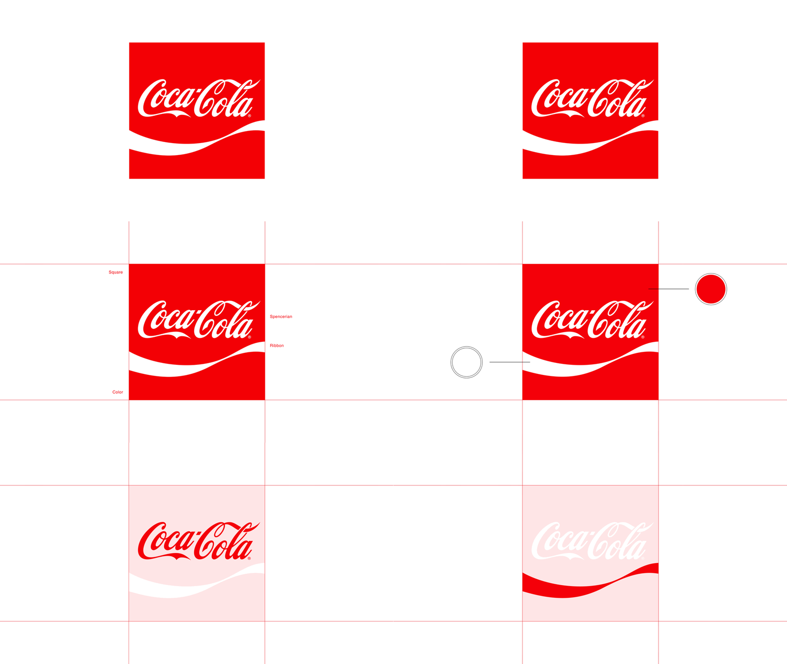
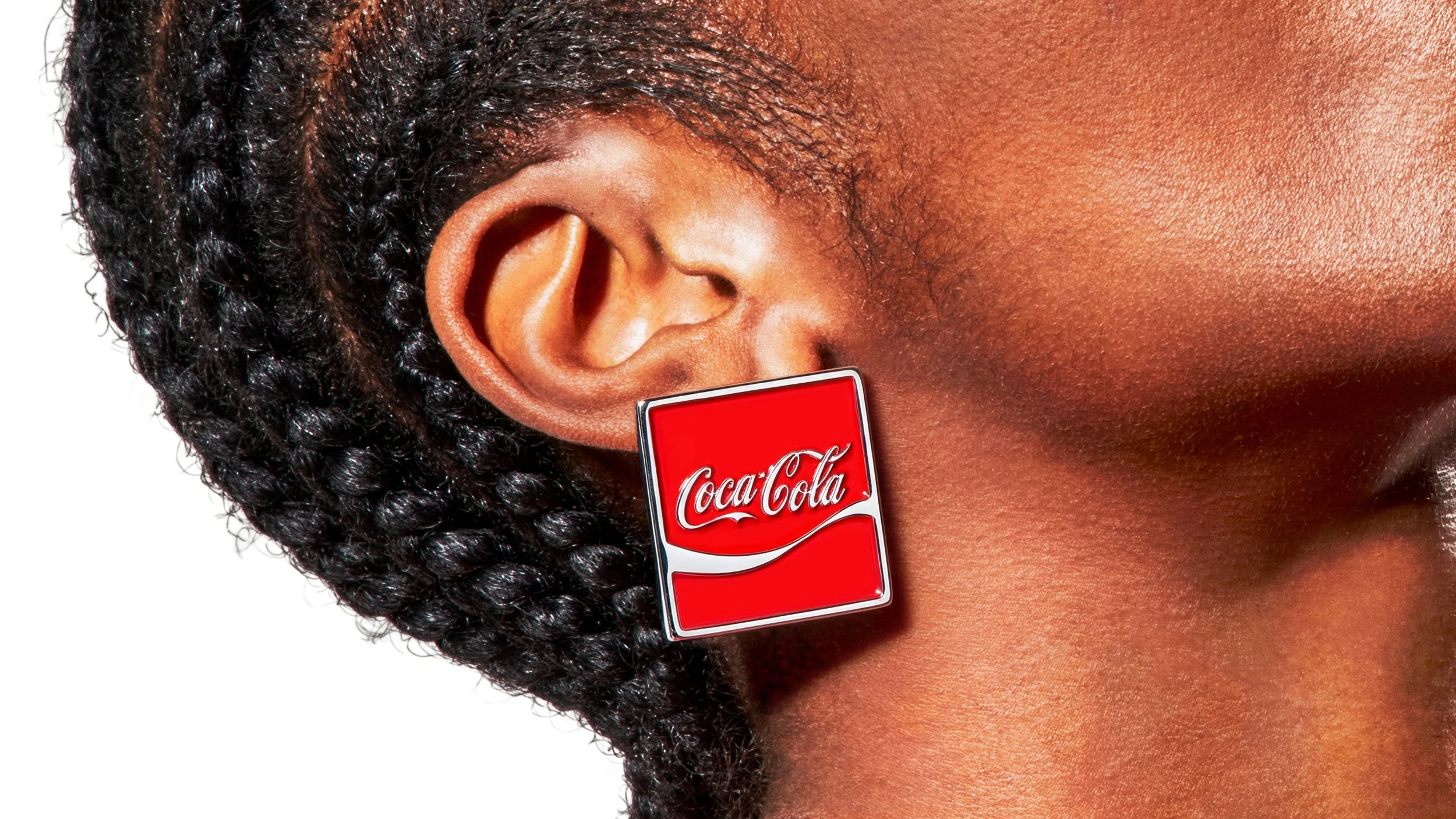
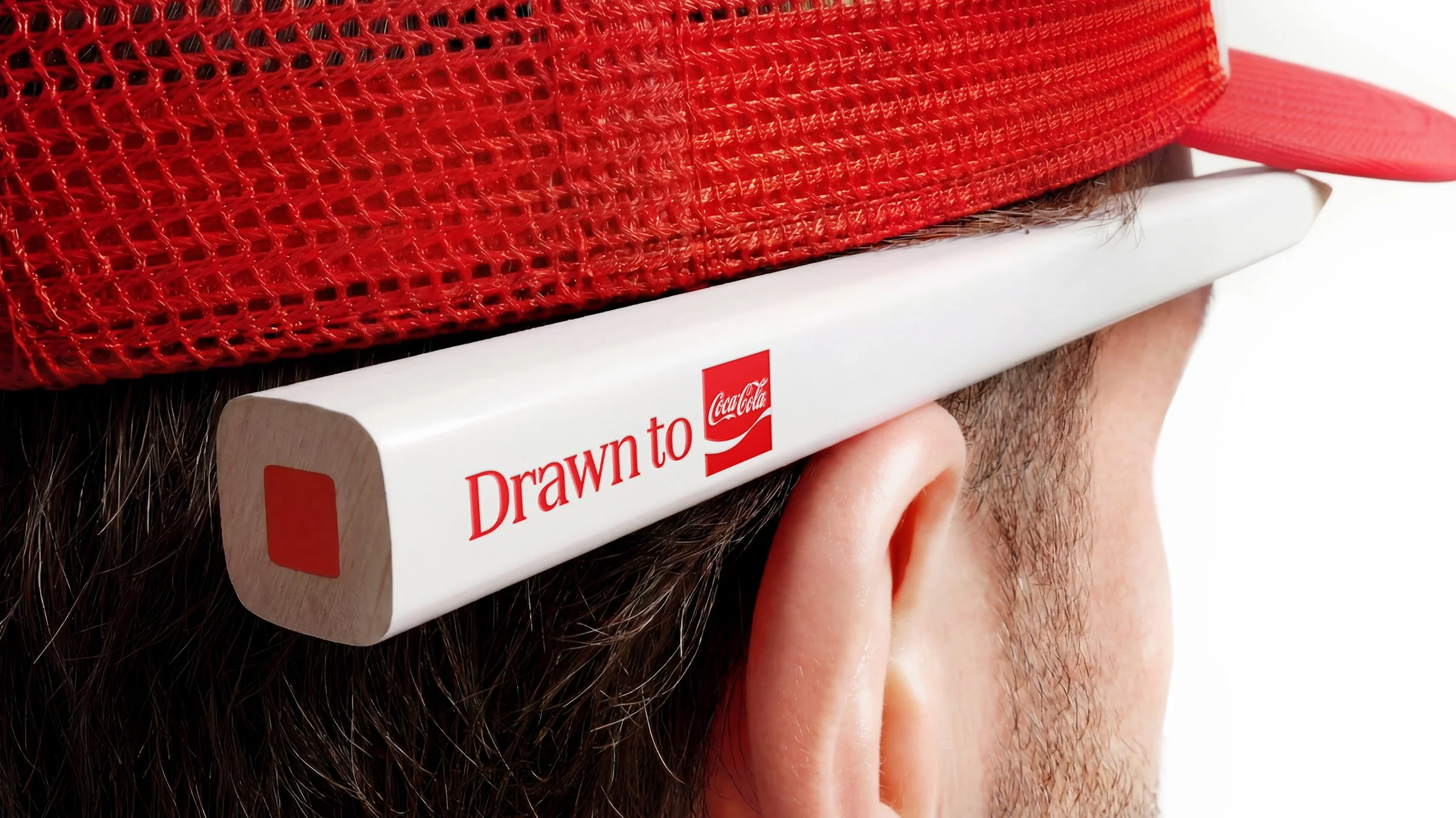
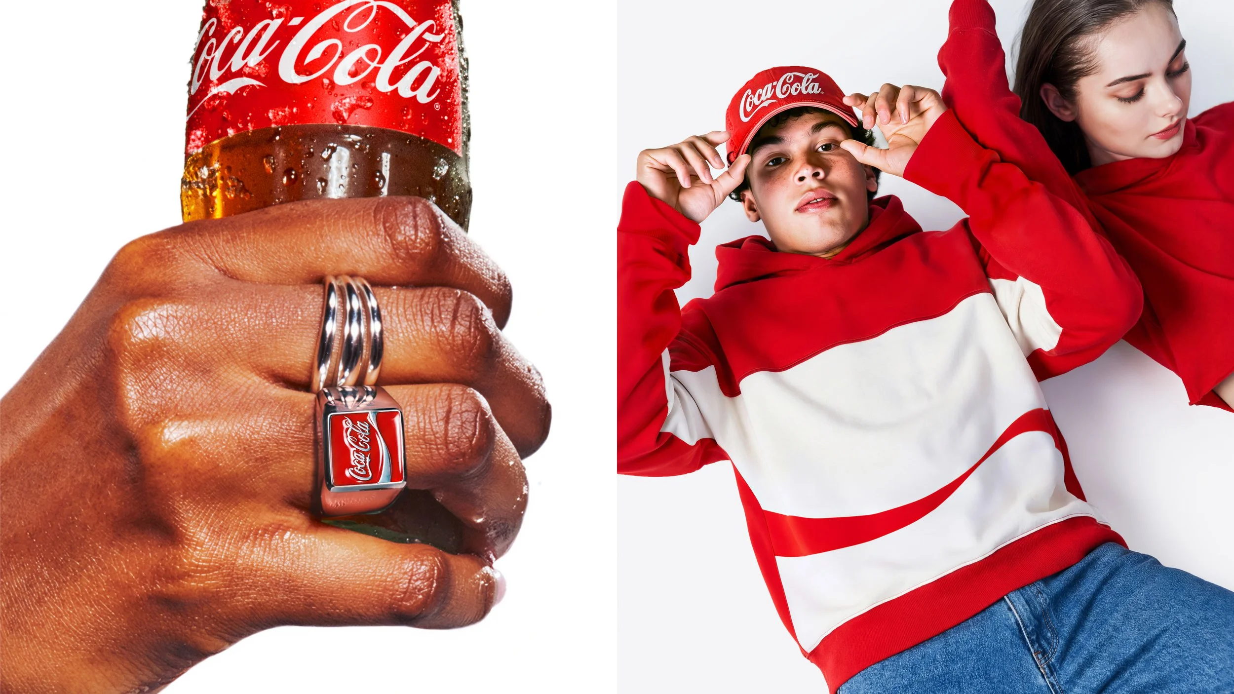
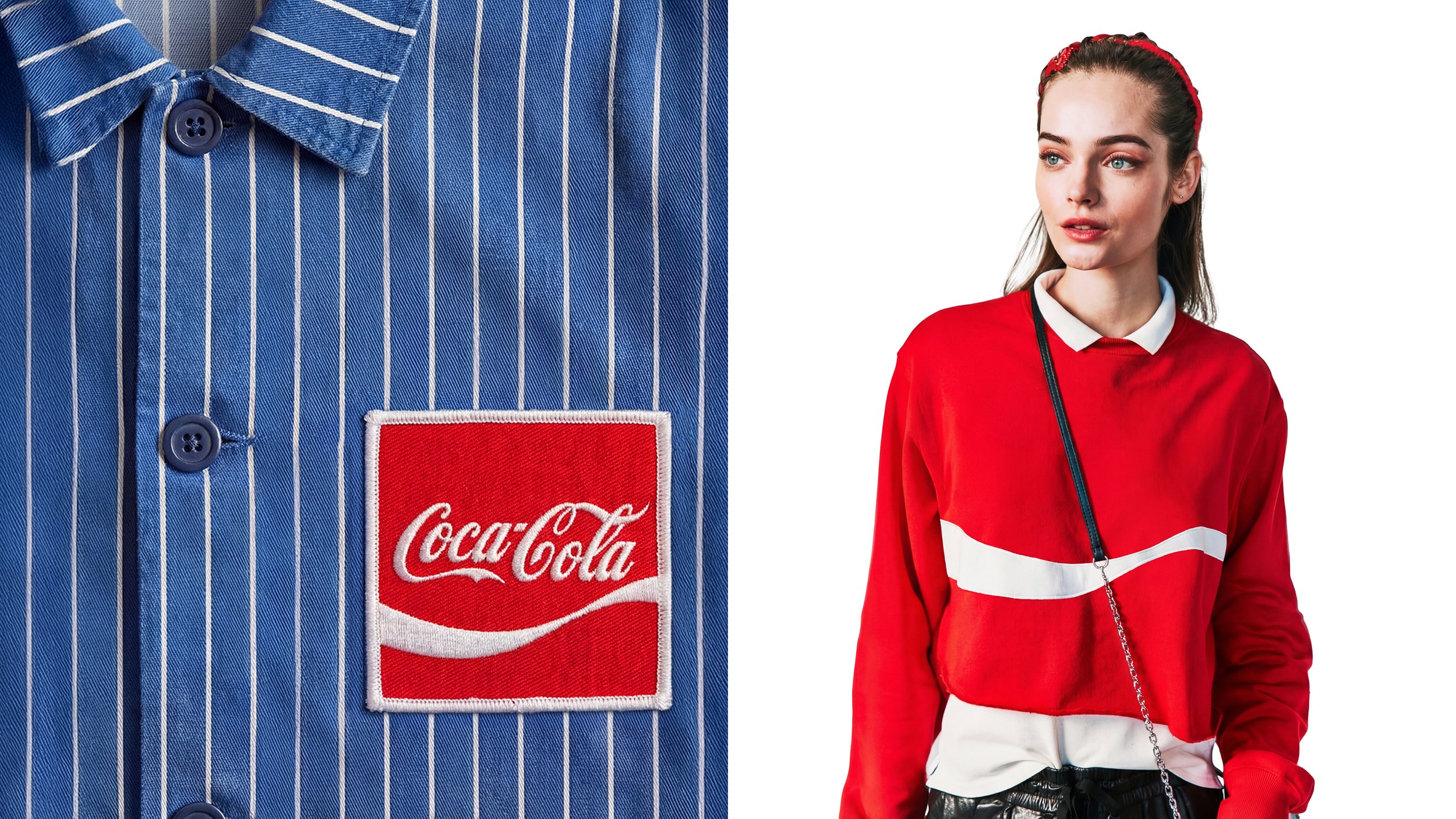
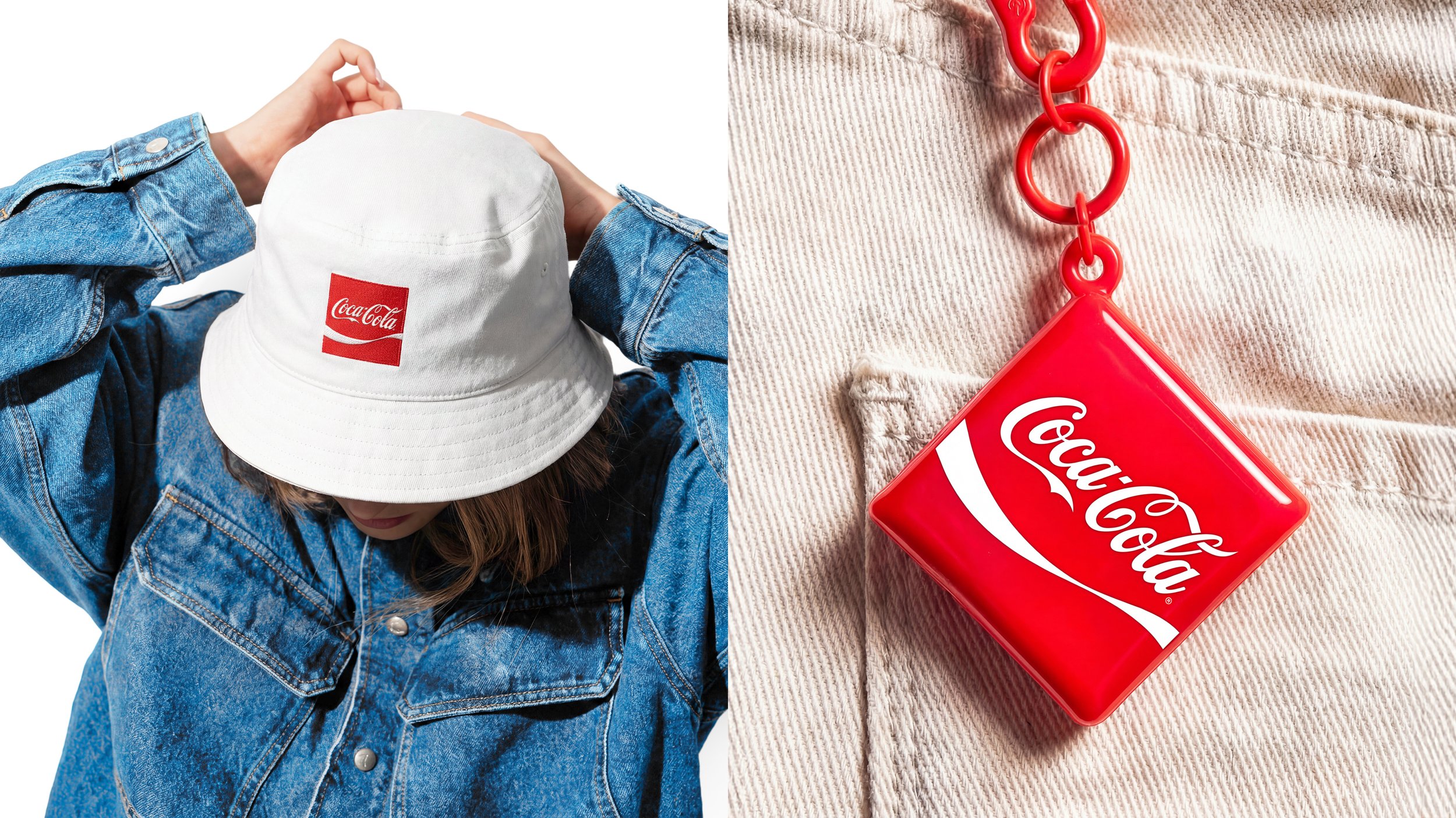
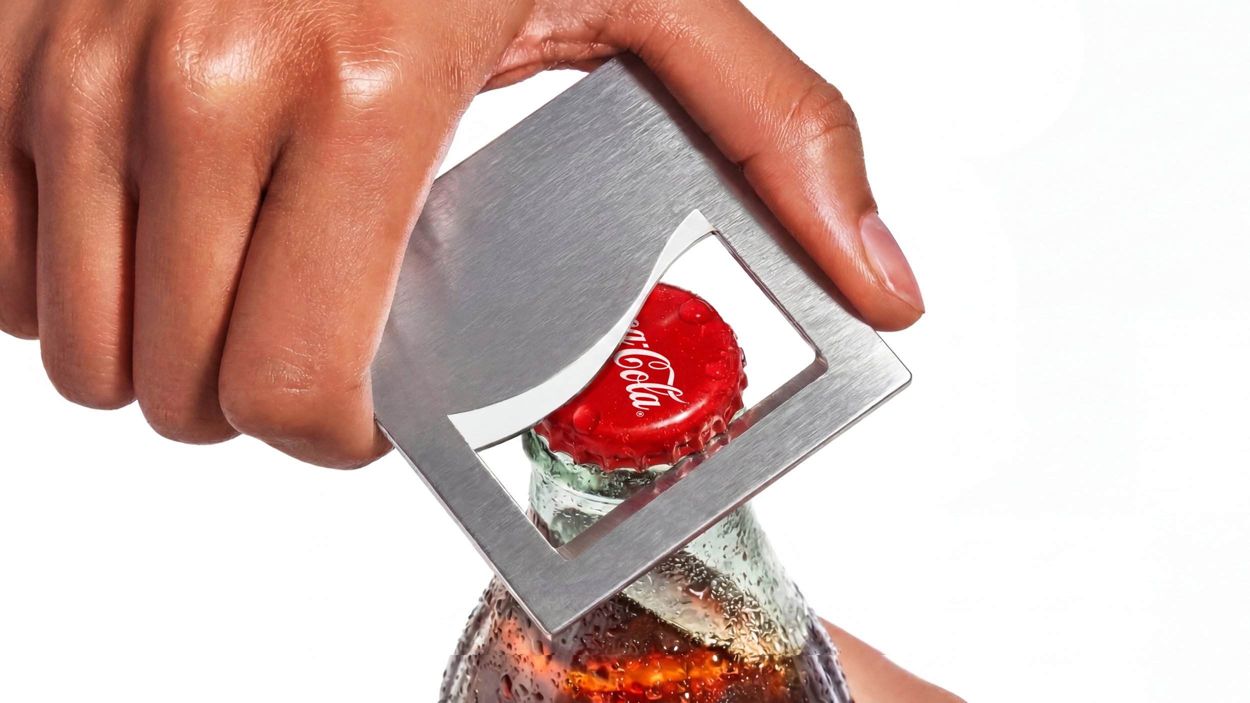
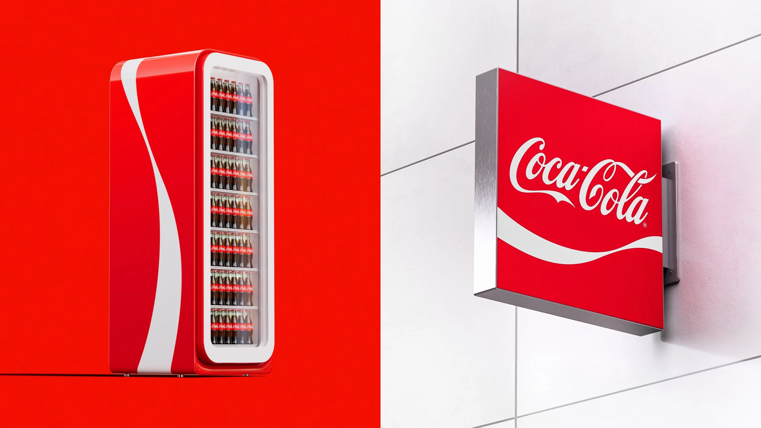
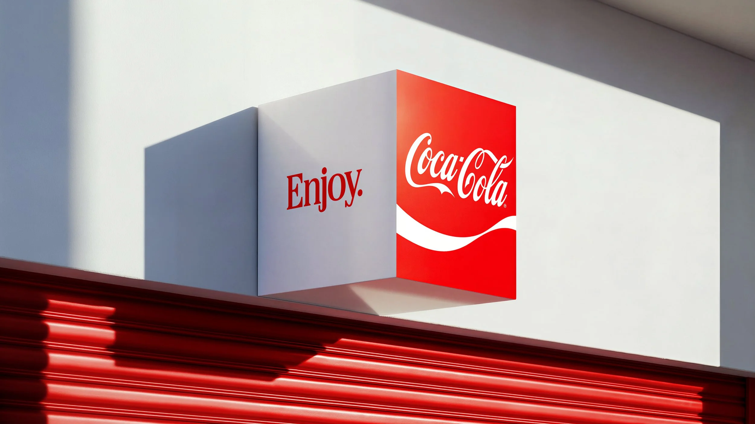
At the center of our design system is the Arden Square. Iconic and consistent, it anchors every element, shapes their behavior, and inspires their expression. All of our core assets draw their DNA from the Arden Square. It is a branding triple thread—housing the ribbon, spencerian script, and our Coca-Cola red.
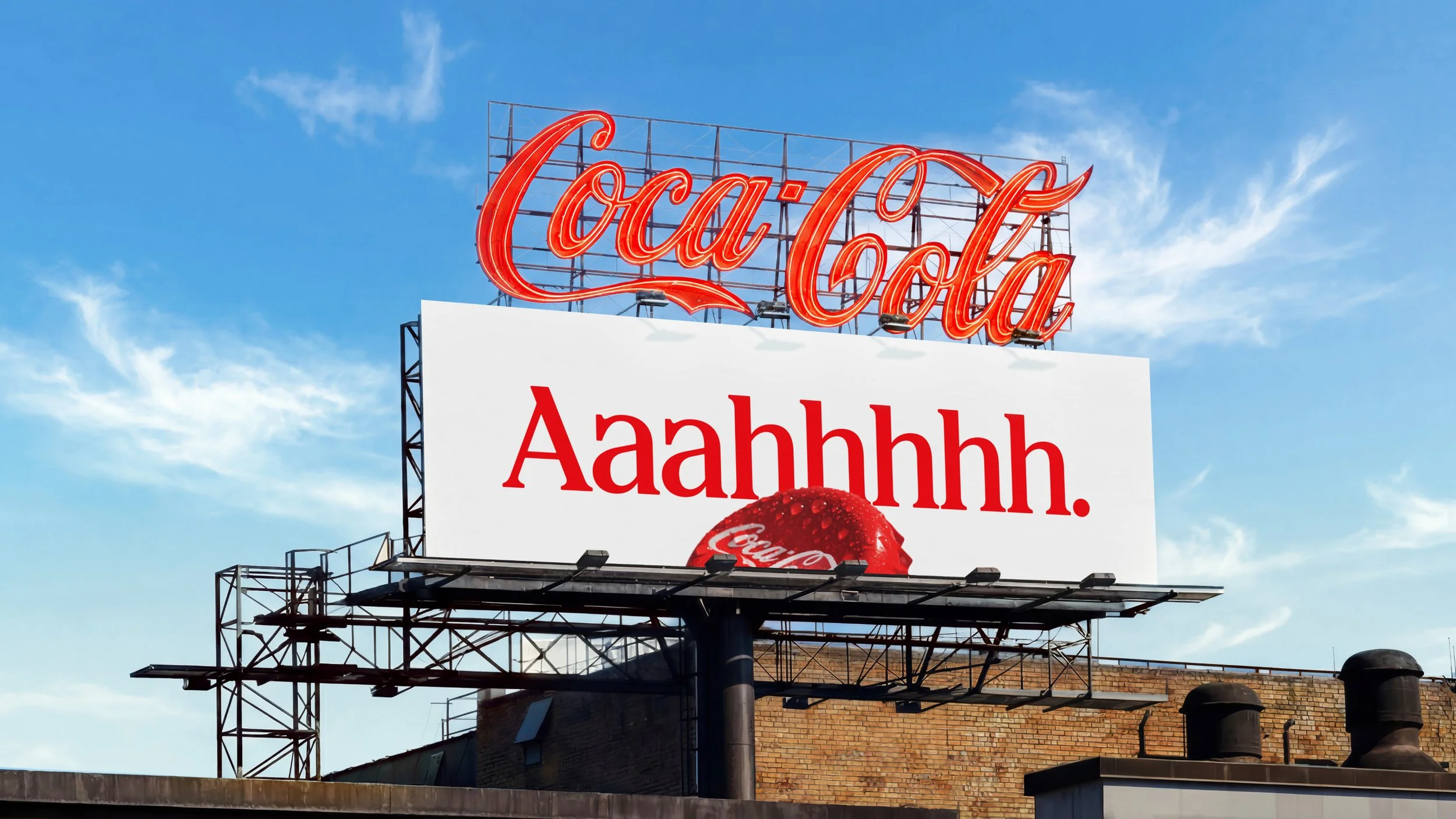
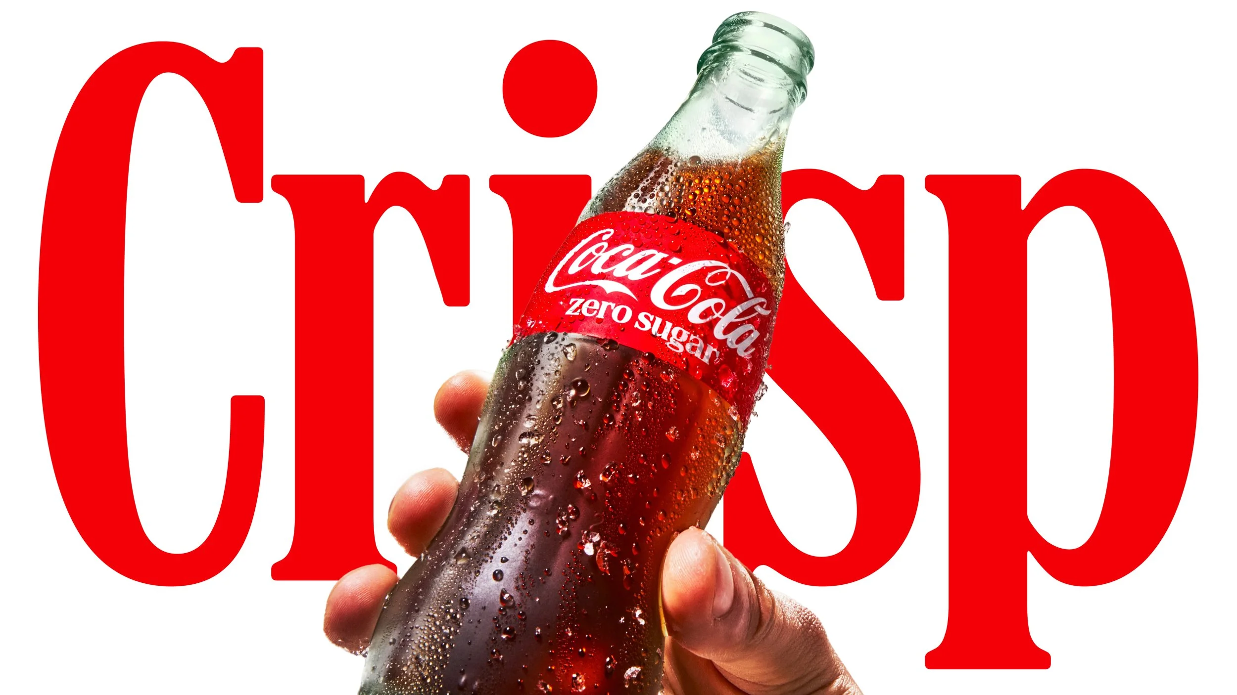
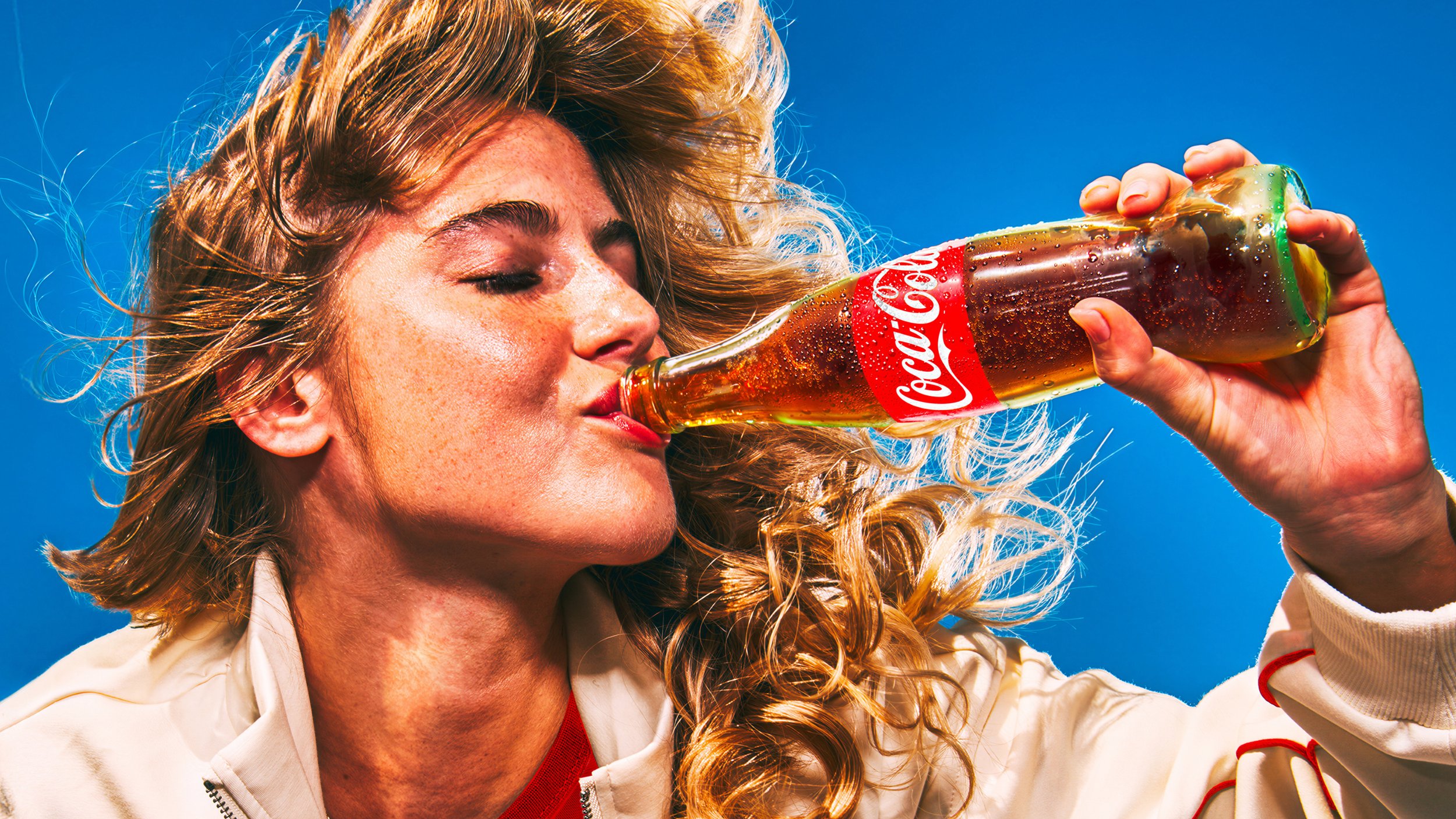
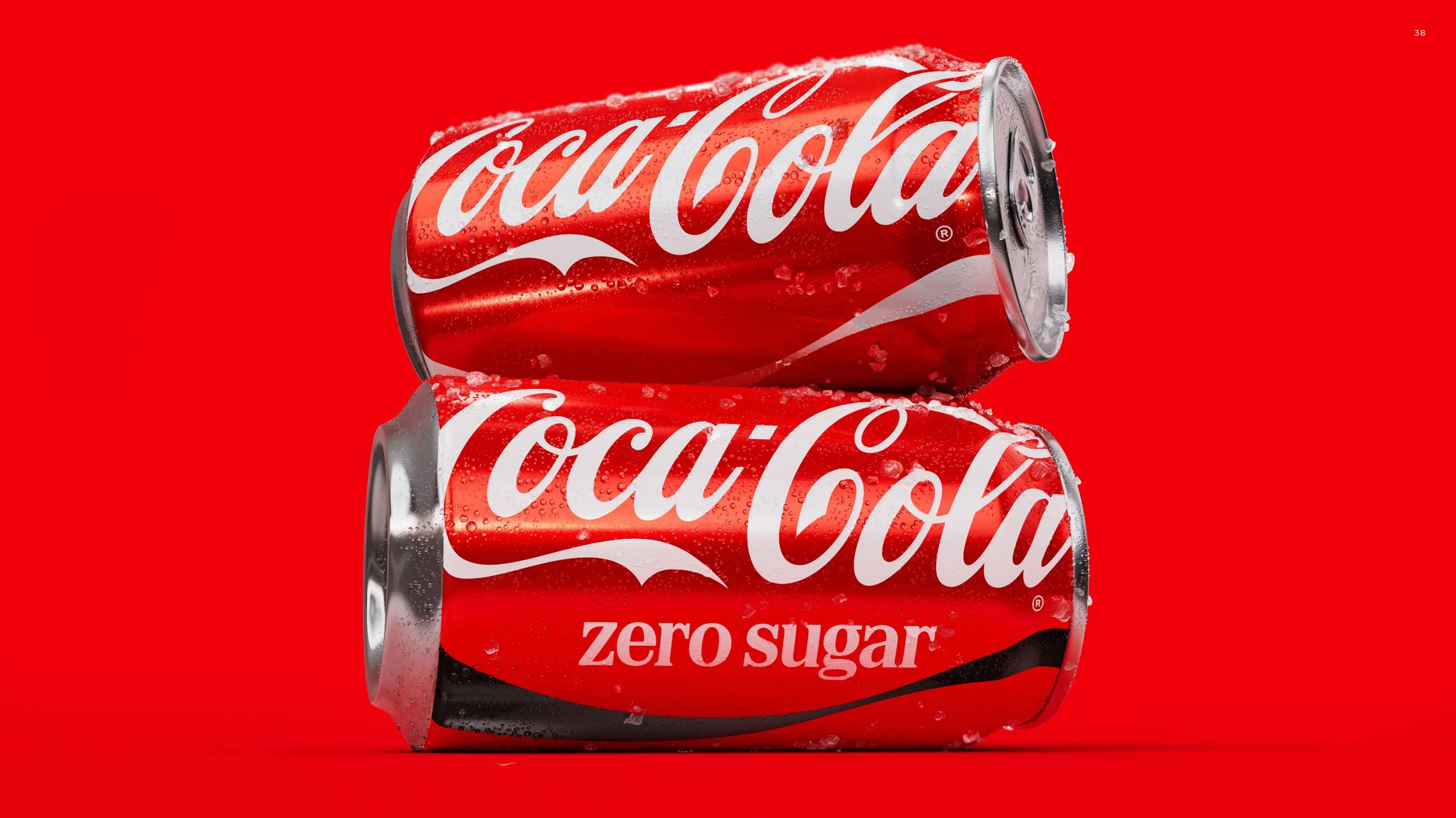
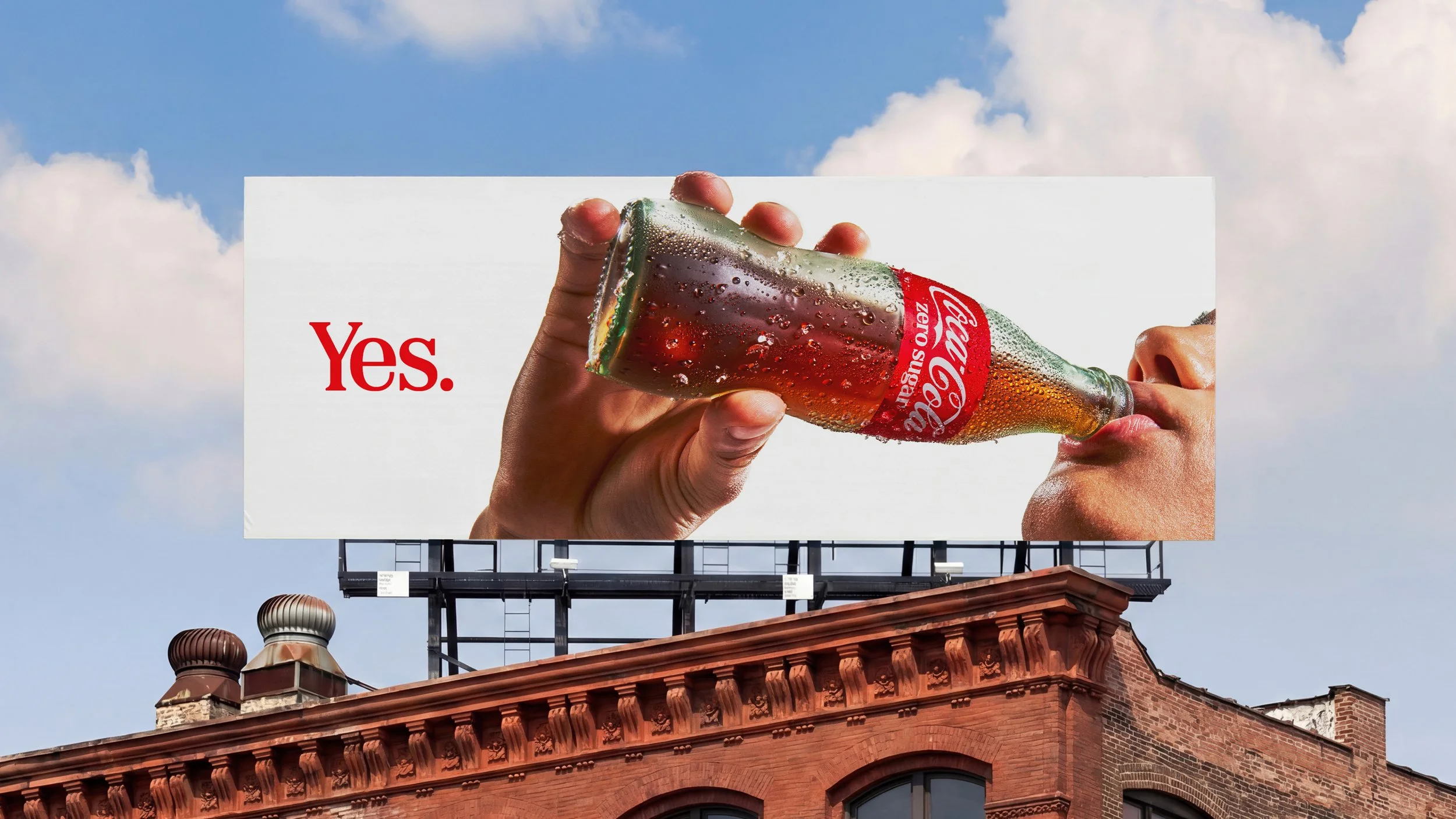
Creating Coca-Cola’s New Global Brand
Design Standards
Over three months, our design team built out and systematized the new identity into a comprehensive global framework—designed for clarity, consistency, and scale.
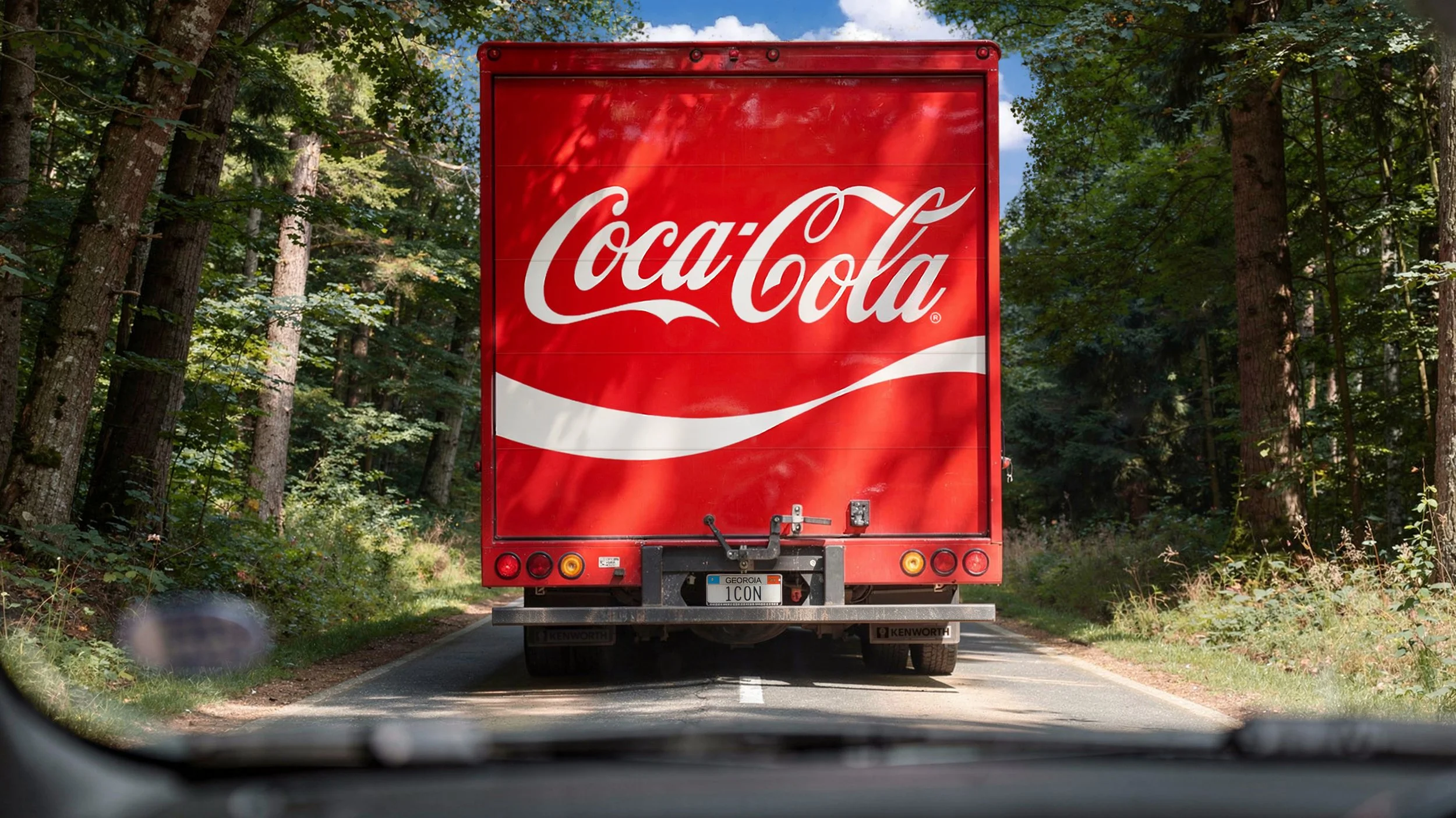
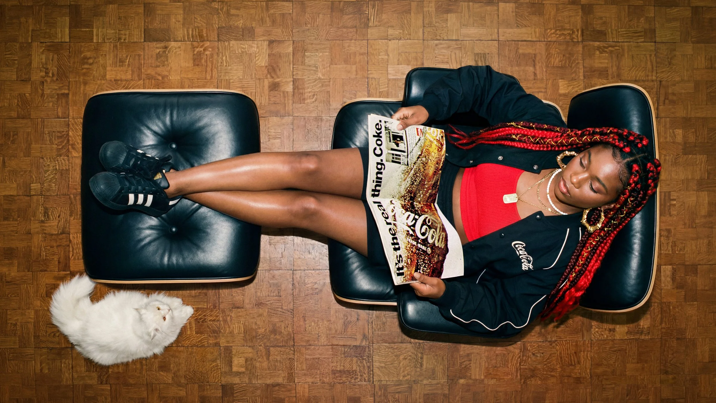
The result was Coca-Cola’s first global brand guidelines since the archived Meet the ’70s brand book, spanning every expression of the brand—from packaging and fleet to motion and photography. Working across disciplines, studios, and agency partners, we brought it all together into one shared standard designed to keep Coca-Cola iconic everywhere.
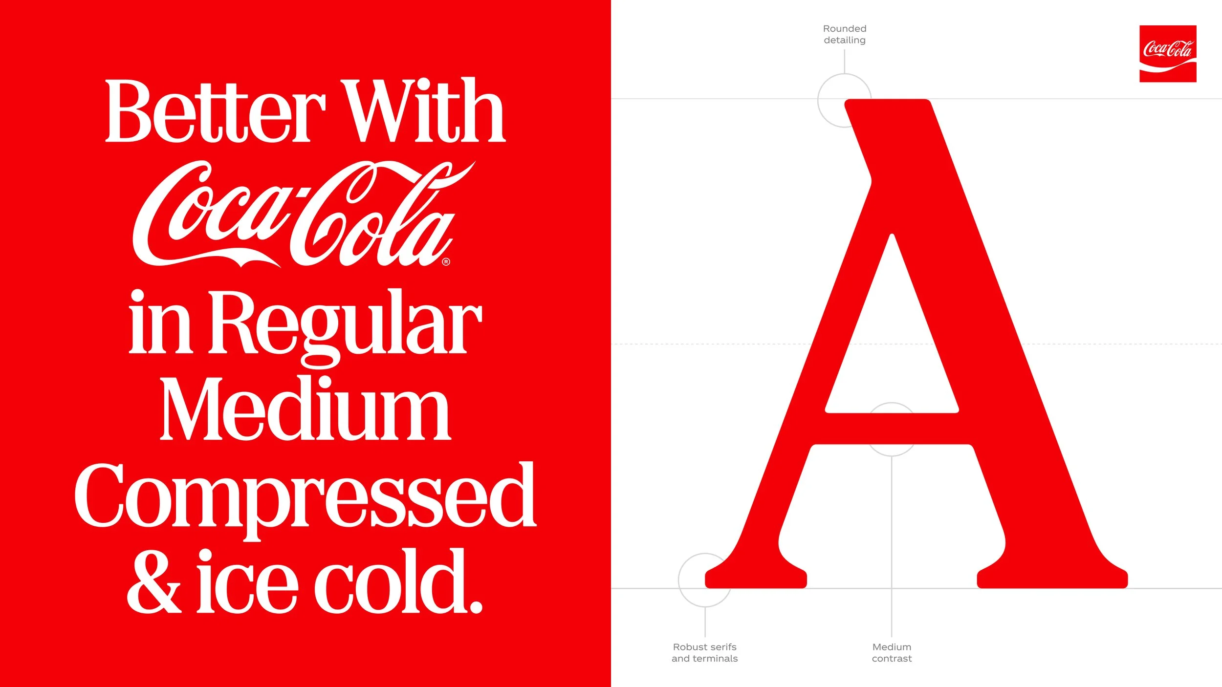
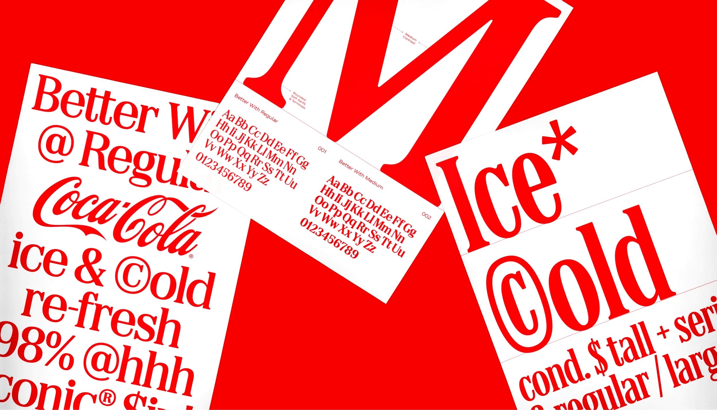
Better With draws directly from our heritage, reflecting the character and personality that has defined our brand from the start. Every type choice—its style, weight, and spacing—connects to our history while adapting seamlessly for modern applications, ensuring our voice remains both timeless and relevant.
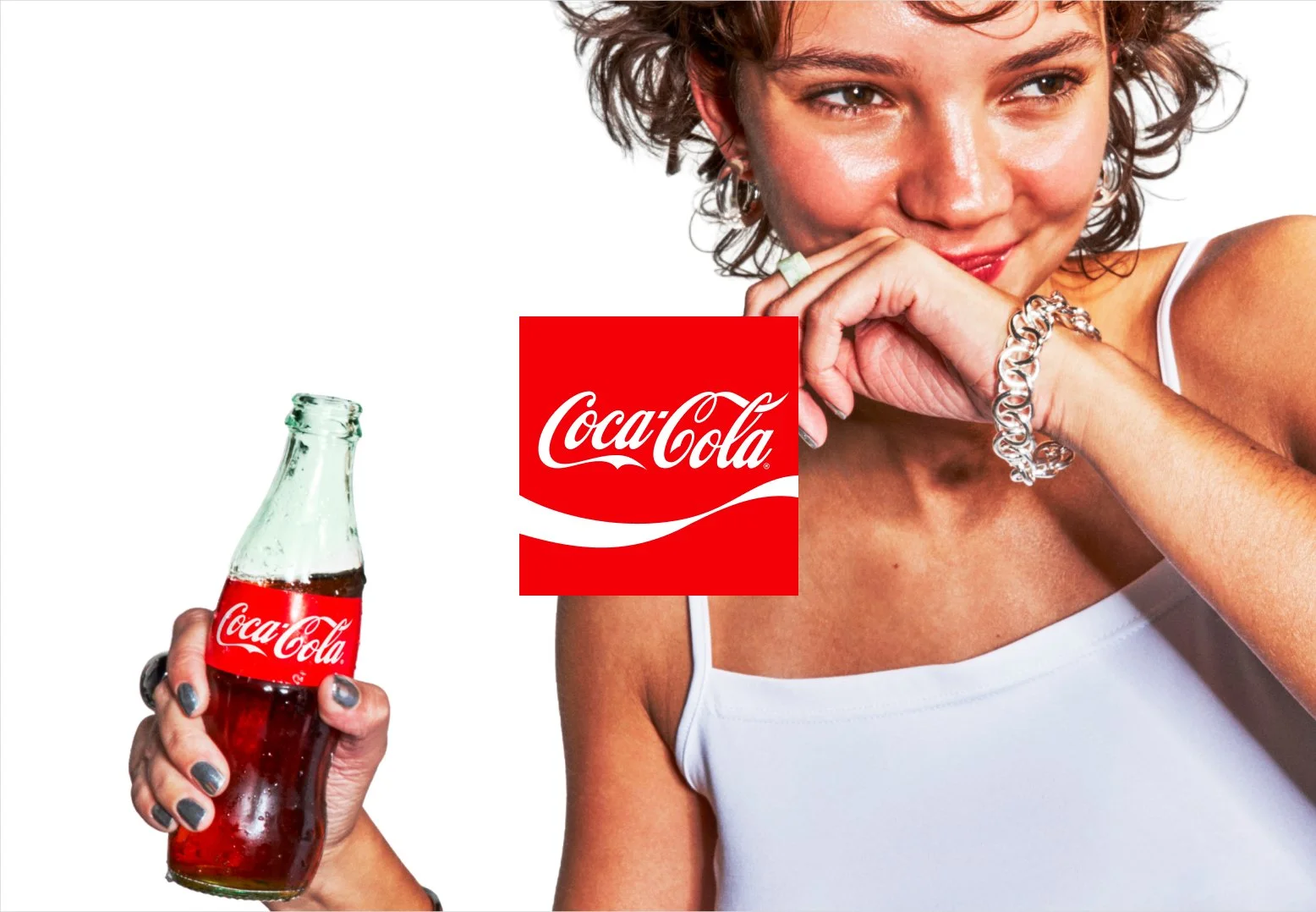
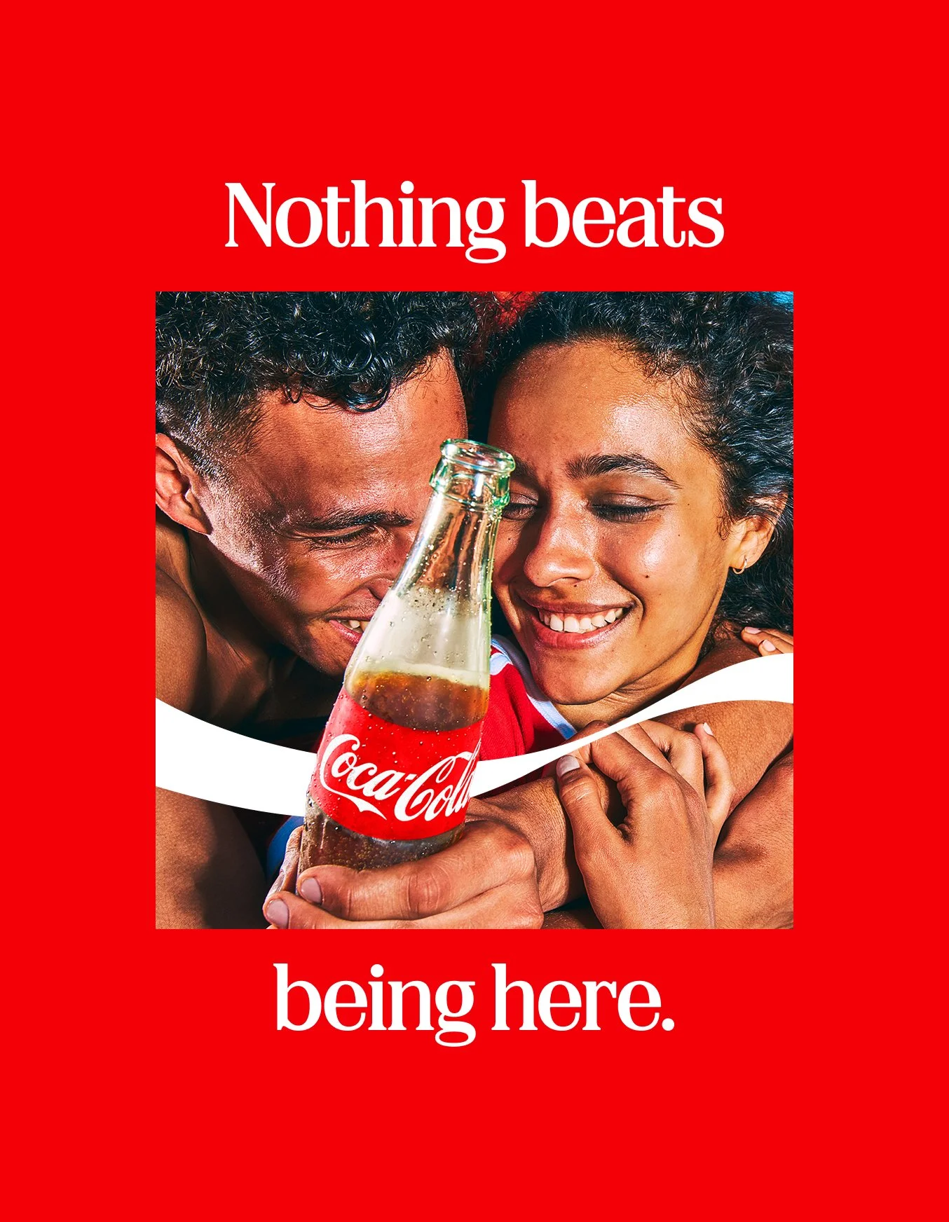
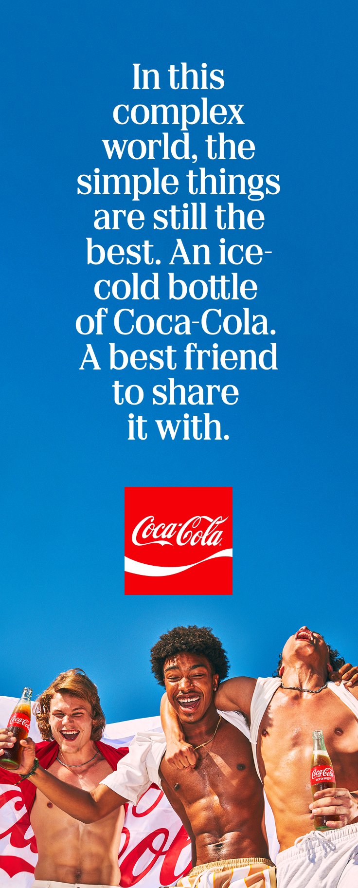
Our layout system brings clarity, balance, and a distinct visual presence across every application. The Arden Square guides alignment, frames content, and creates a recognizable visual rhythm.
Used as a framing device, it draws focus to key moments within a composition—either as a solid square containing imagery or as an outline framing the focal point.