Ades. A new kind of plant-based.
SERVICES
Visual Identity
Packaging Design
Art Direction
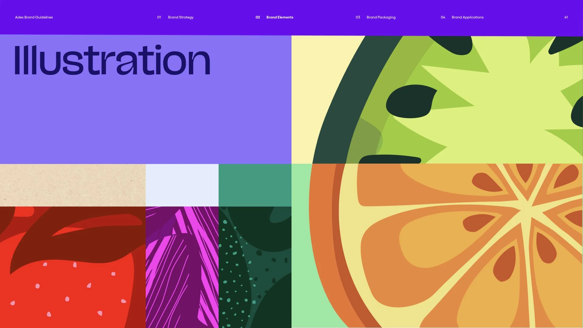
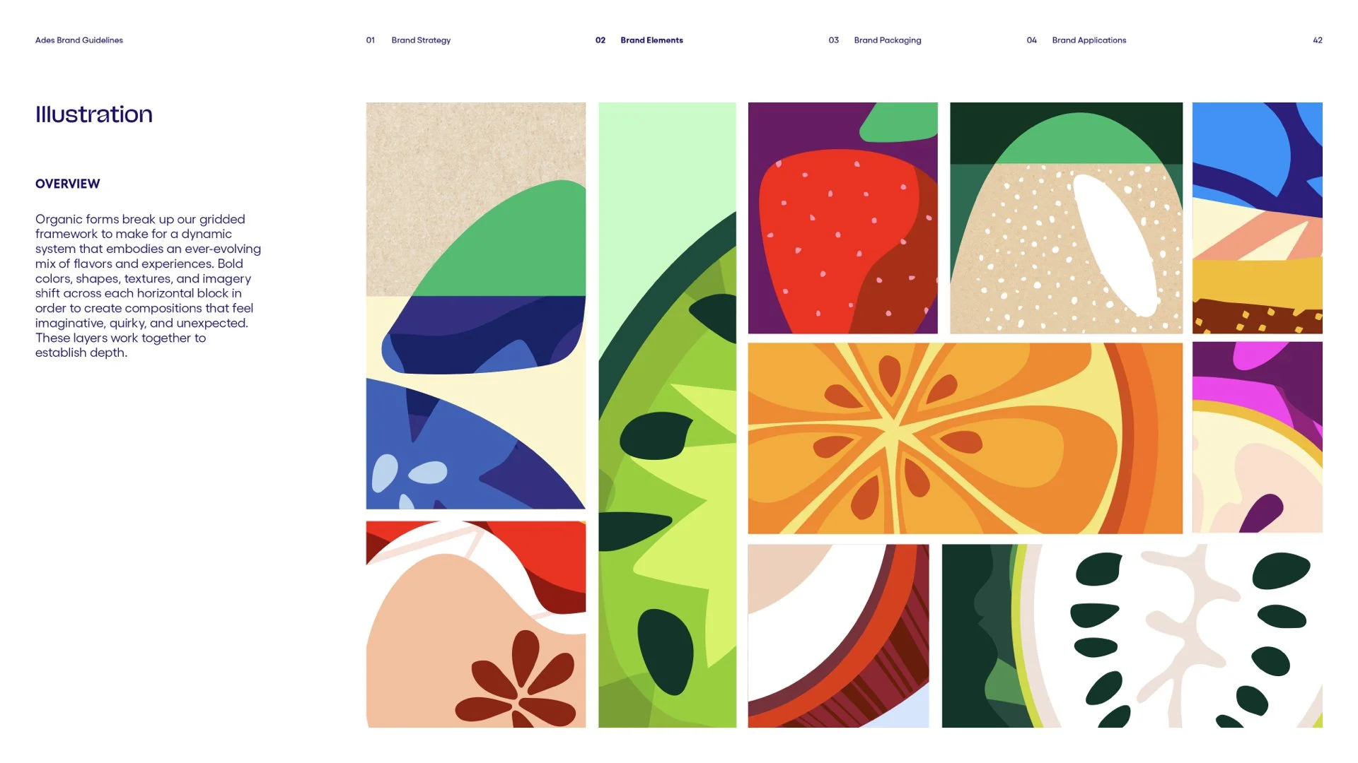
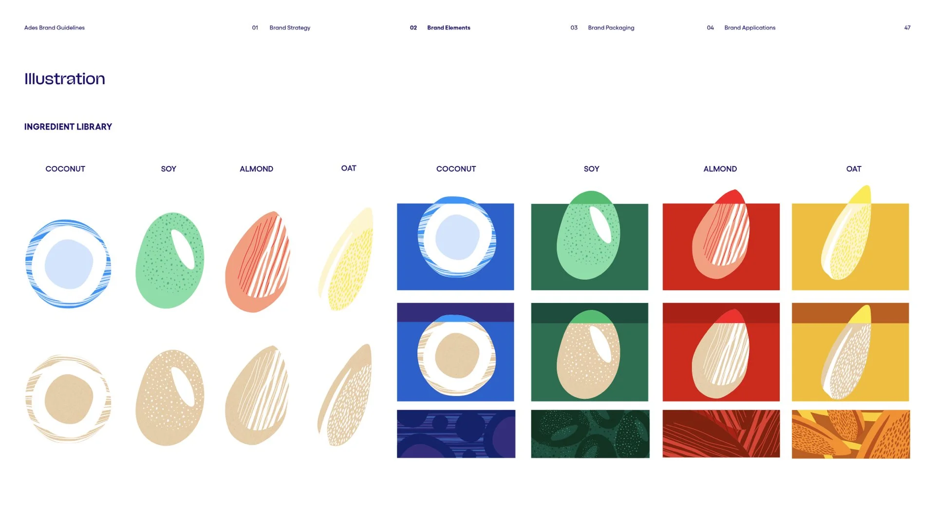
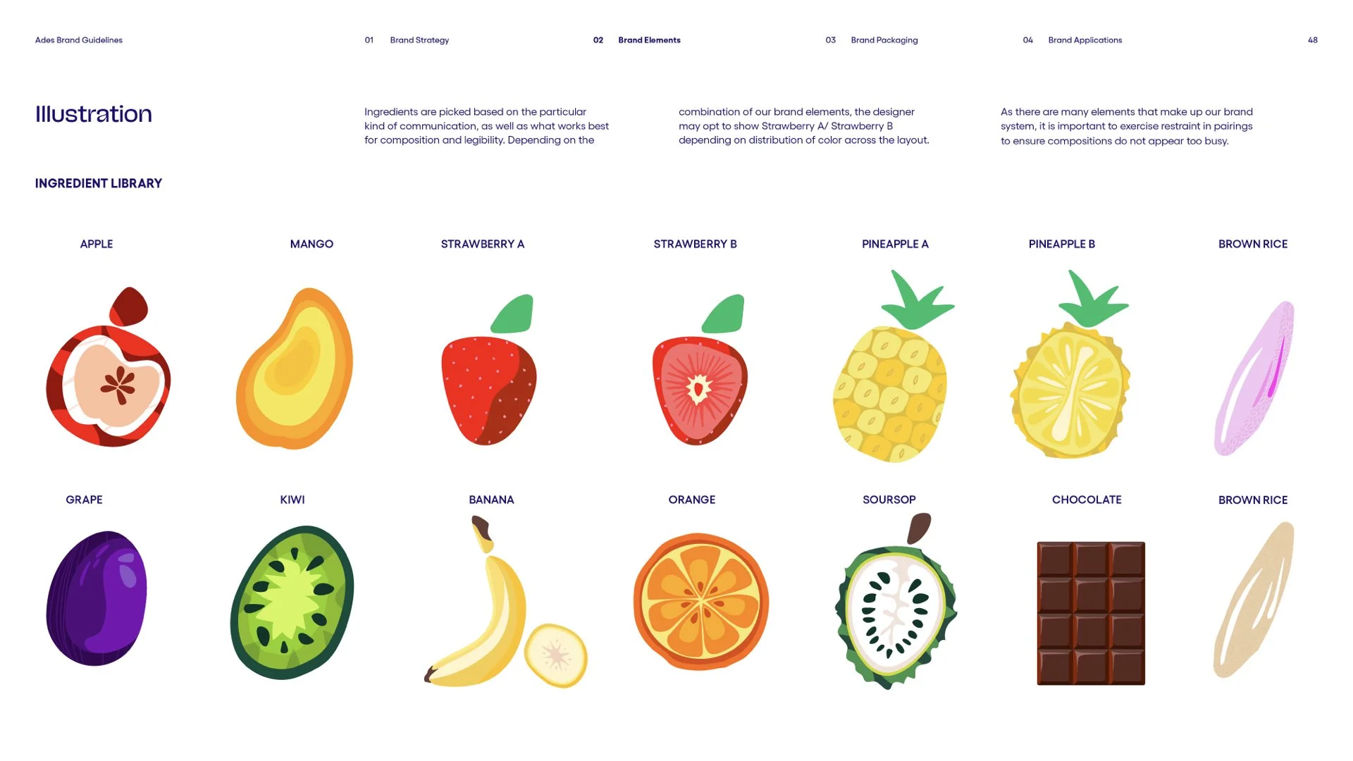
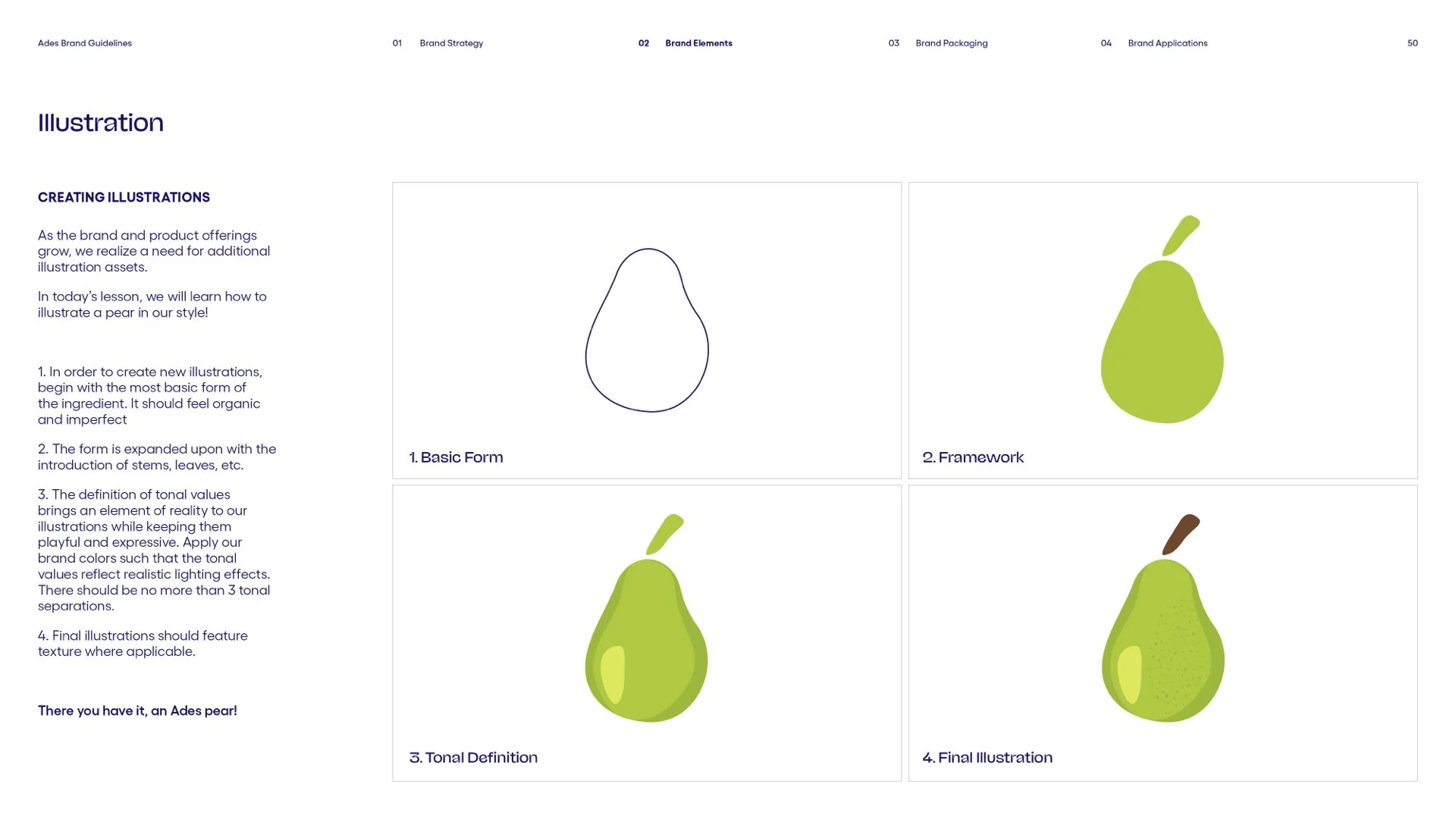
Illustration
Created while under employment of Superunion.
The nature of this work is confidential.
CLIENT
Coca-Cola
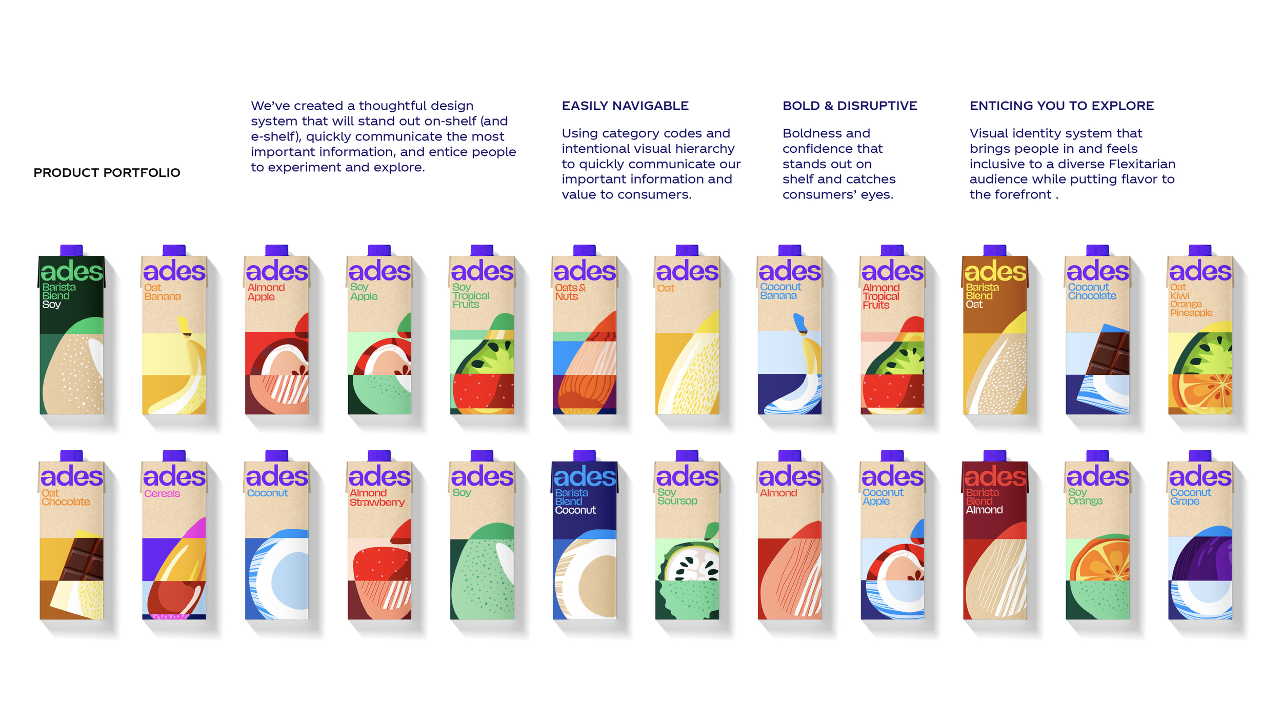
In 2016, The Coca-Cola company purchased Ades/Adez–originating from alimentos des semillas–a plant-based beverage company with a foothold in the LATAM market. Since then, there has been a rapid expansion in its portfolio of products–from single-ingredient beverages with flavors like chocolate or strawberry, to blended beverages with different plants, fruits, nuts, seeds, and grains.
Rapid expansion led to a globally fragmented brand identity at a time when many hyper-focused brands entered the category around the world.
Our team was brought on to develop a new visual identity system and bring the new brand positioning to life.
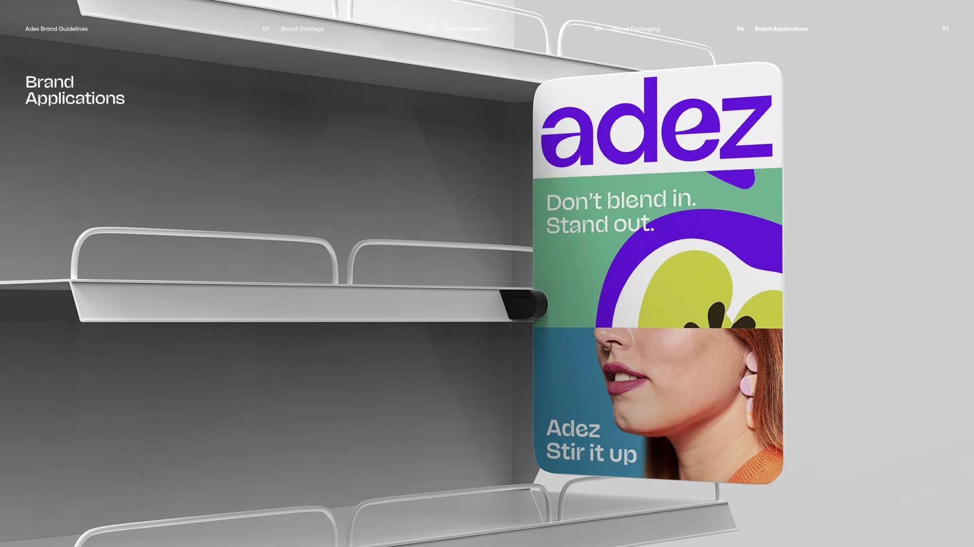
We set out to build a bold, differentiated, globally cohesive brand that can disrupt and lead the plant-based beverage category.
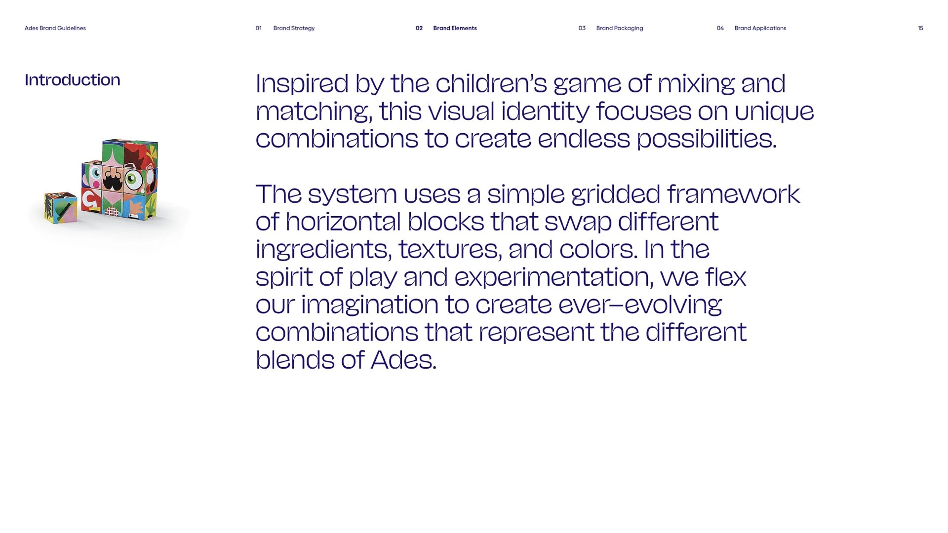
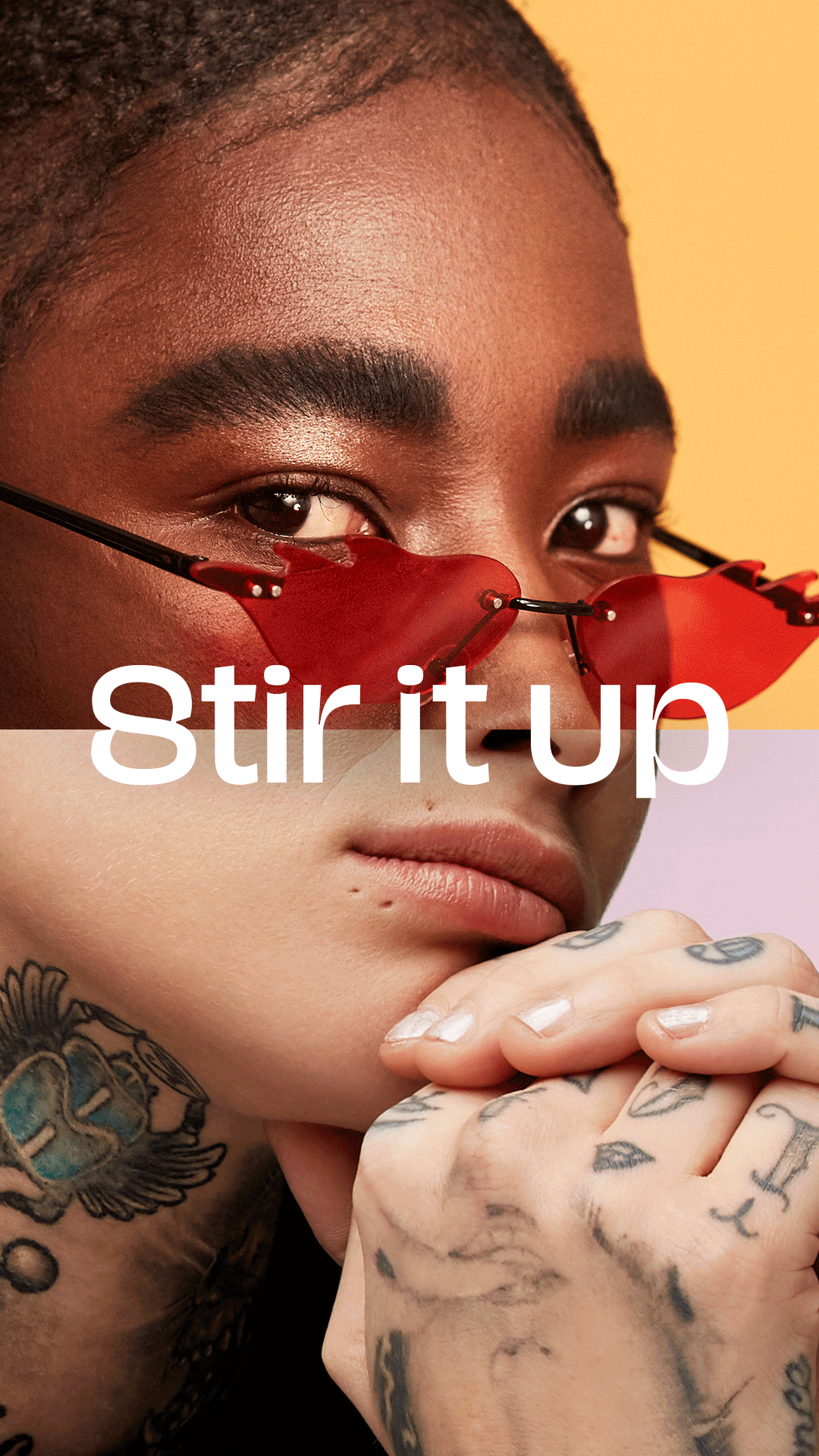
Inspired by the children’s game of mixing and matching—this visual identity focuses on unique combinations to create endless possibilities. At Ades, we believe life is richer, more colorful, more interesting, more vibrant when we embrace the in-between.
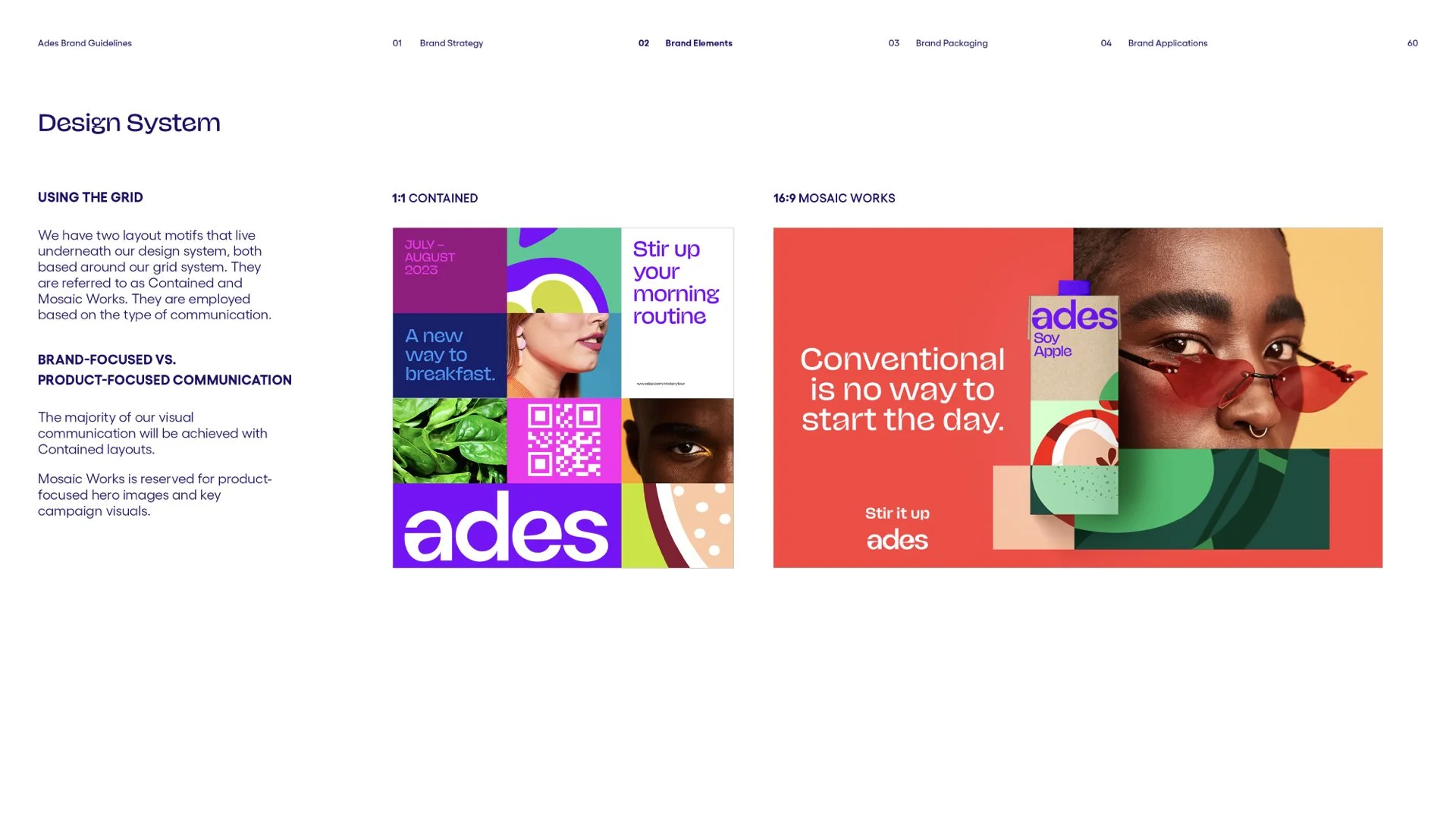
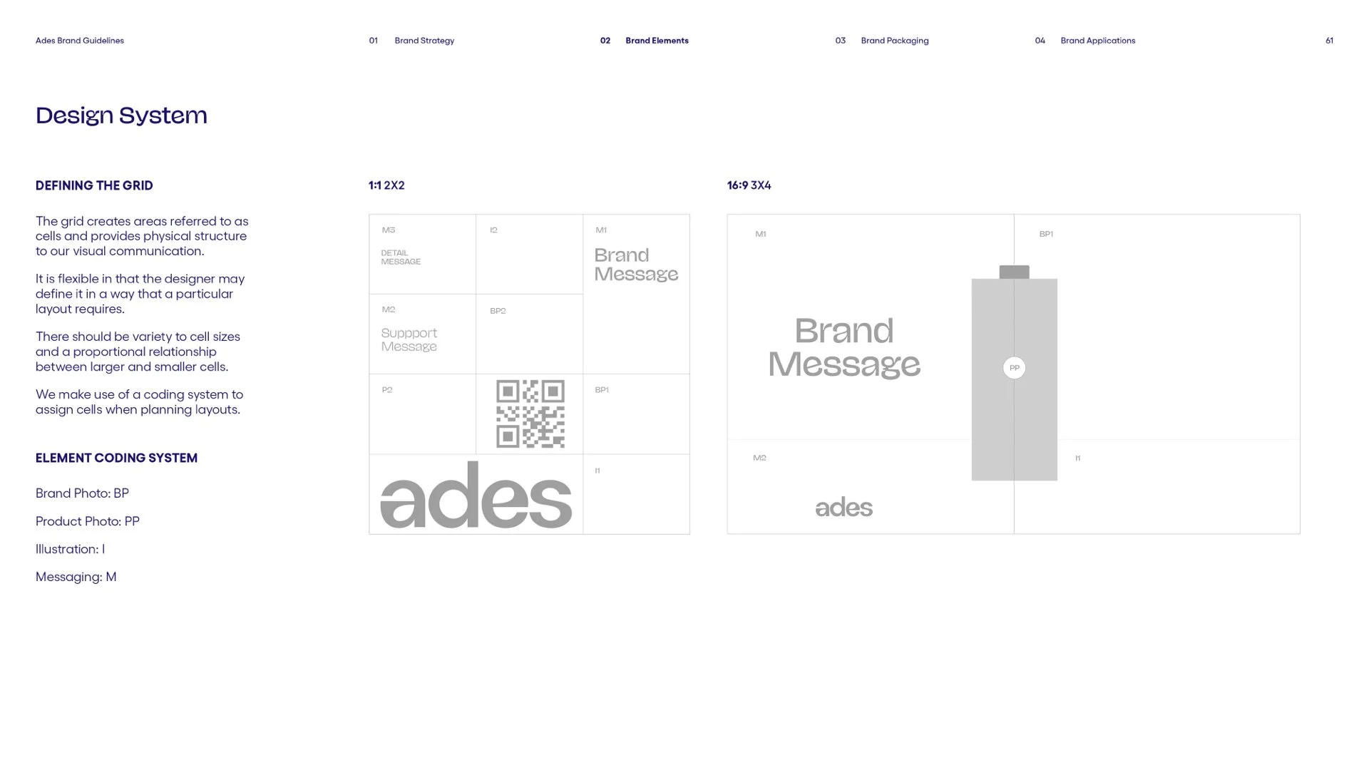
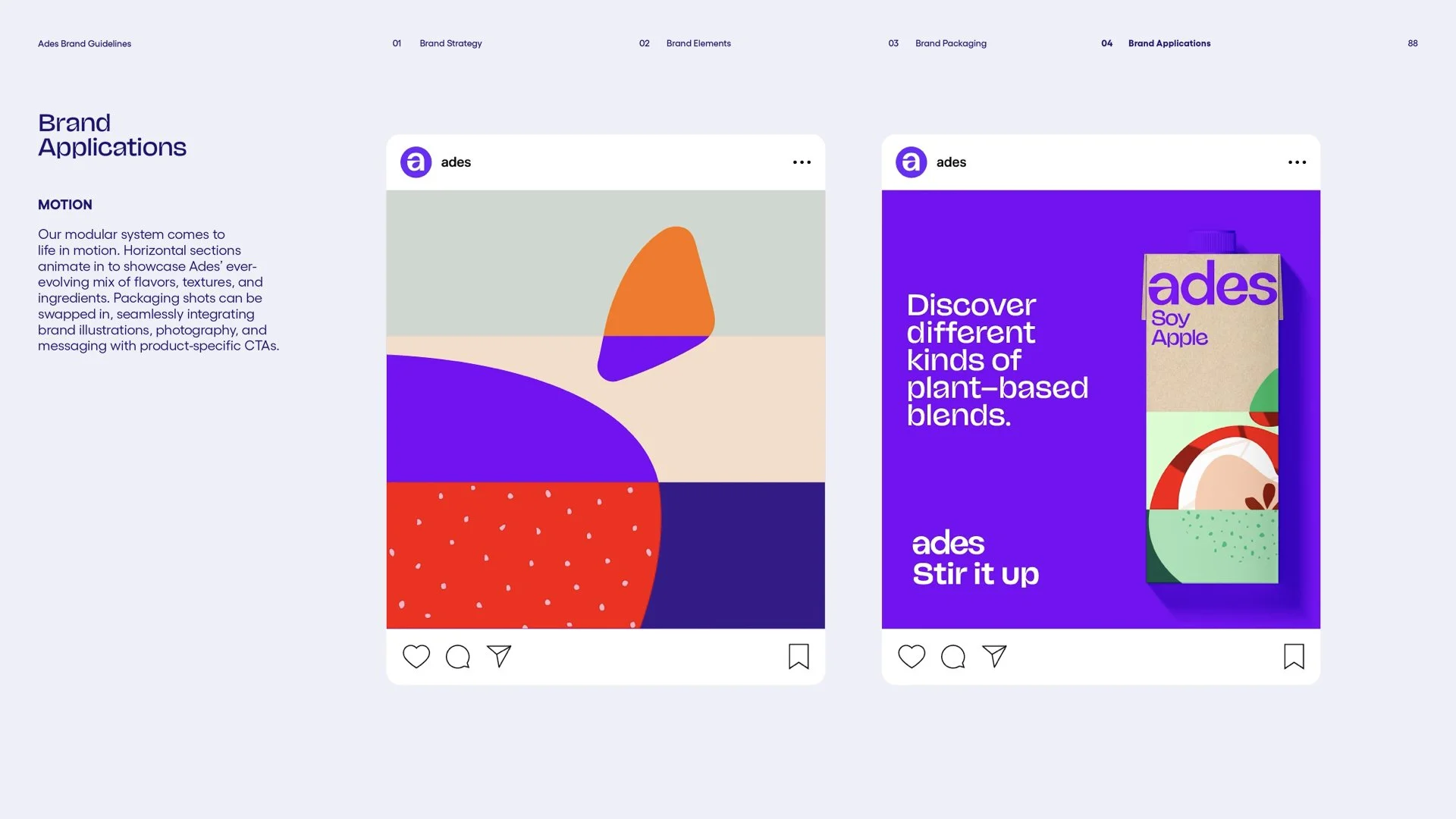
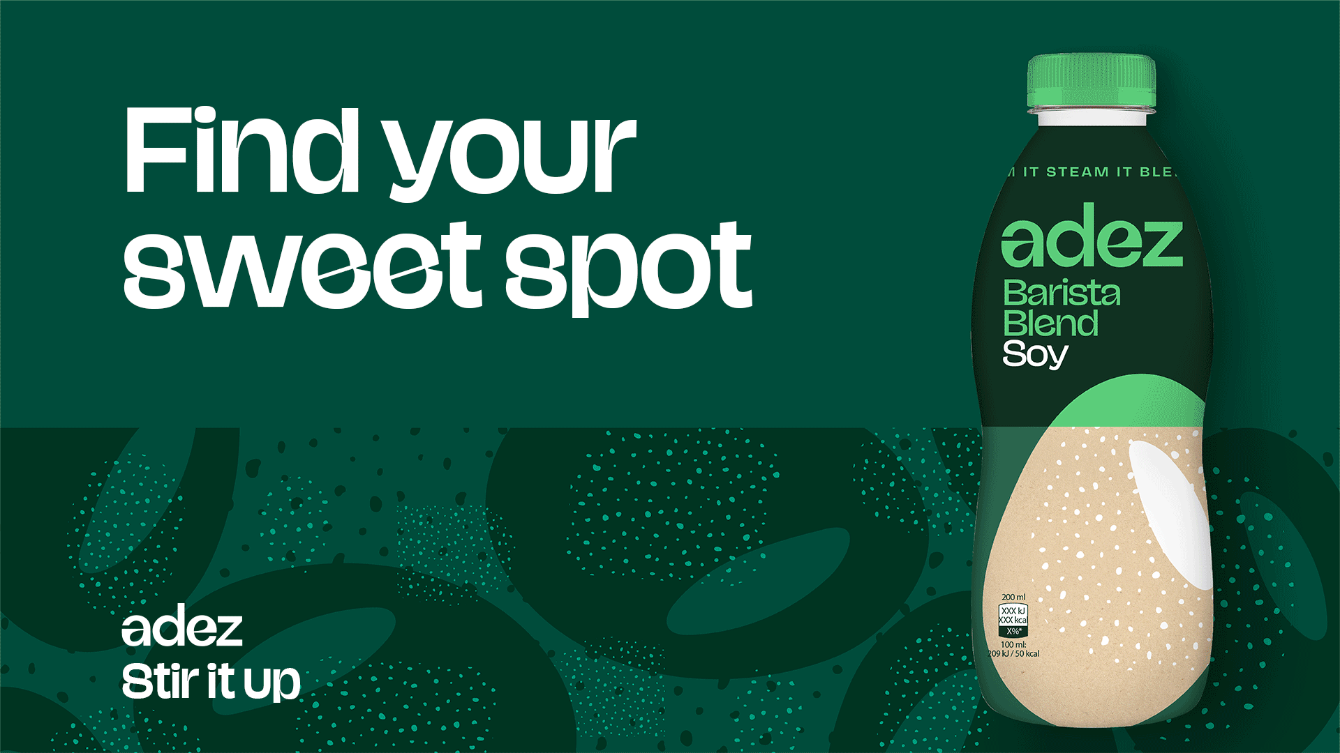
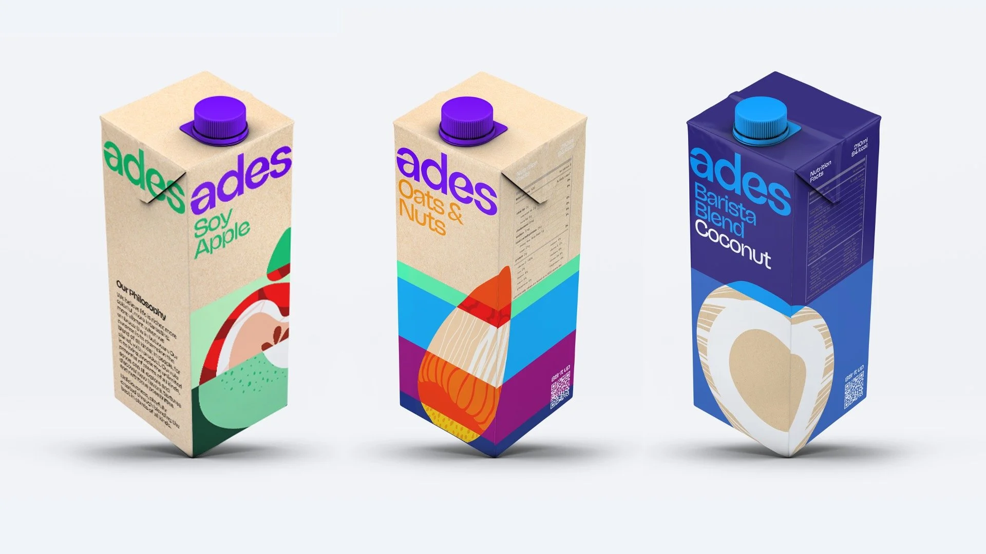
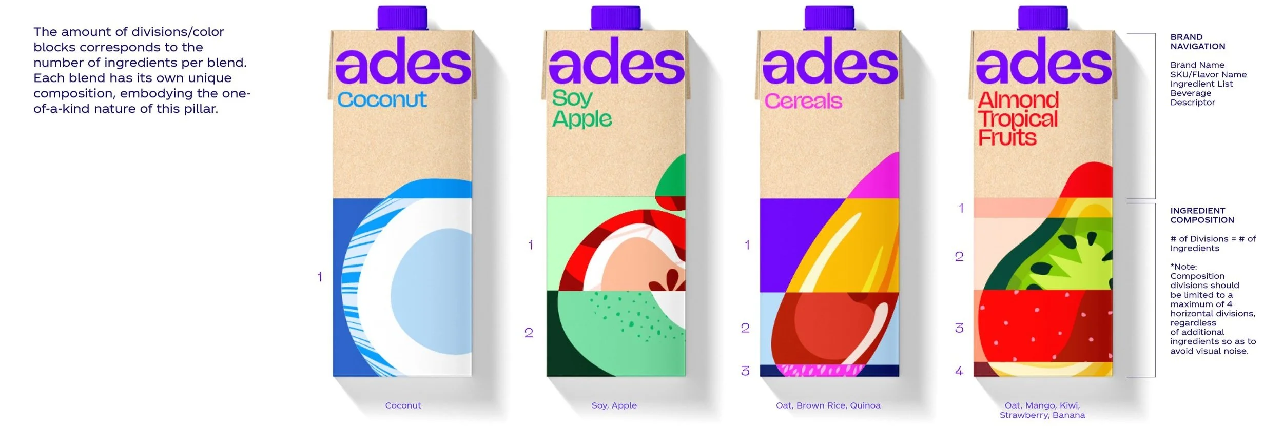
The system uses a simple framework of horizontal blocks that swap different ingredients, textures, and colors. In the spirit of play and experimentation, we flex our imagination to create ever–evolving combinations that represent the different blends of Ades.
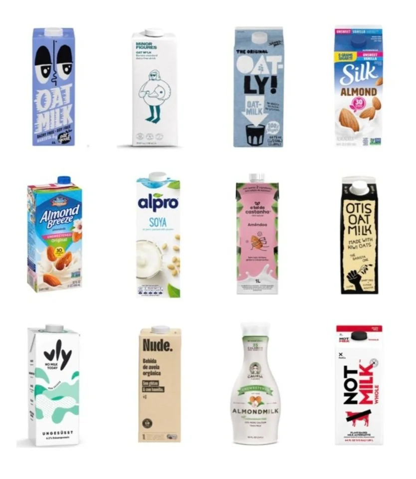

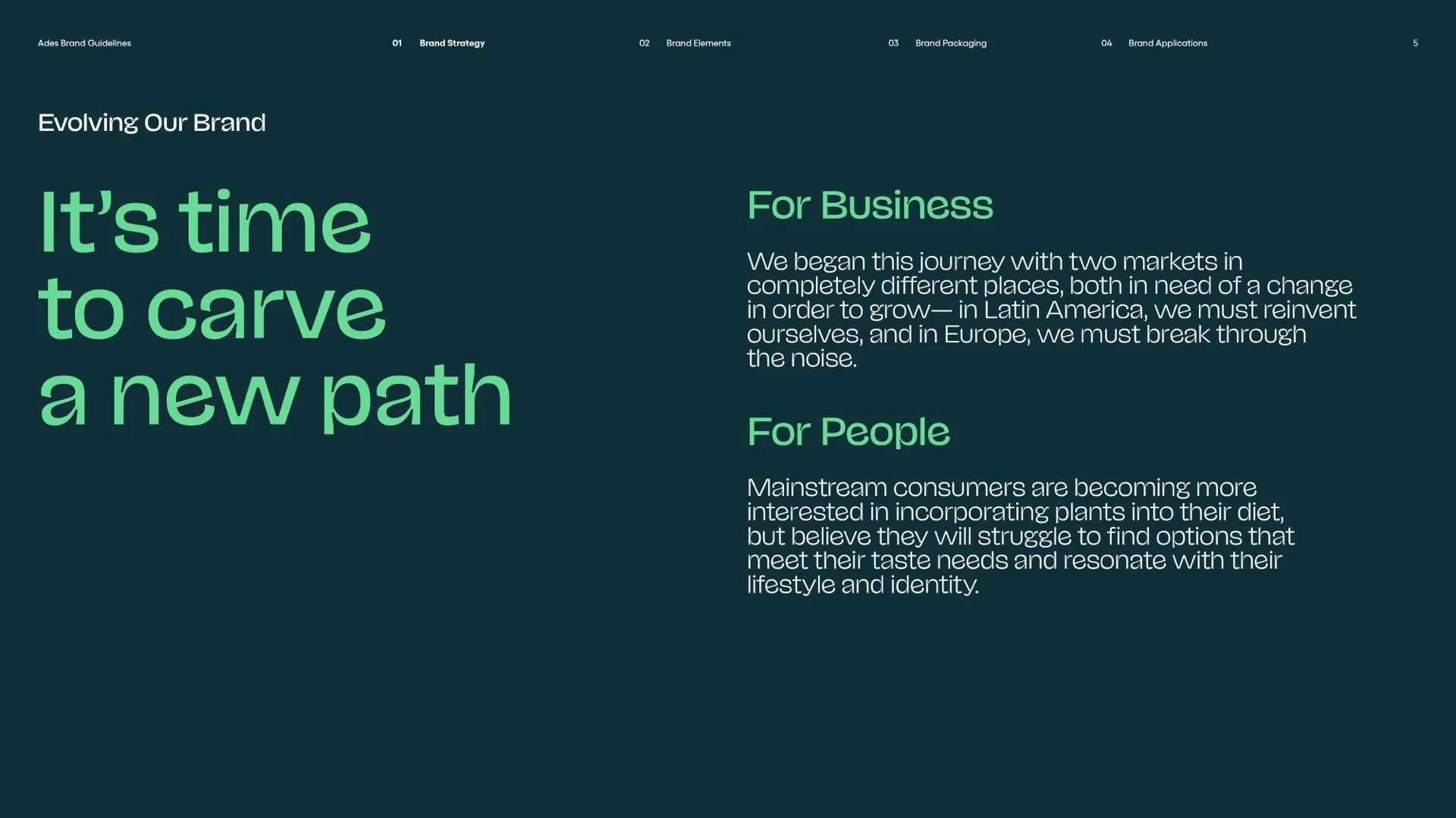
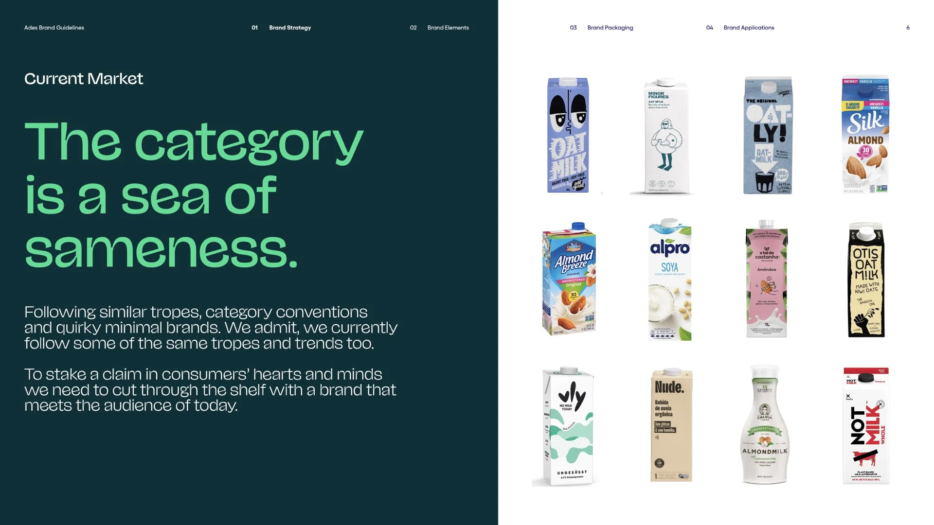
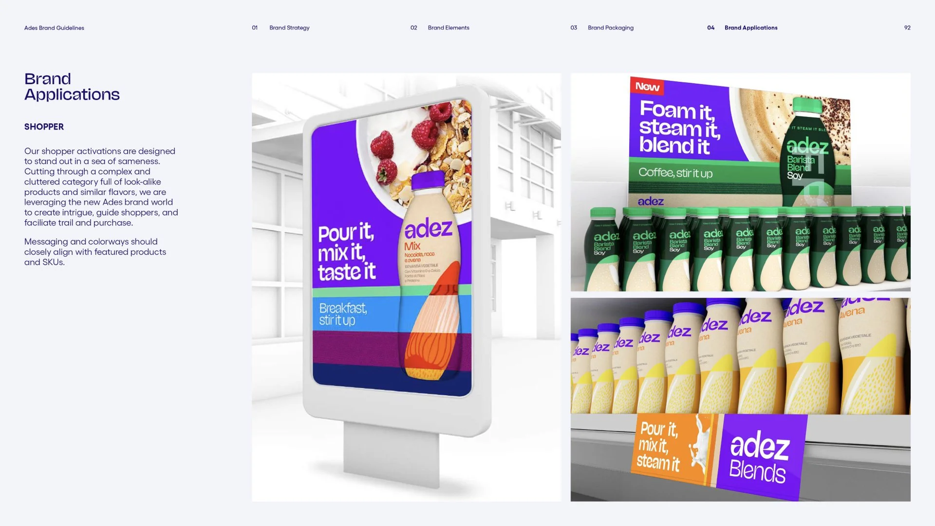
The category is currently a sea of sameness. The category today leans heavily into extremes, with design and messaging that relies on milk cues and restrained colors.
The “Milk replacements” borrow category conventions from dairy creating a sea of blue’s and white’s with generic packaging and messaging.
The “Quirky Minimalists” are more simplistic, using muted colors, strong tone of voice and large type to create distinction and challenge to the status quo of dairy cues.
The “Plant Extremists” lean into nature cues and emphasize the plant-based ingredients.
To stake a claim in consumers’ hearts and minds, we need to cut through the shelf with a brand that meets the audience of today.
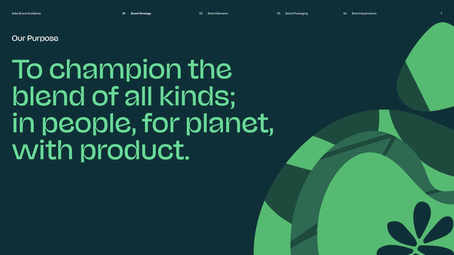
OUR PURPOSE
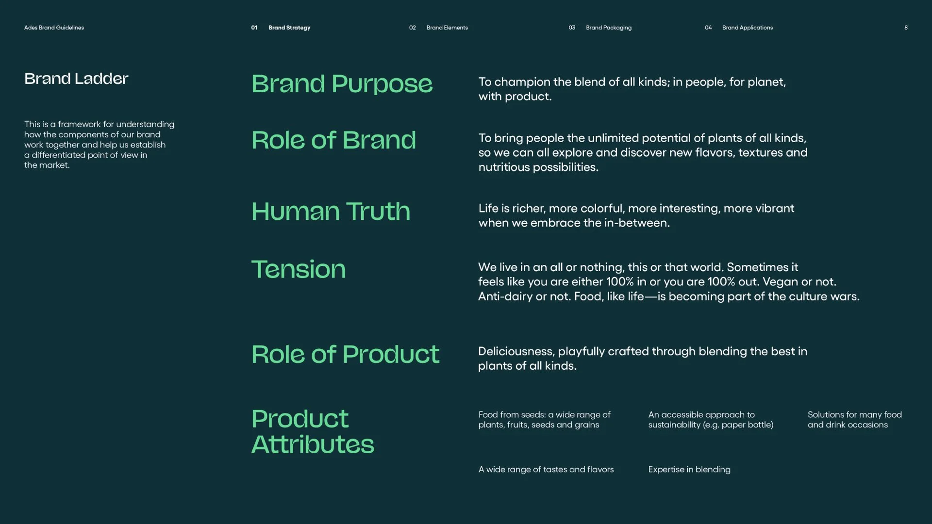
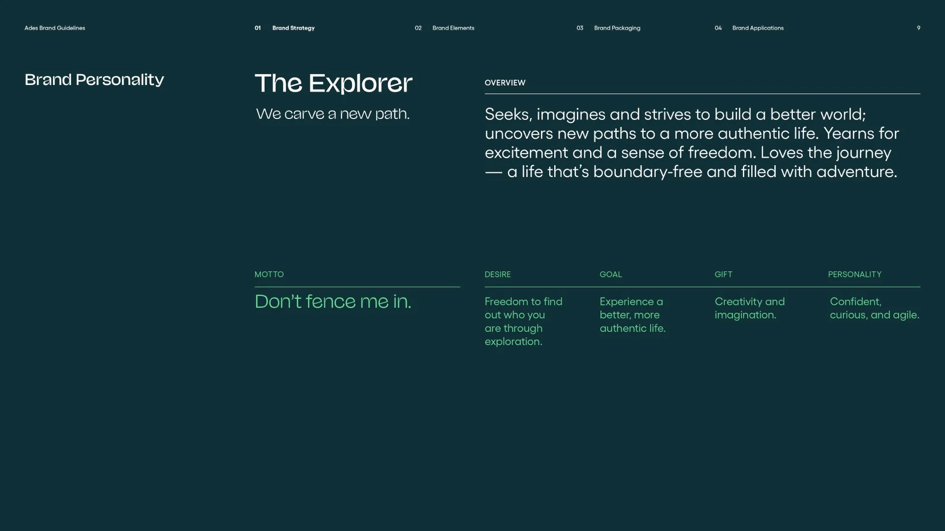
To champion the blends of all kind; in people, for planet, with product.
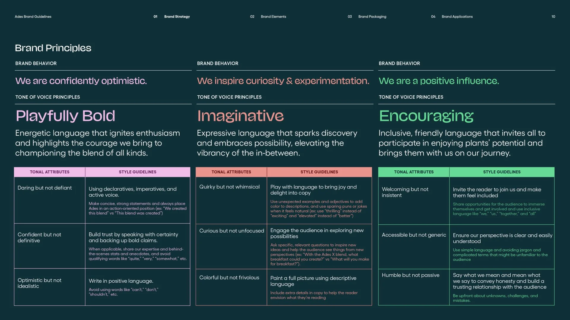
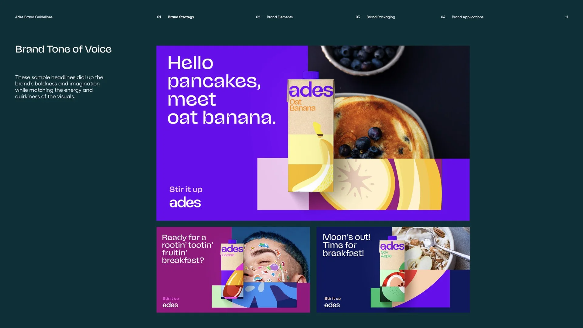
We created a system that encourages experimentation, refllecting Ades’ wide and varied portfolio of tastes, textures and flavors. Our visual language is full of color, boldness, and brightness; we are bringing a spirited, welcoming and flavorful approach to the plant-based world. With confidence and positivity, we are never afraid to stand out. From our packs to ads to social media, anywhere our brand shows up we aim to be truthful, collaborative and practice restraint – making the most important information clear, and bringing people in to join and contribute to the exploration and discovery.
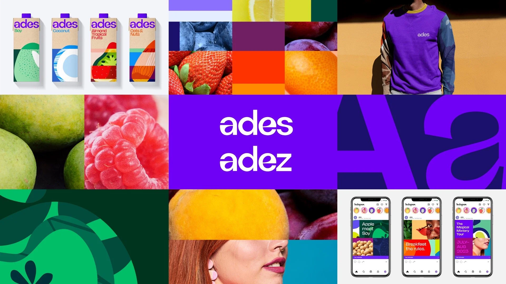
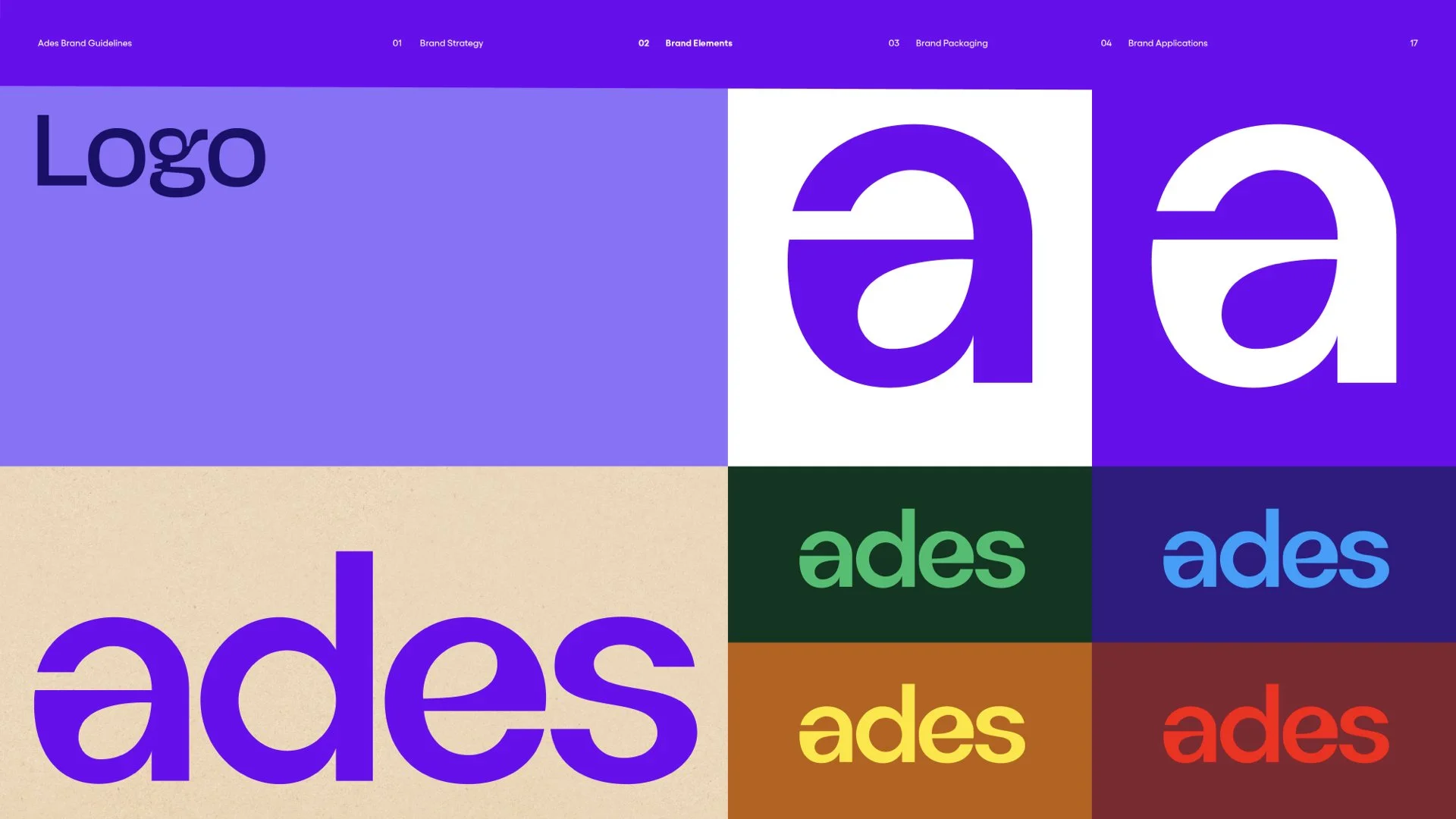
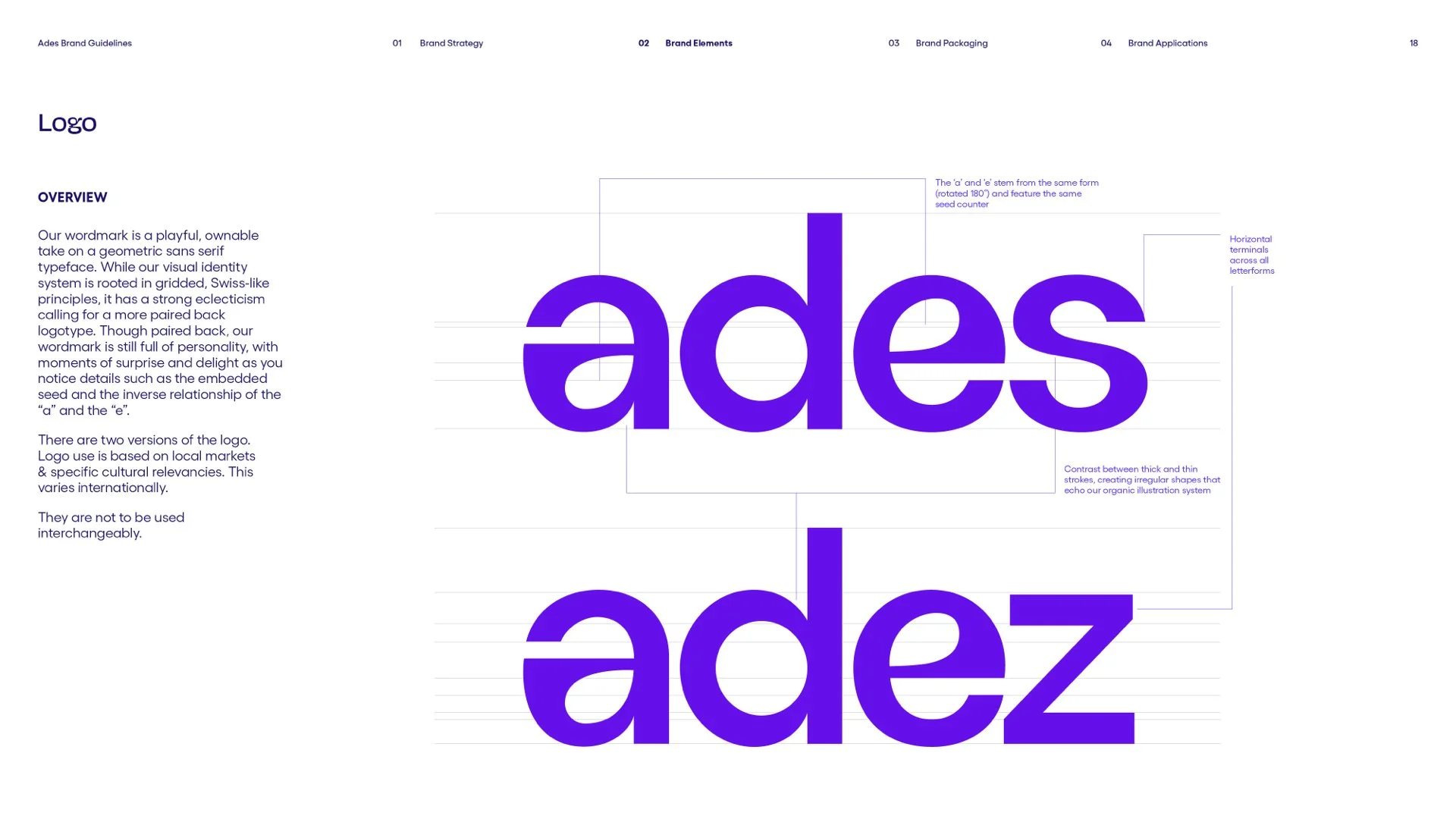
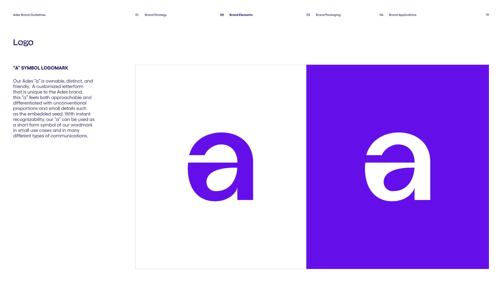
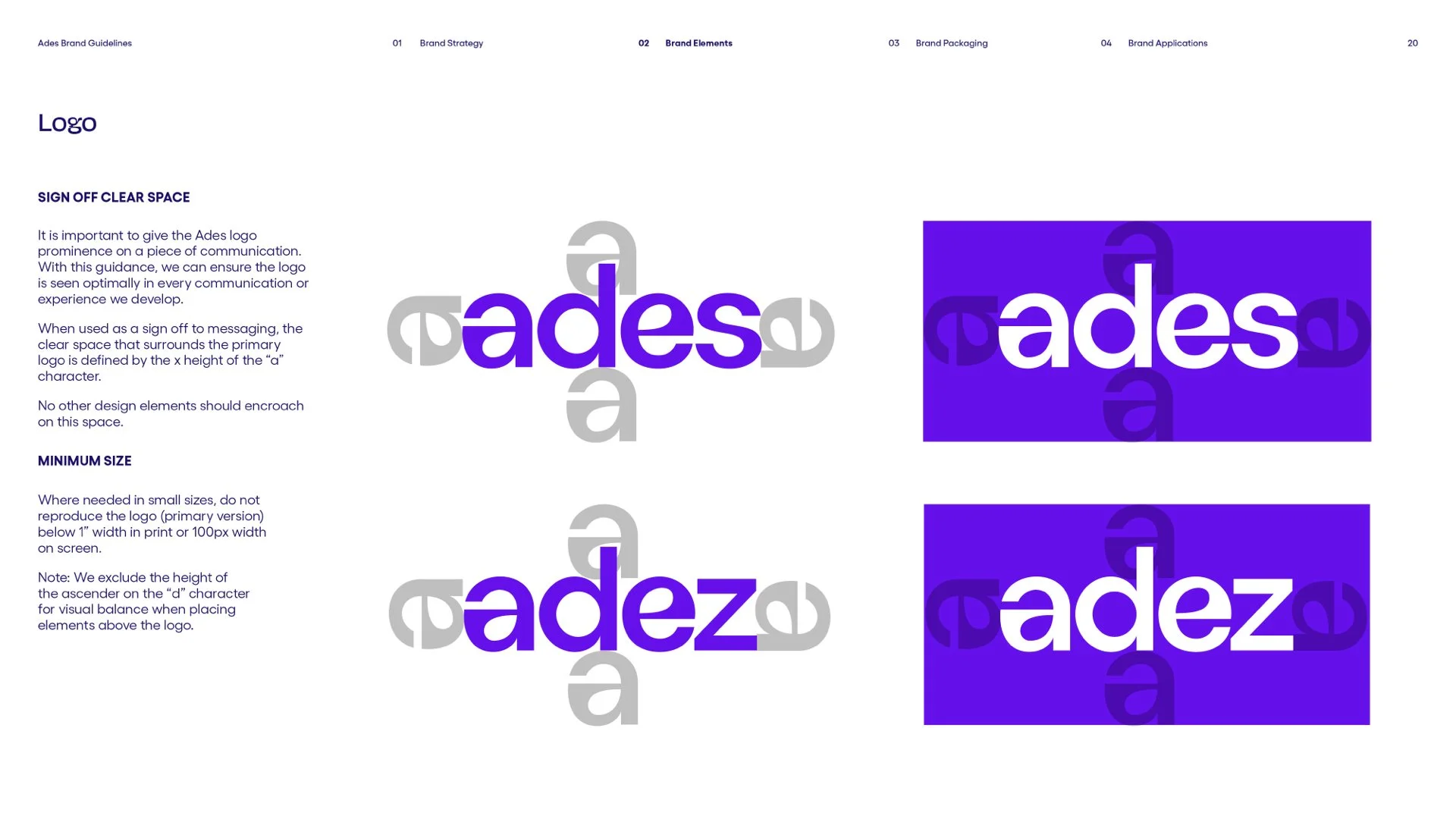
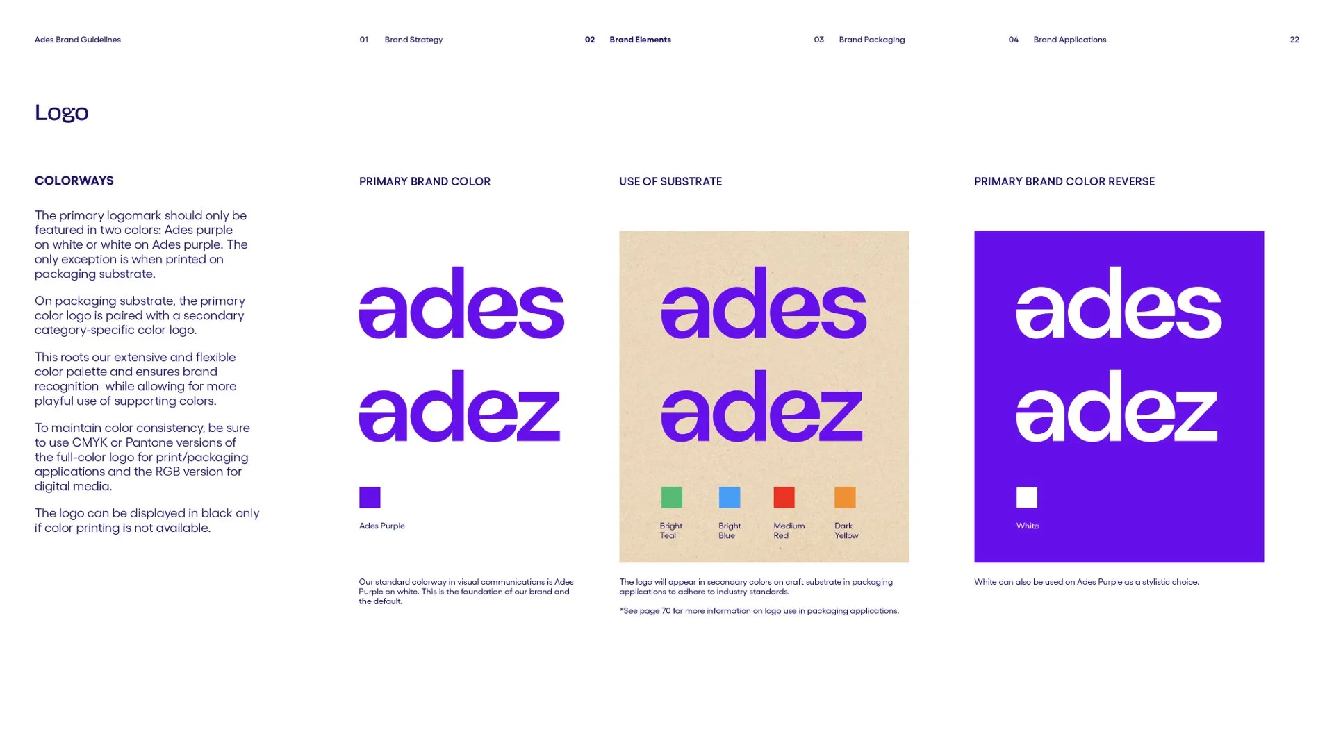
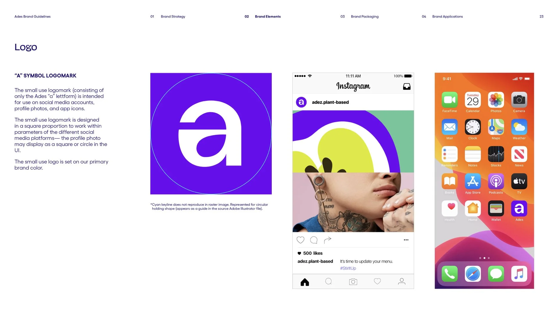
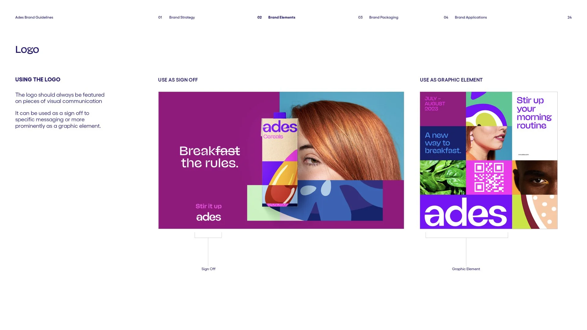
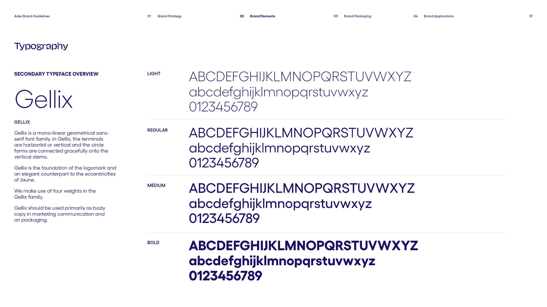
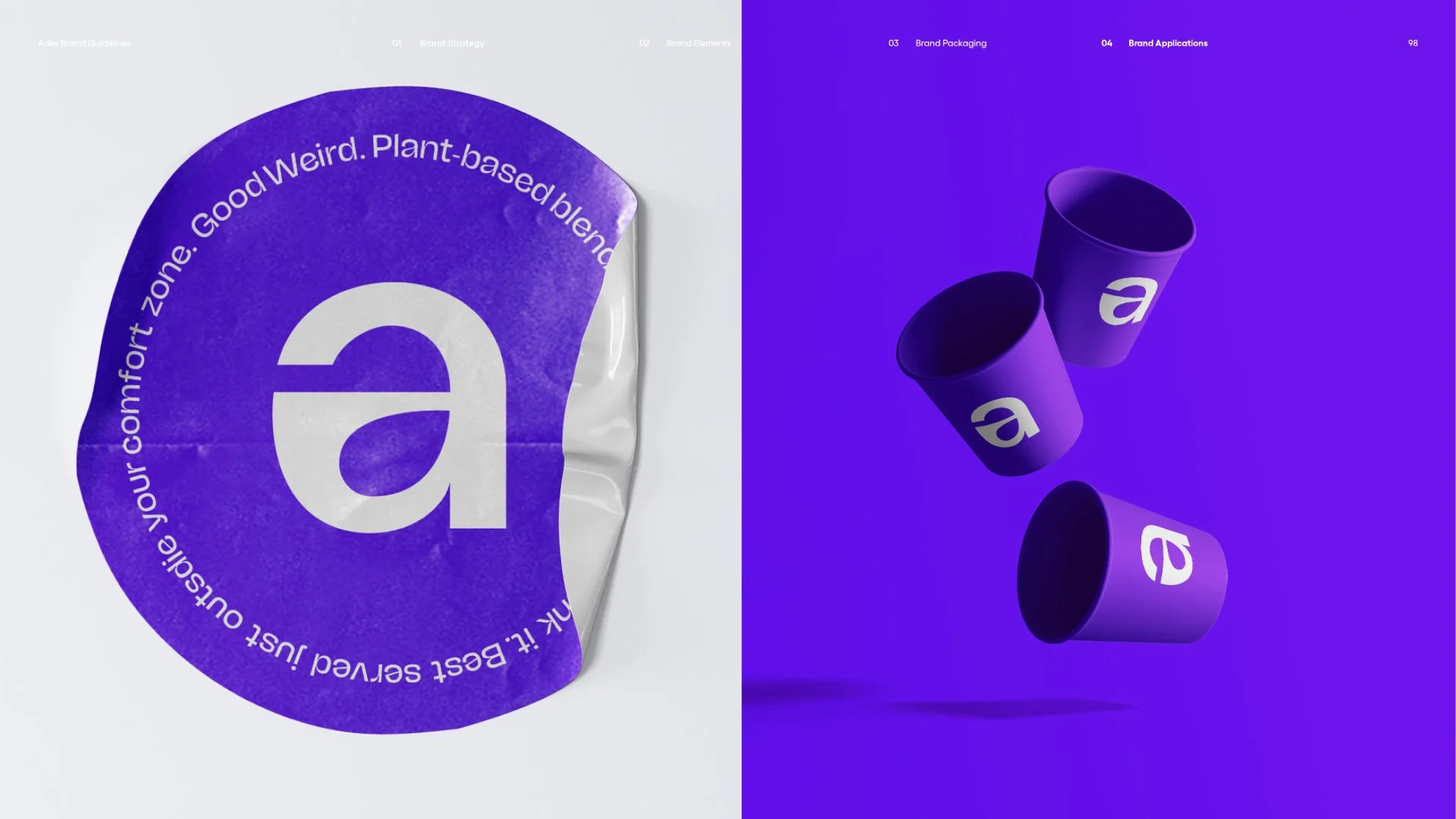
Our wordmark is a playful, ownable take on a geometric sans serif typeface. While our visual identity system is rooted in gridded, Swiss-like principles, it has a strong eclecticism calling for a more paired back logotype. Though paired back, our wordmark is still full of personality, with moments of surprise and delight as you notice details such as the embedded seed and the inverse relationship of the “a” and the “e”. There are two versions of the logo. Logo use is based on local markets & specific cultural relevancies. This varies internationally.
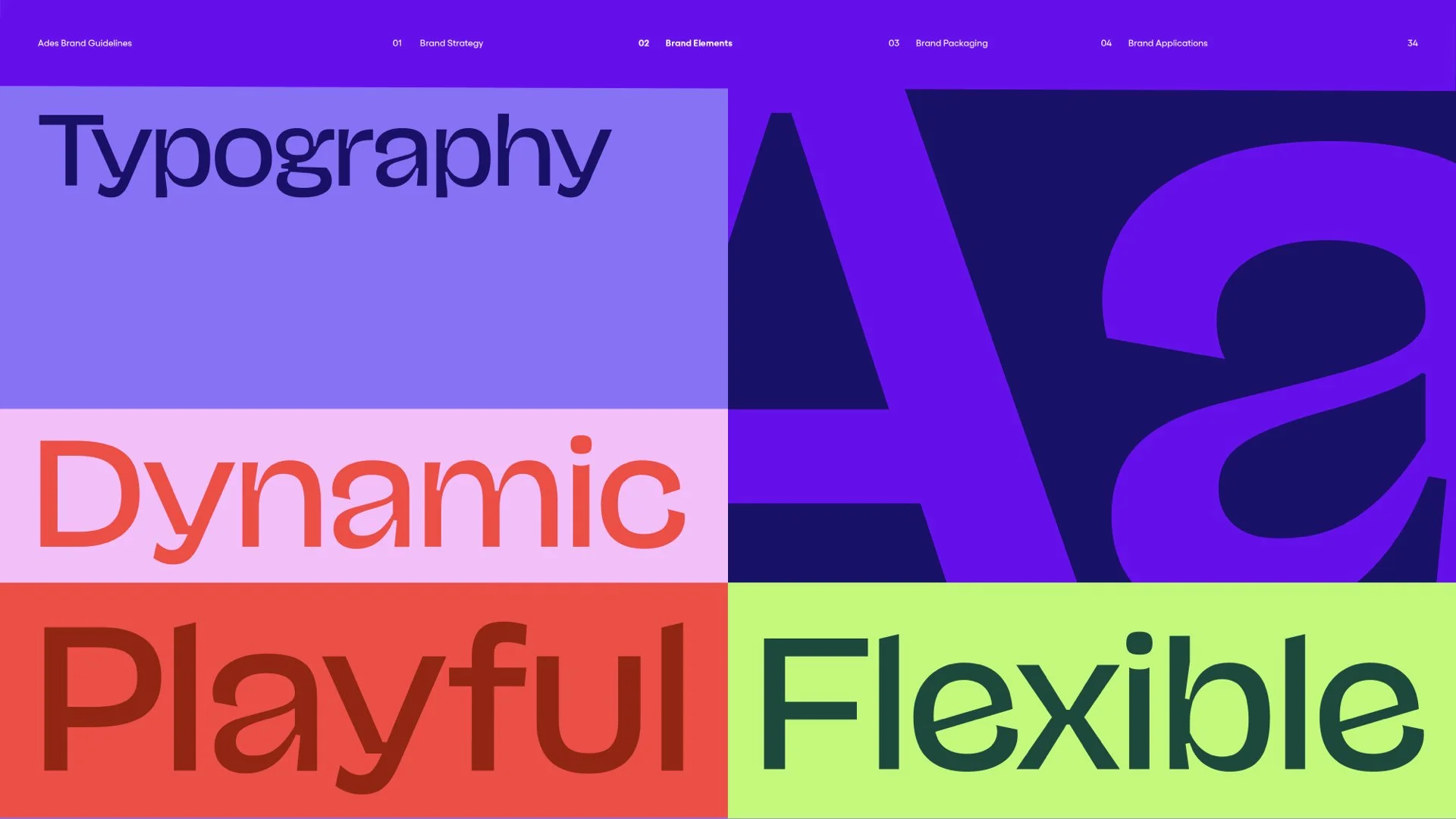
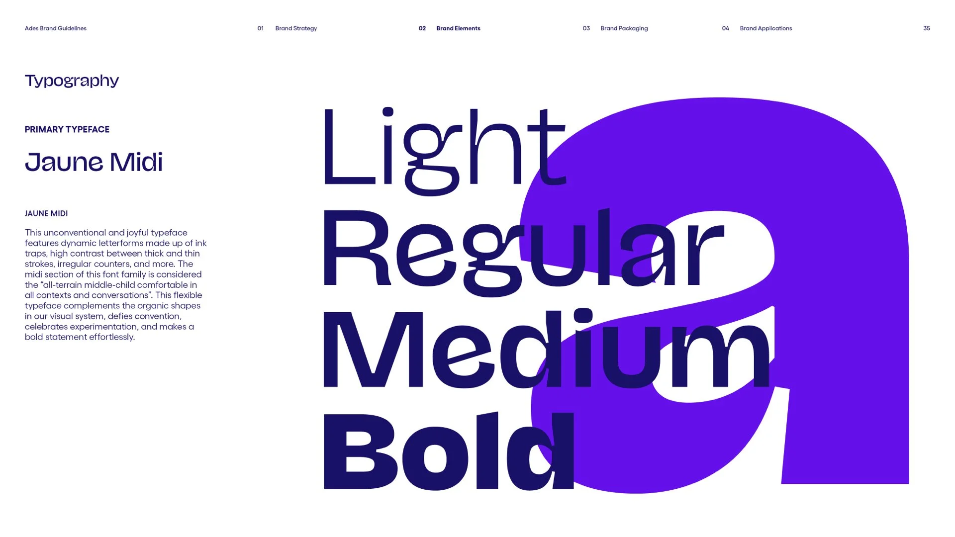
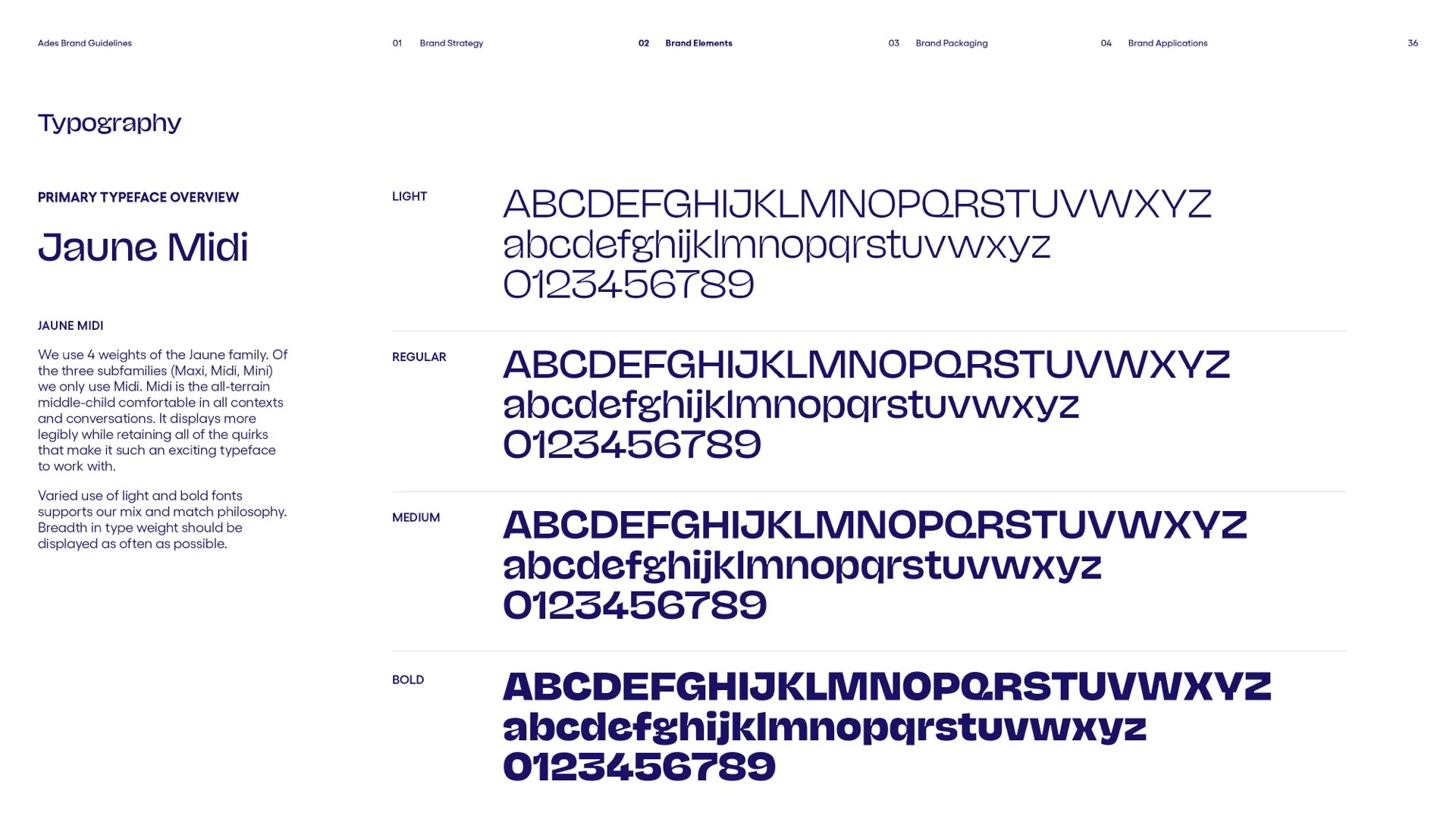
Our brand’s joyful typeface features dynamic letterforms–made up of ink traps, high contrast between thick and thin strokes, and irregular counters. It compliments the organic shapes in our visual system, defies convention, celebrates experimentation, and makes a bold statement effortlessly.
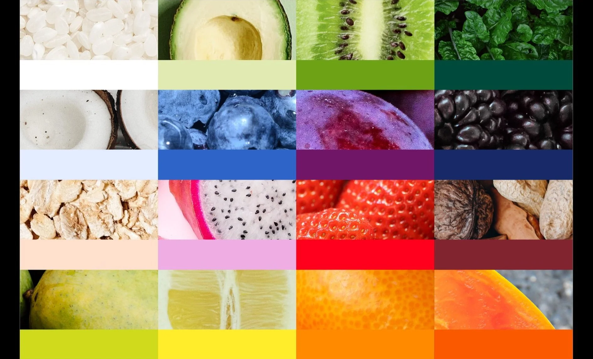
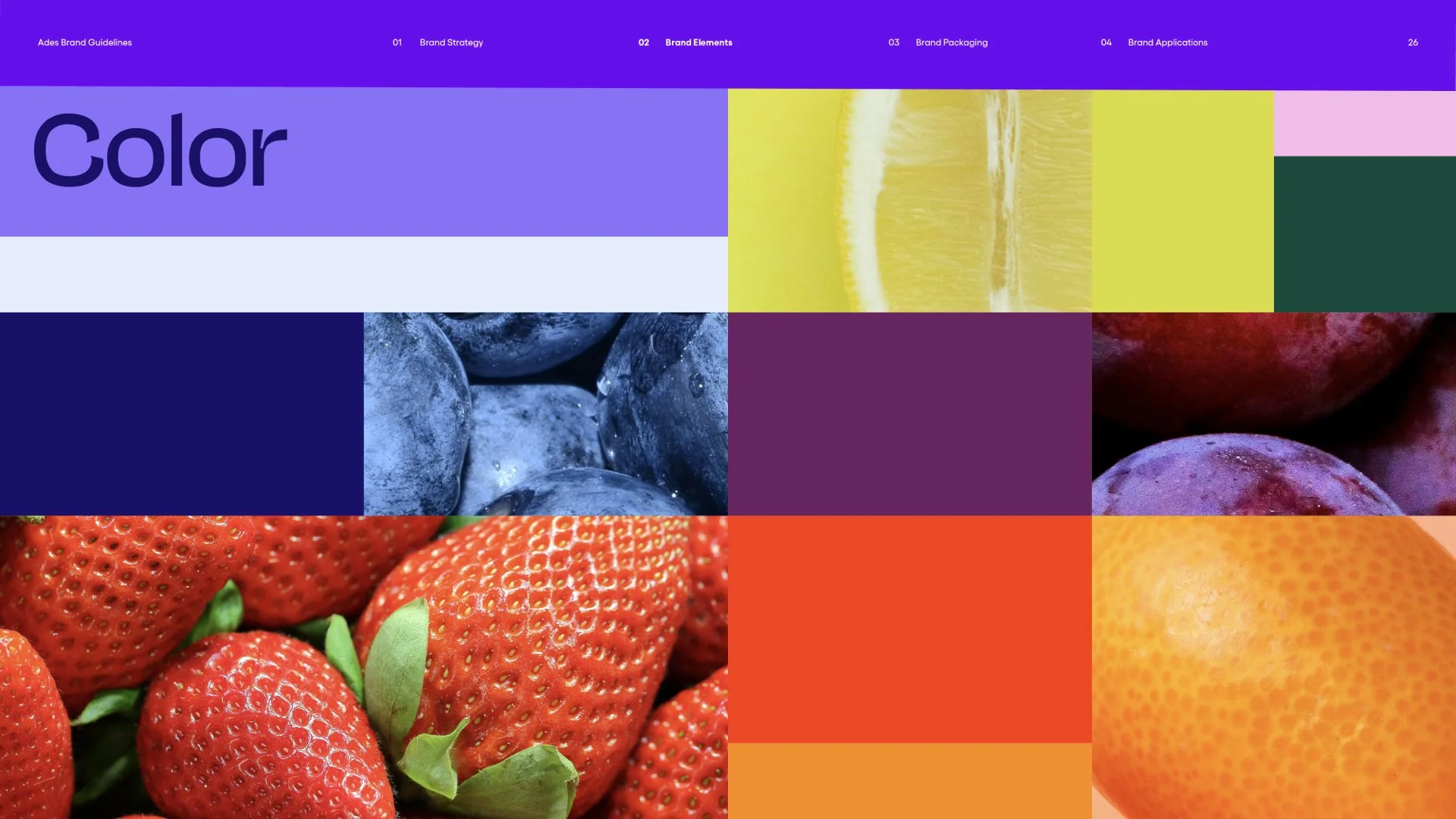
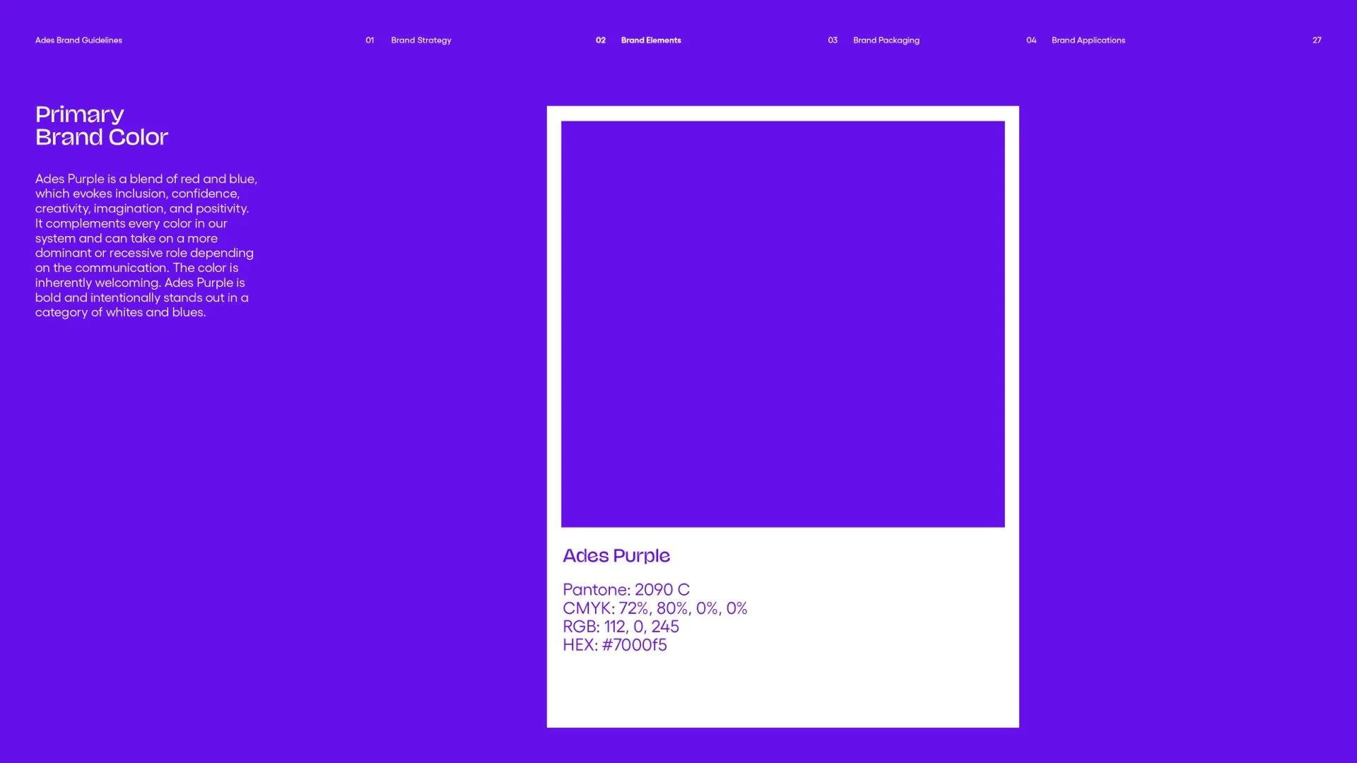
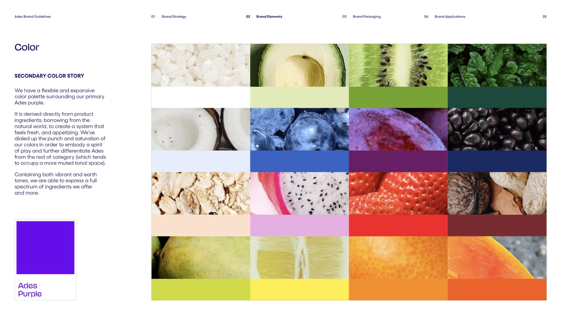
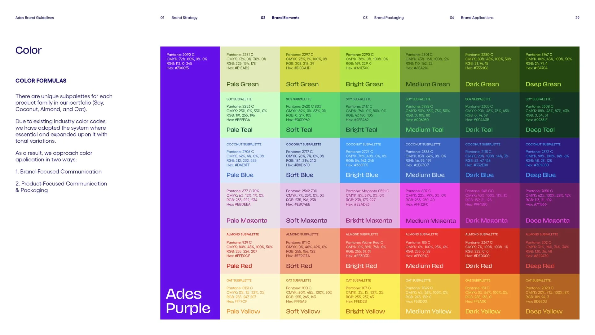
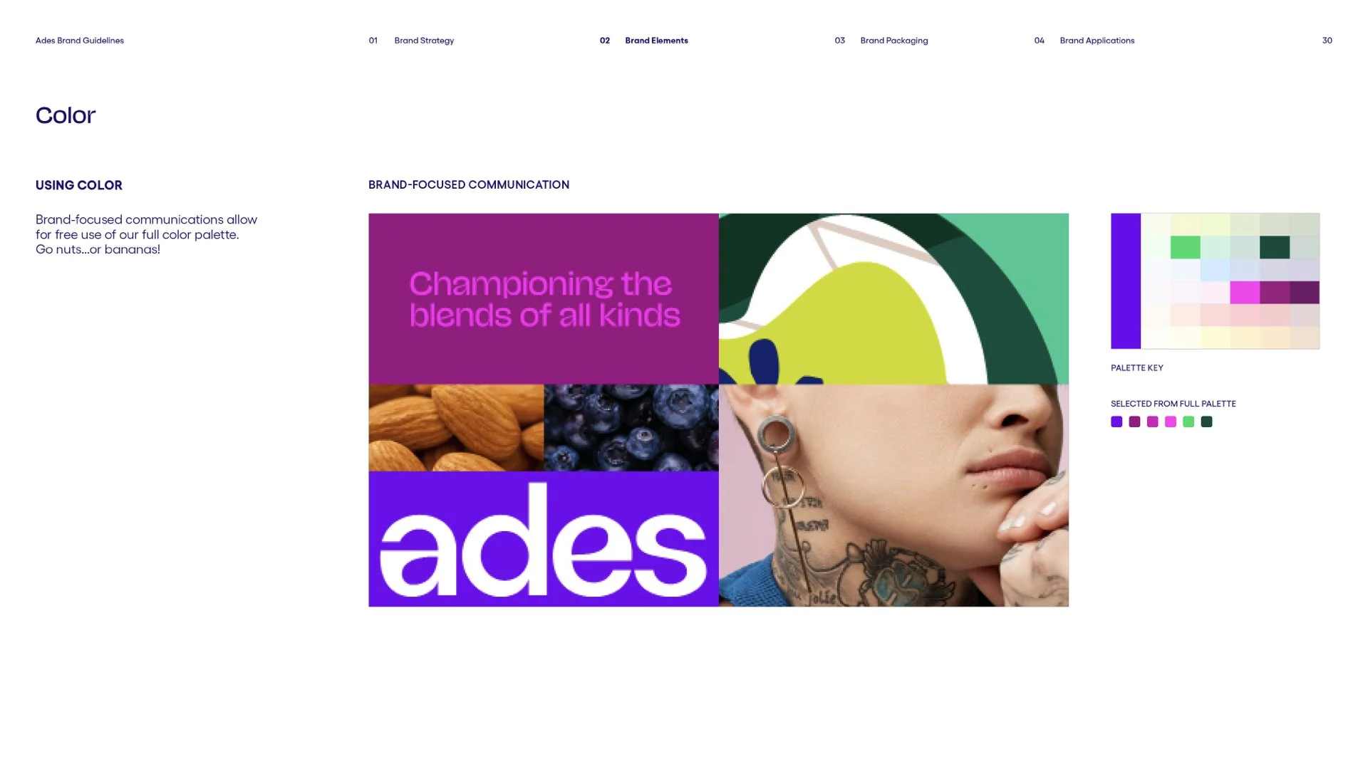
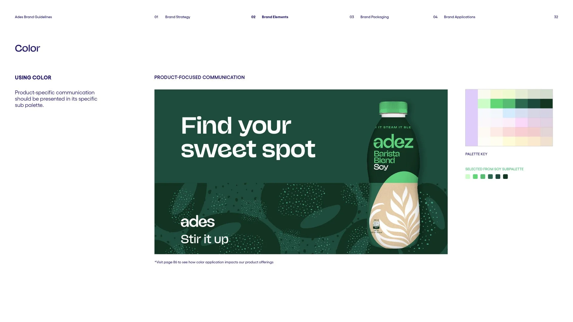
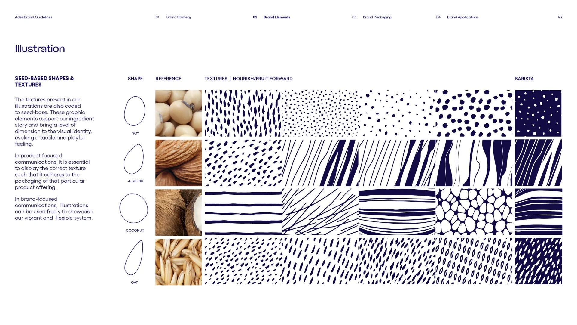
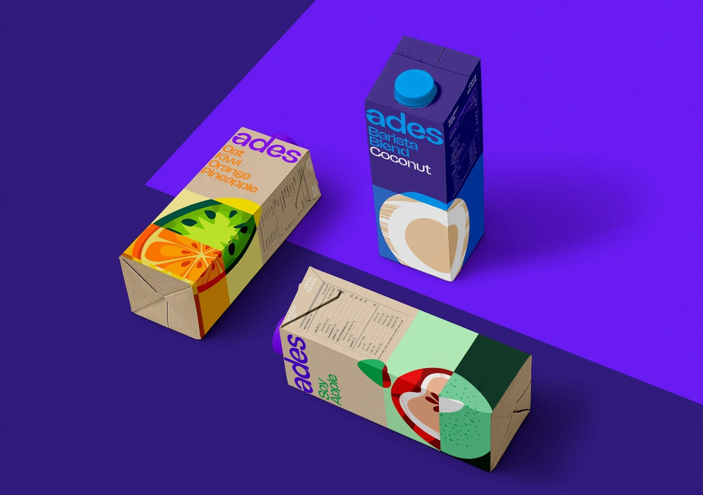
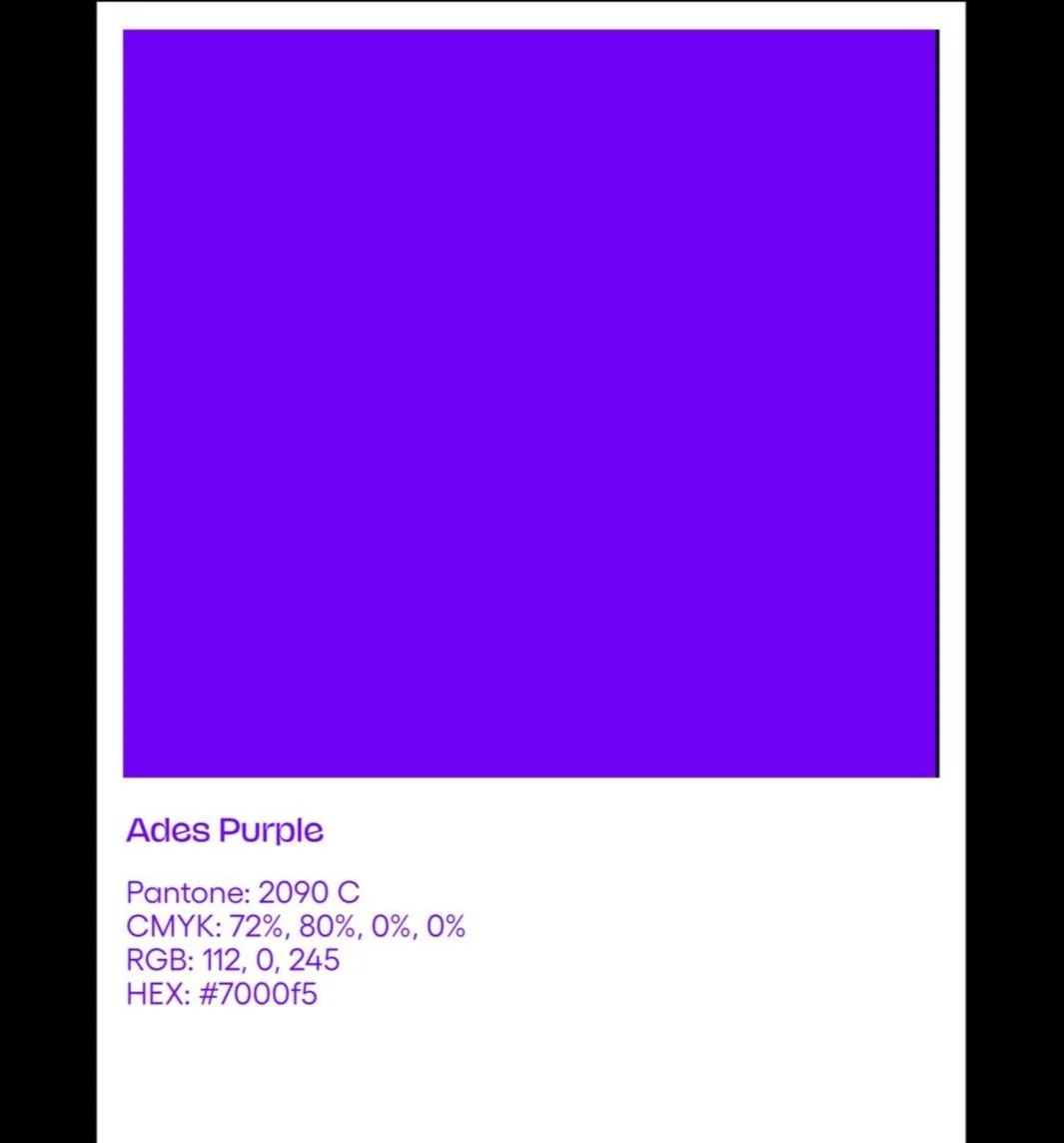
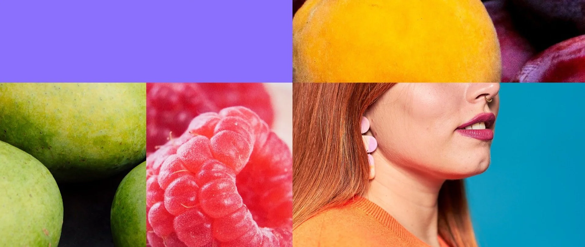
Our color palette is derived directly from product ingredients; borrowing from the natural world, to create a system that feels fresh and appetizing. We’ve dialed up the punch and saturation of our colors in order to further differentiate Ades.
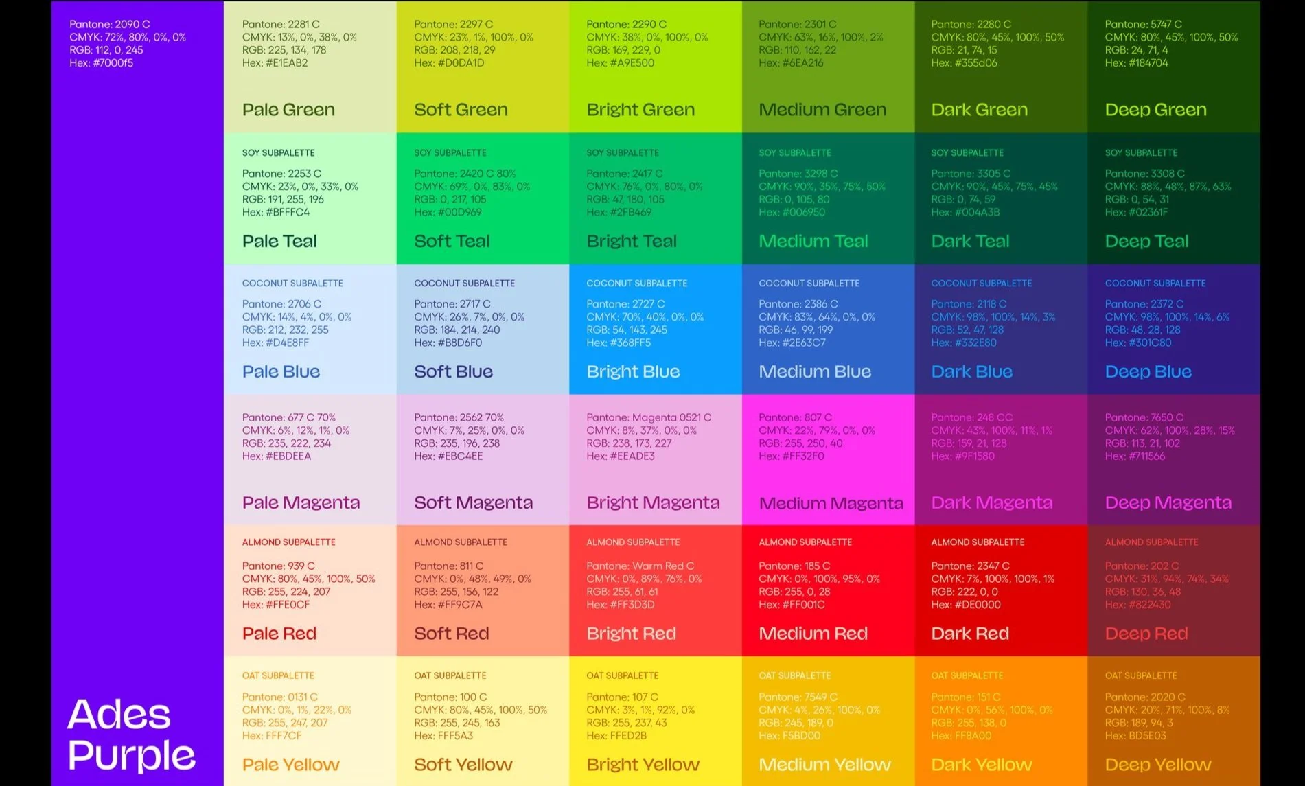
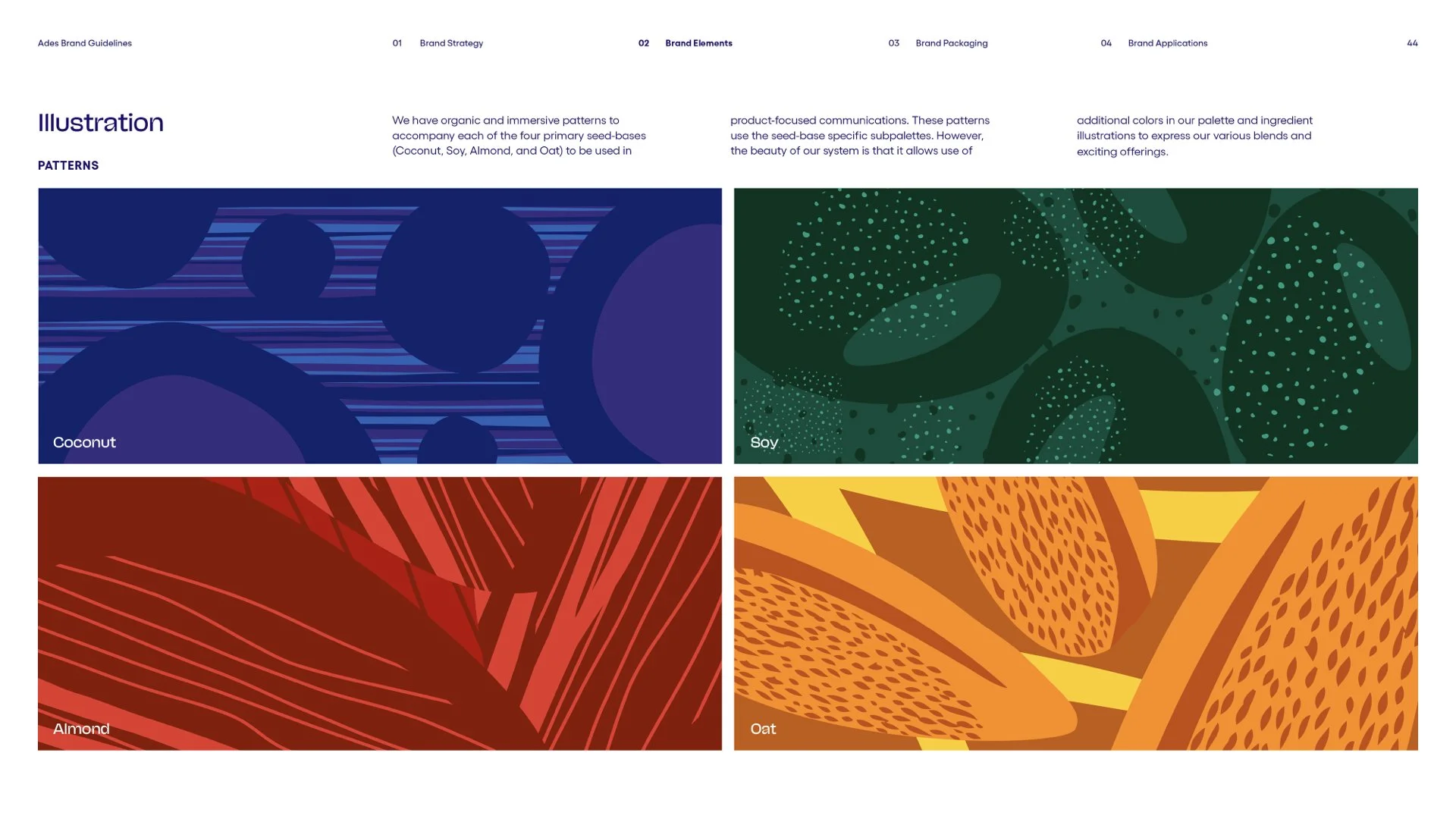
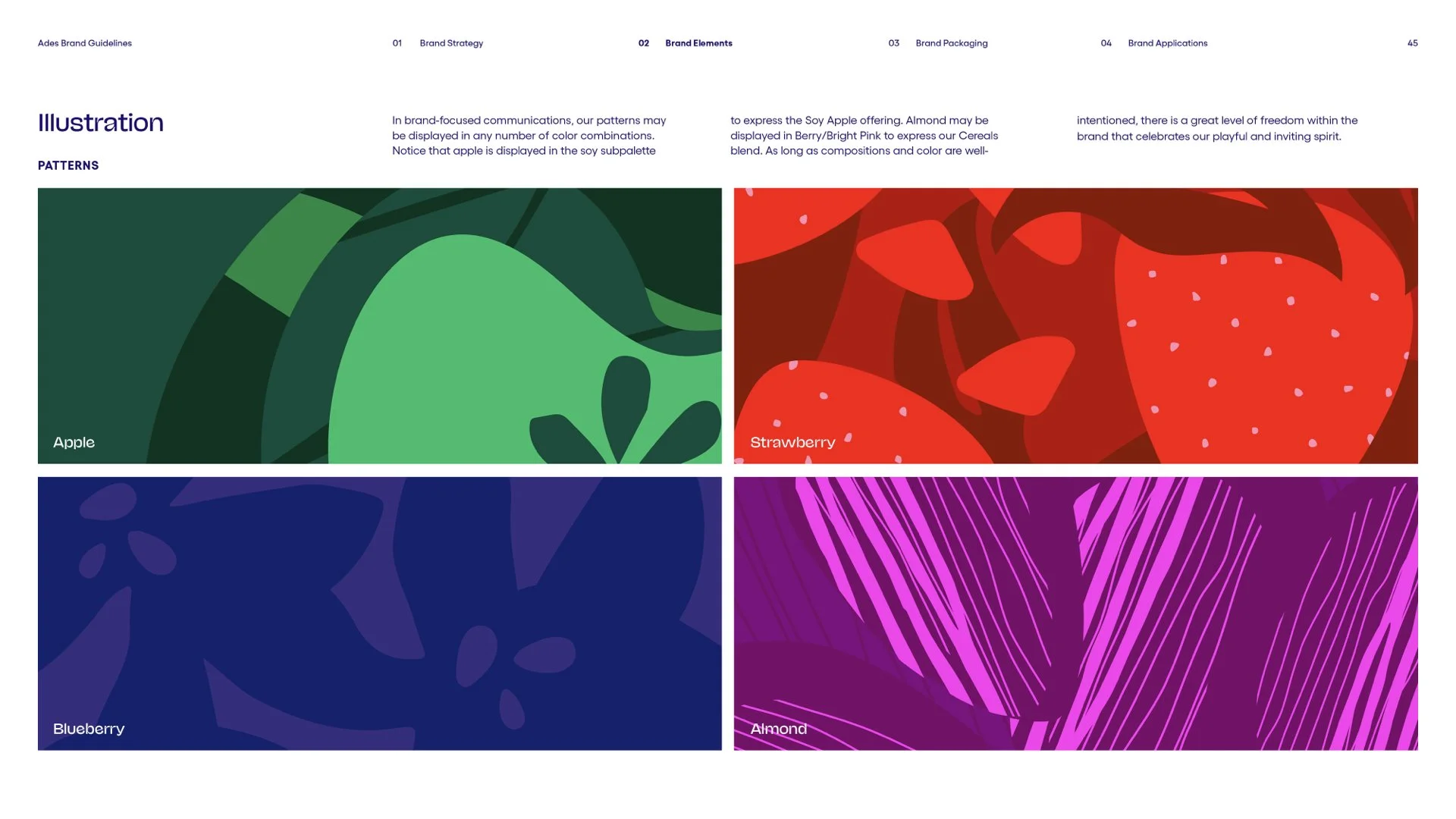
There are unique subpalettes for each product family in our portfolio (Soy, Coconut, Almond, and Oat). Due to existing industry color codes, we have adopted the system where essential and expanded upon it with tonal variations.
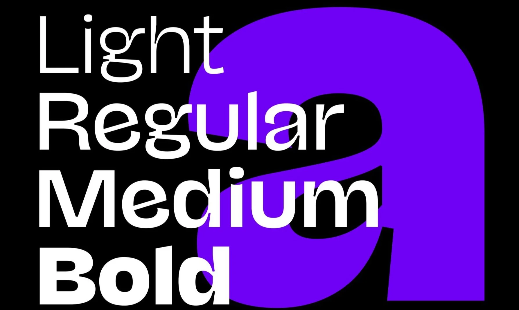
Our brand’s joyful typeface features dynamic letterforms–made up of ink traps, high contrast between thick and thin strokes, and irregular counters. It compliments the organic shapes in our visual system, defies convention, celebrates experimentation, and makes a bold statement effortlessly.
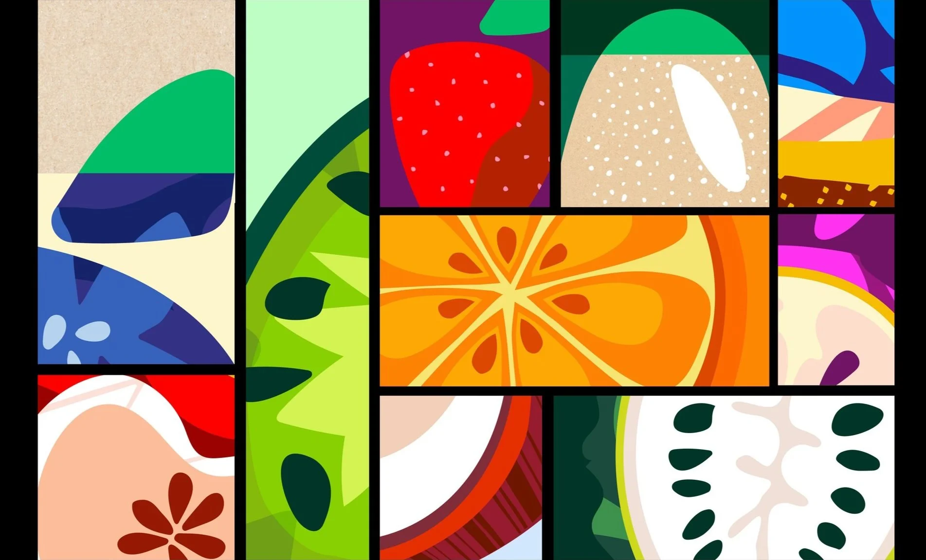
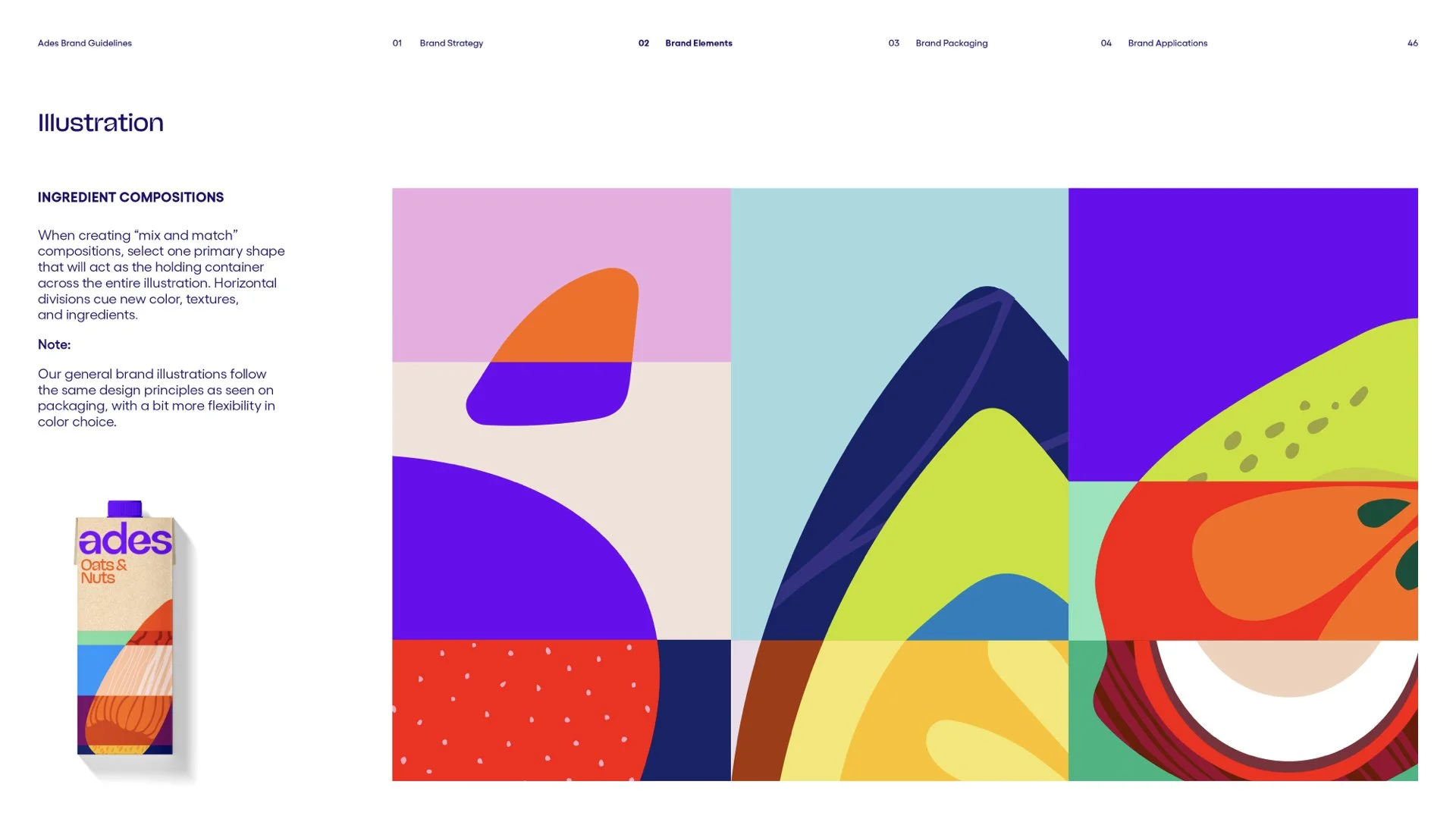
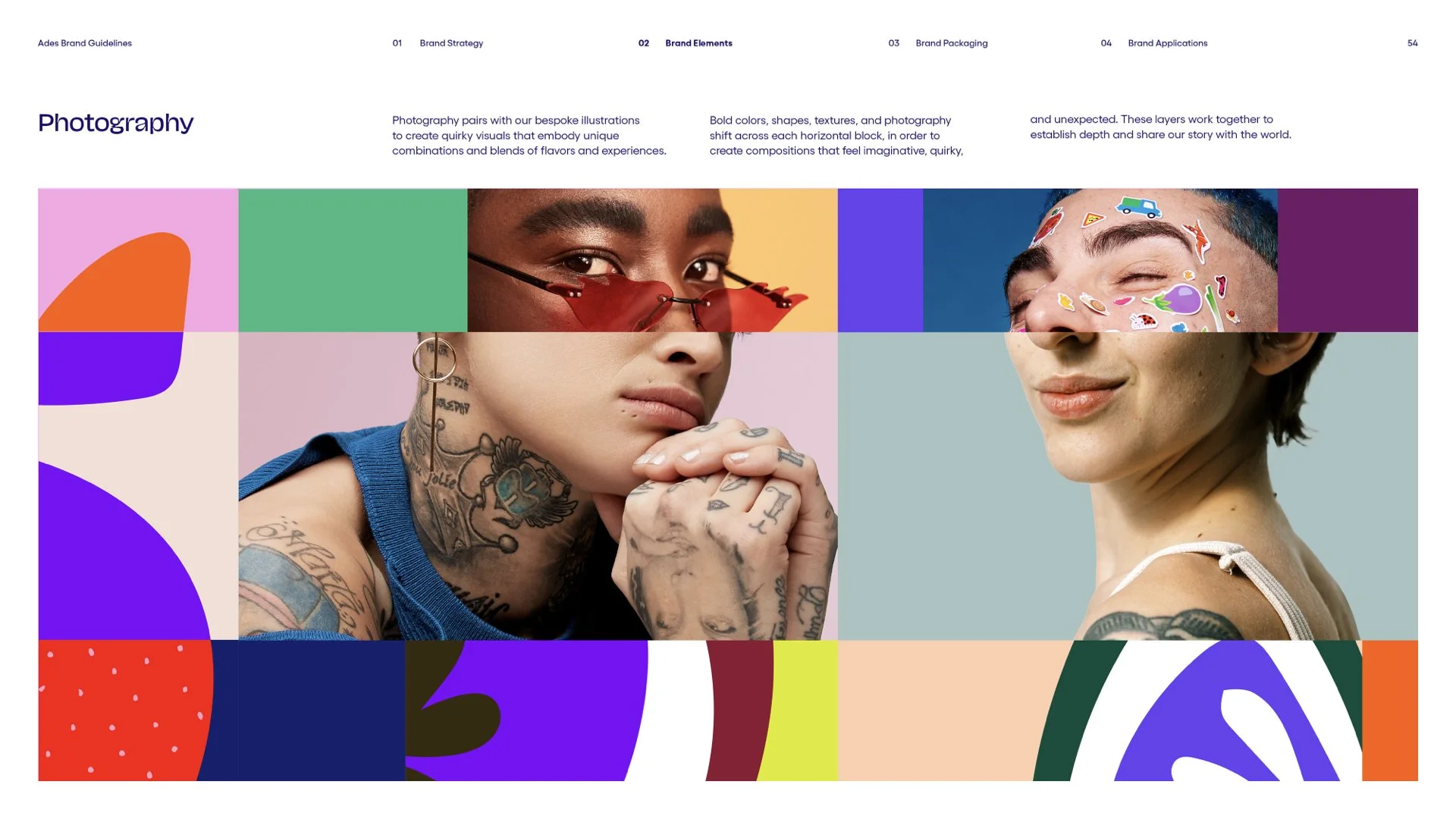
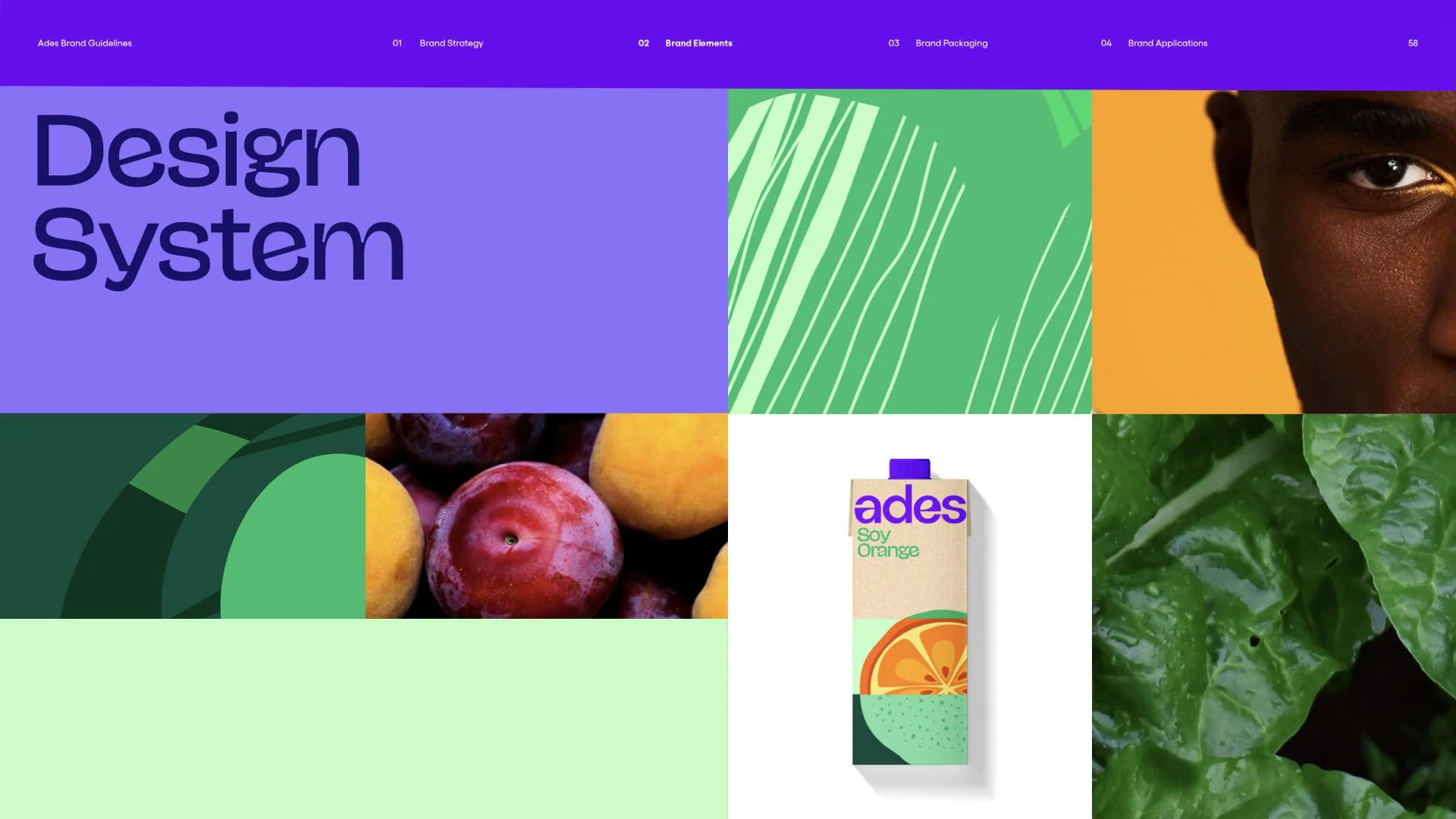
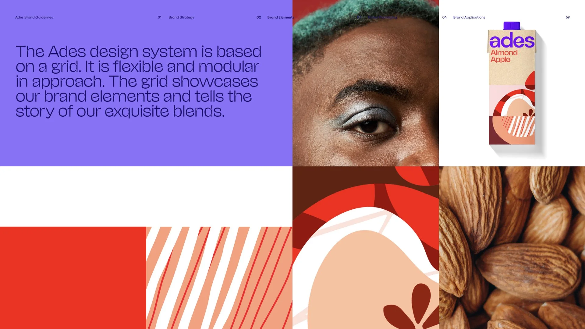
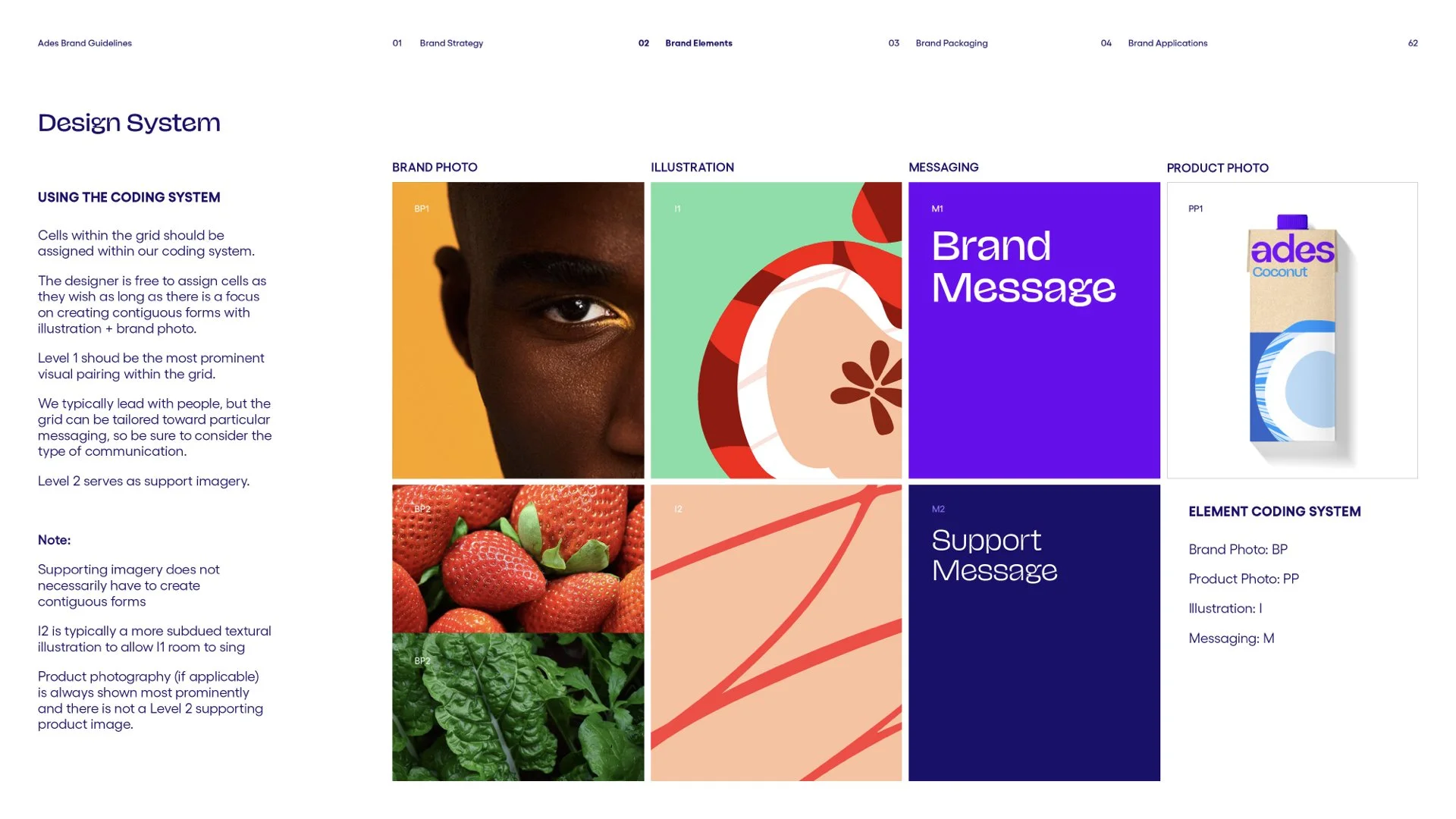
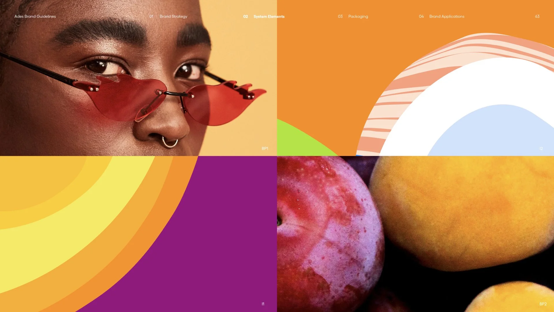
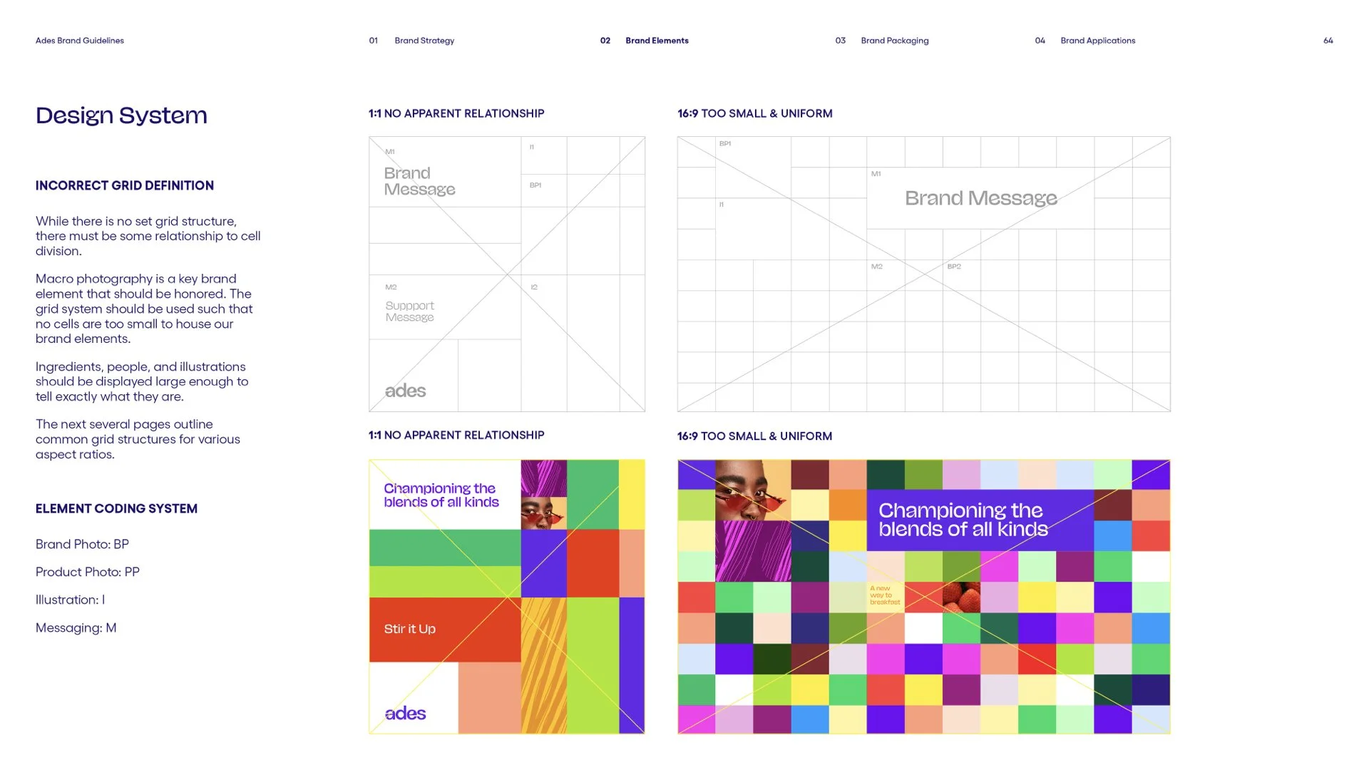
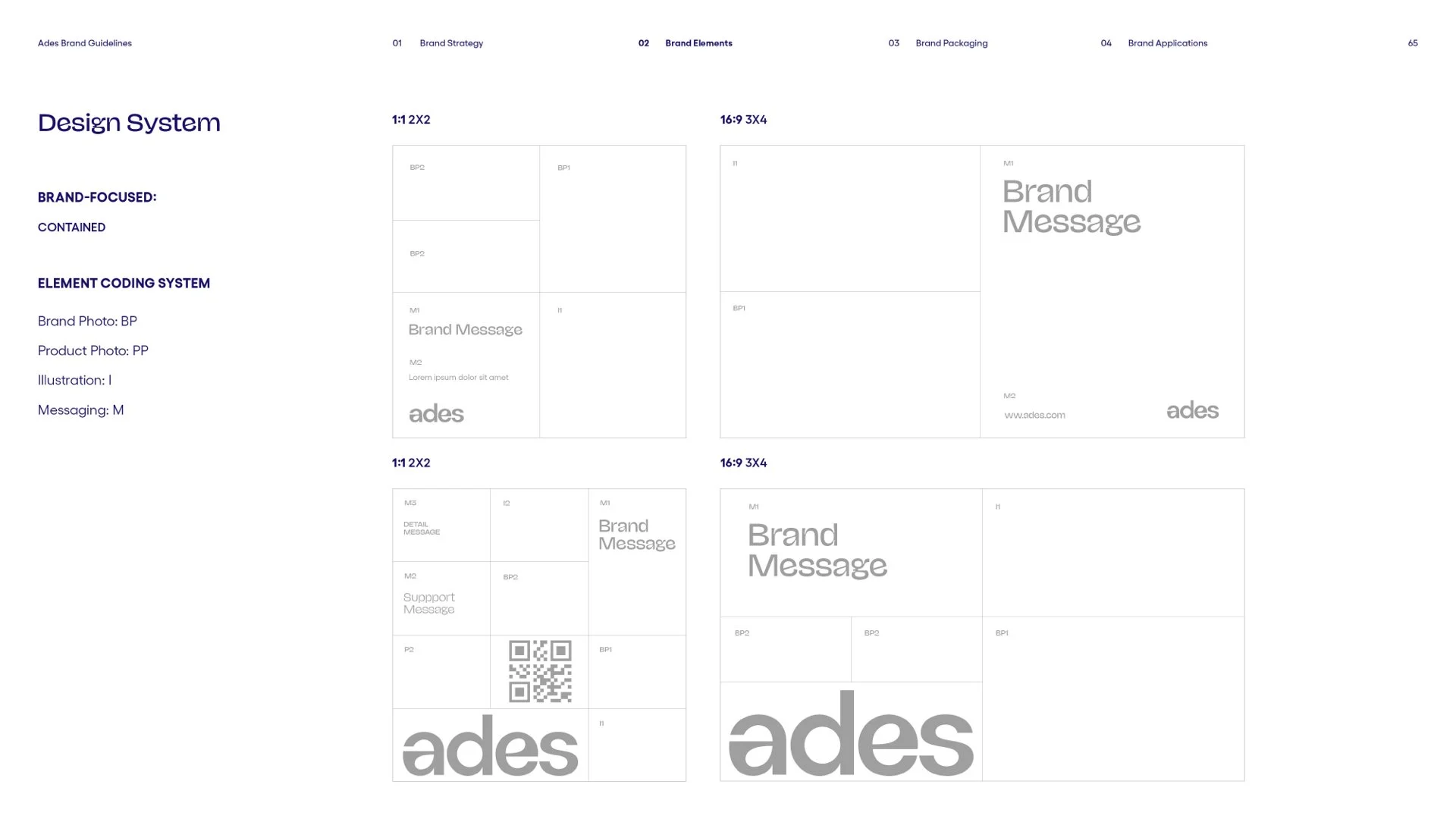
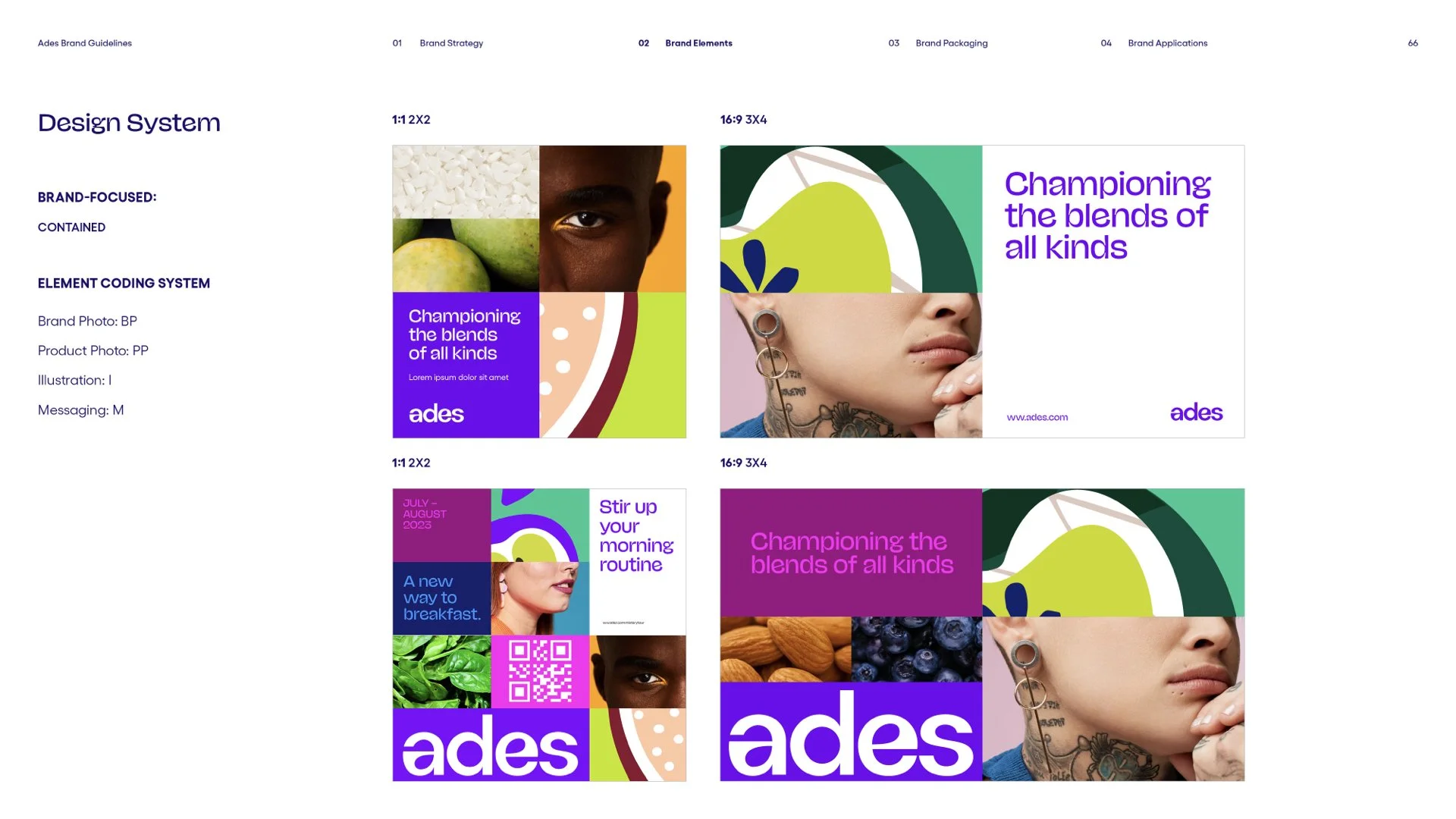
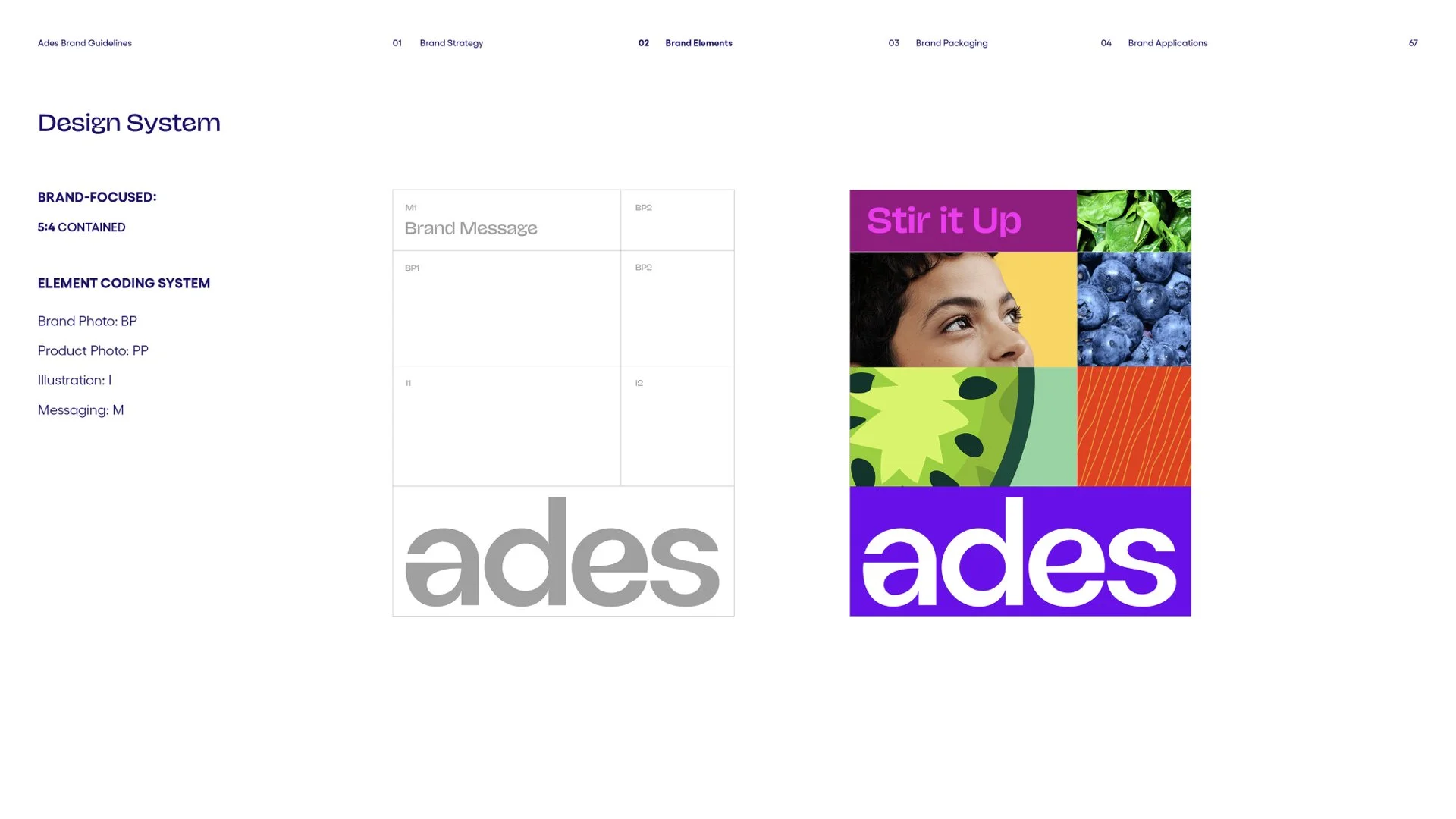
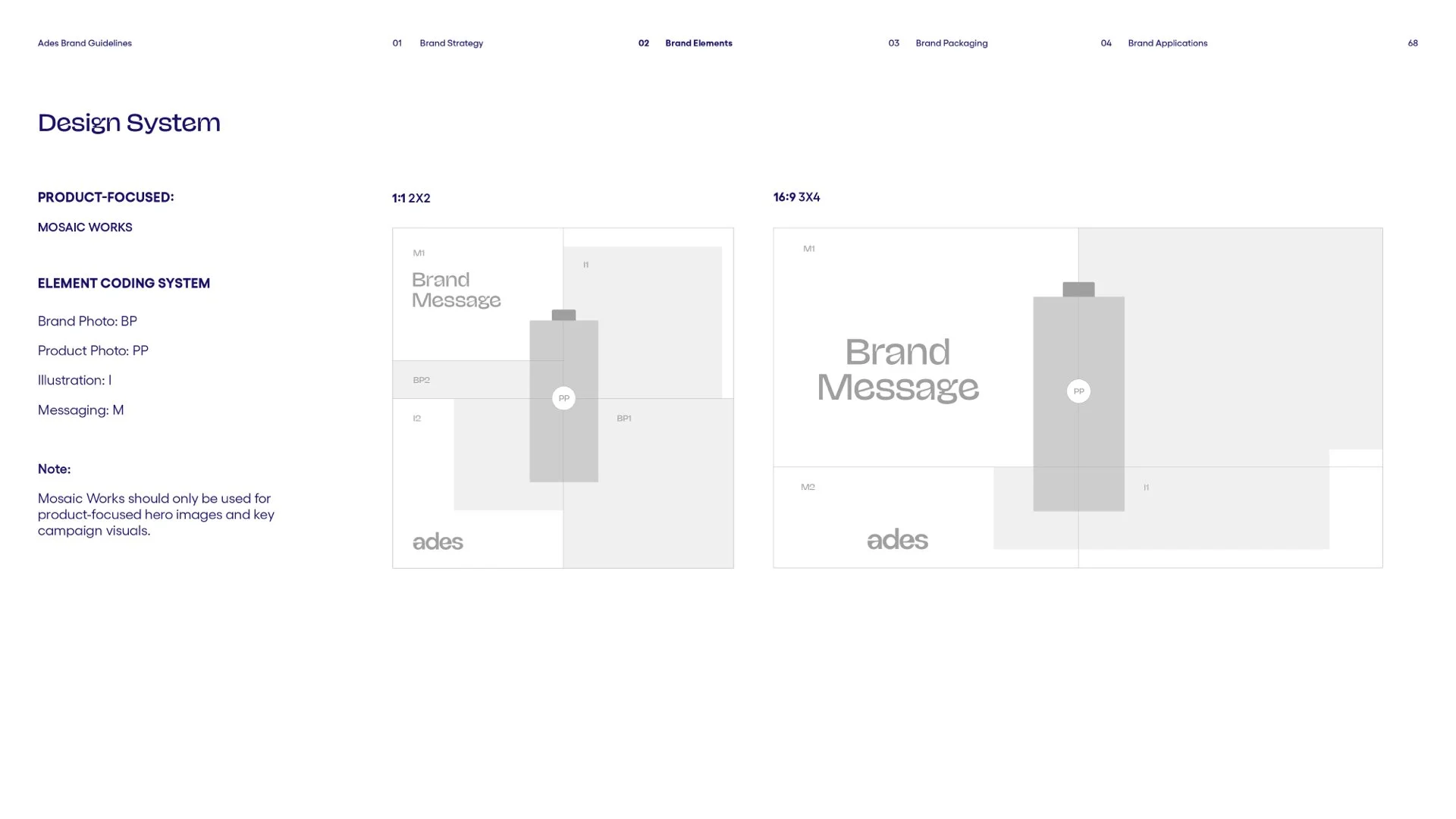
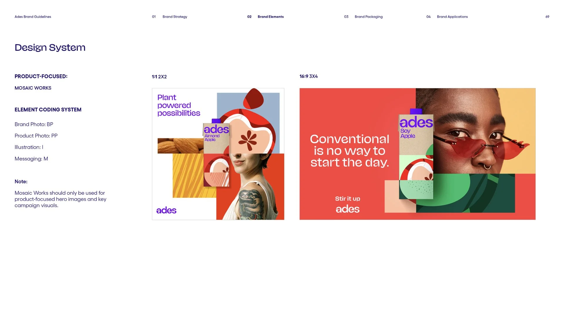
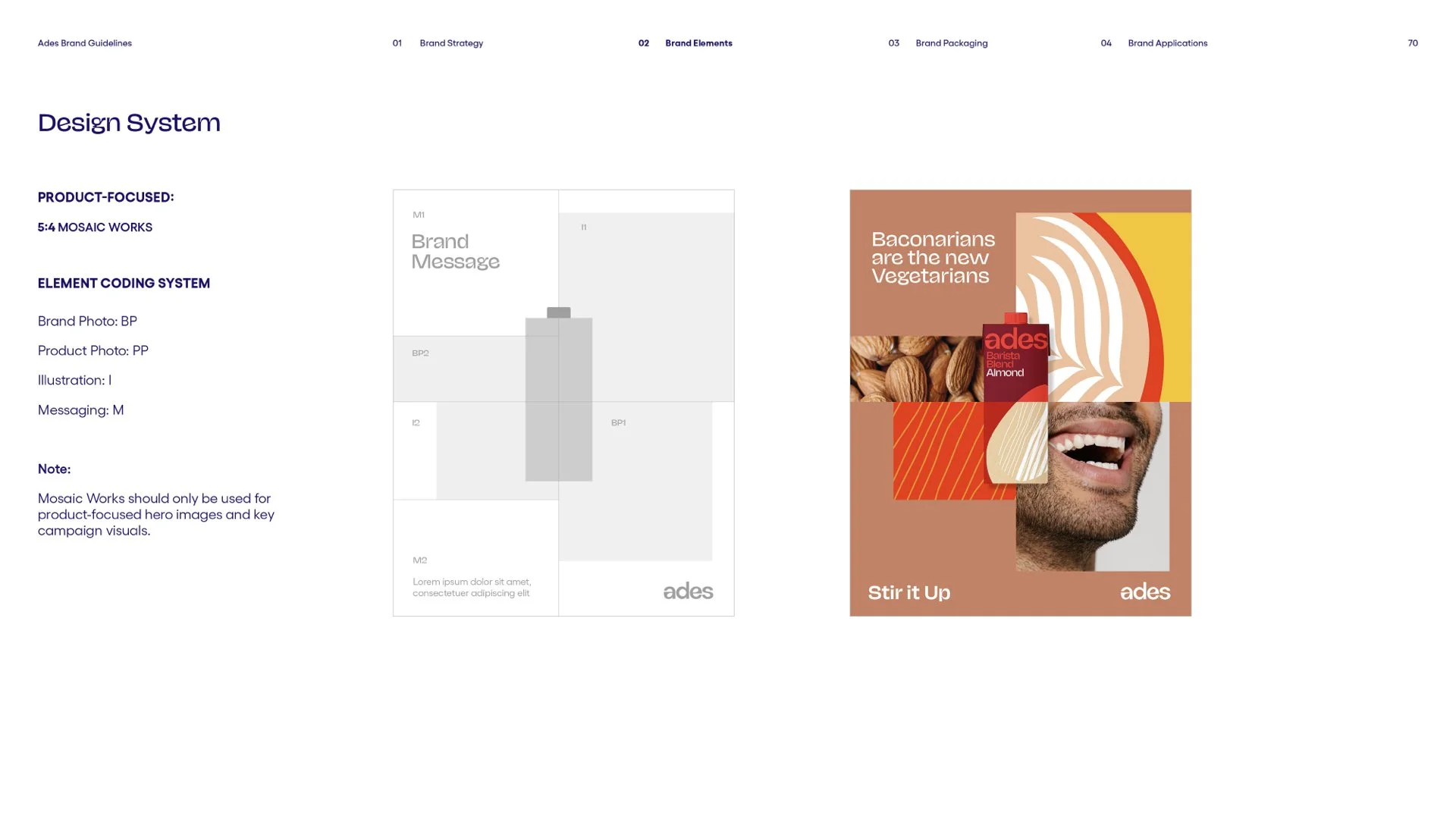
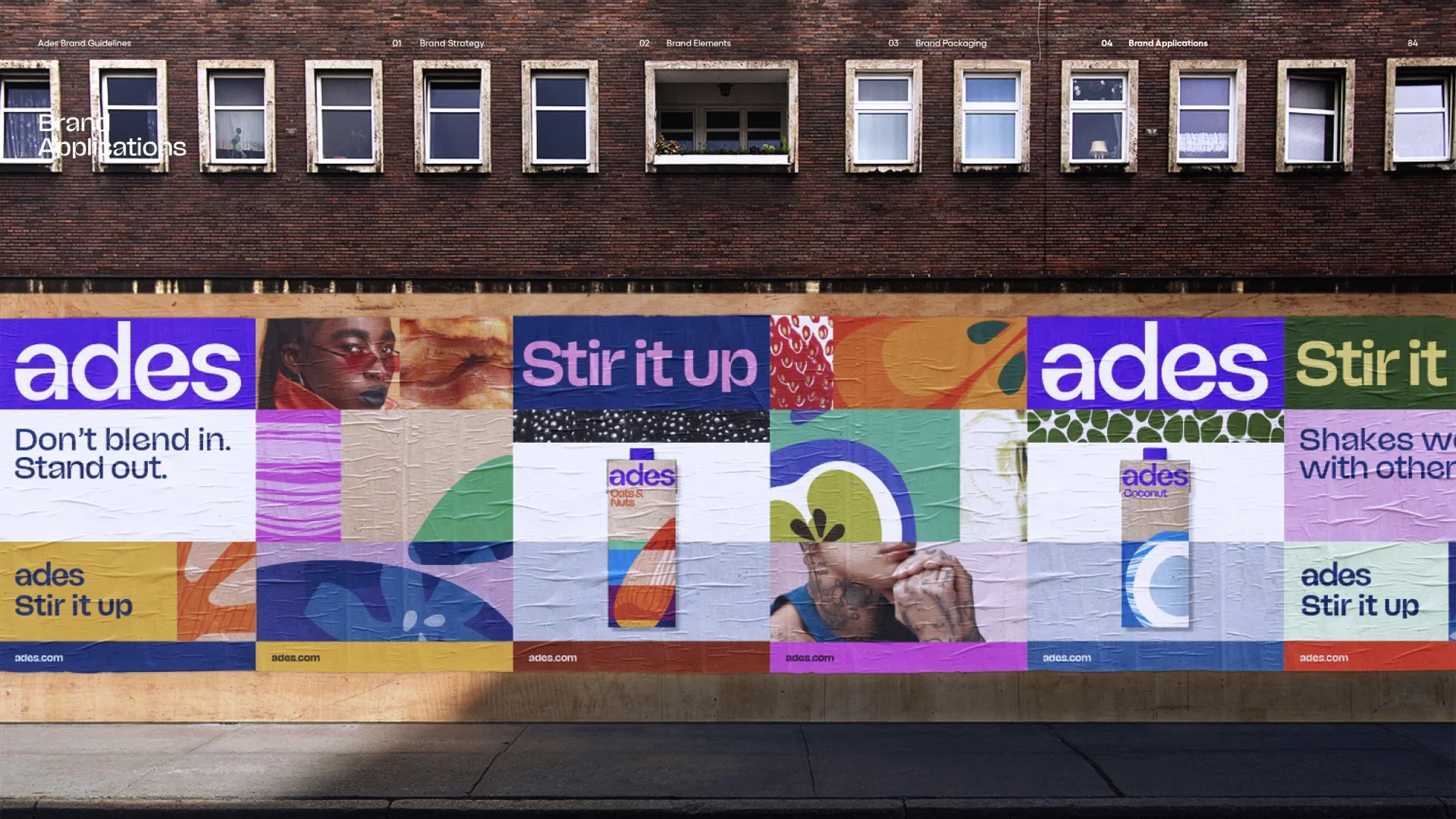
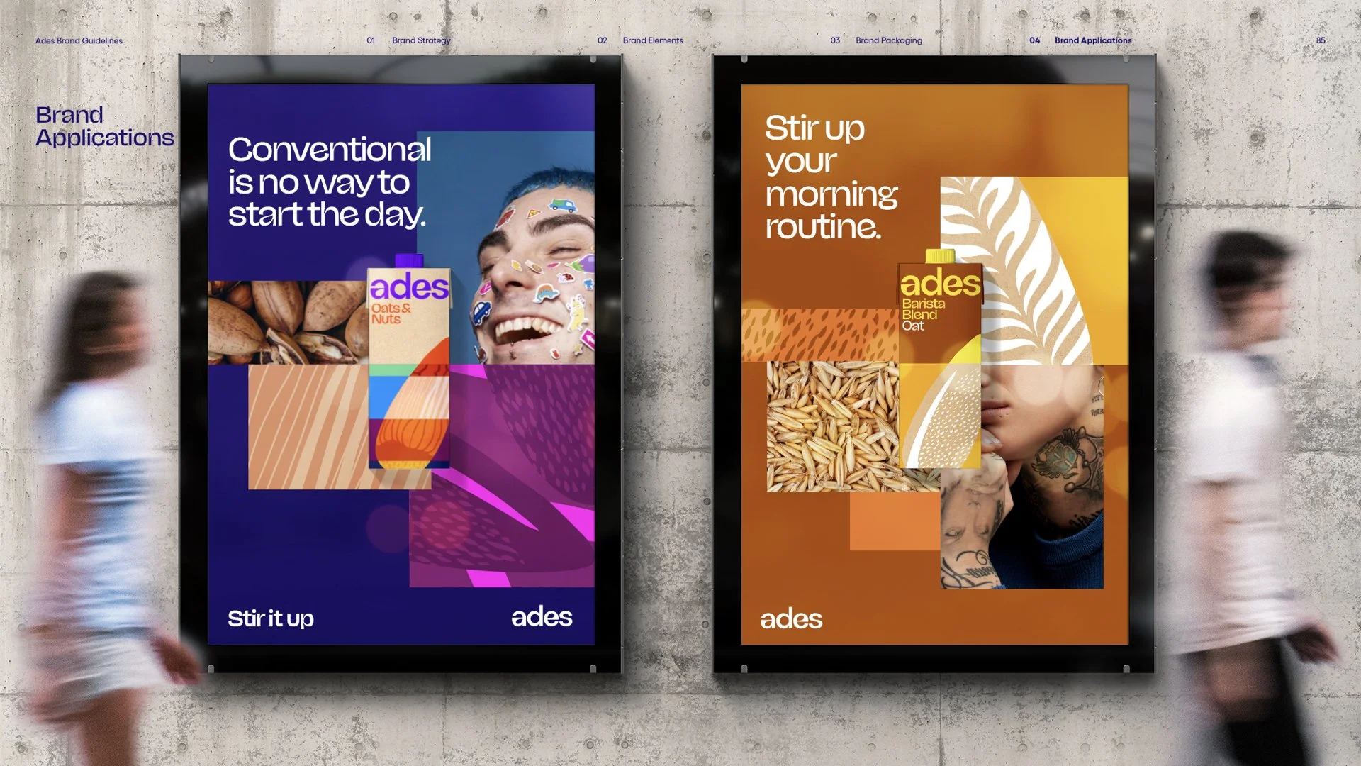
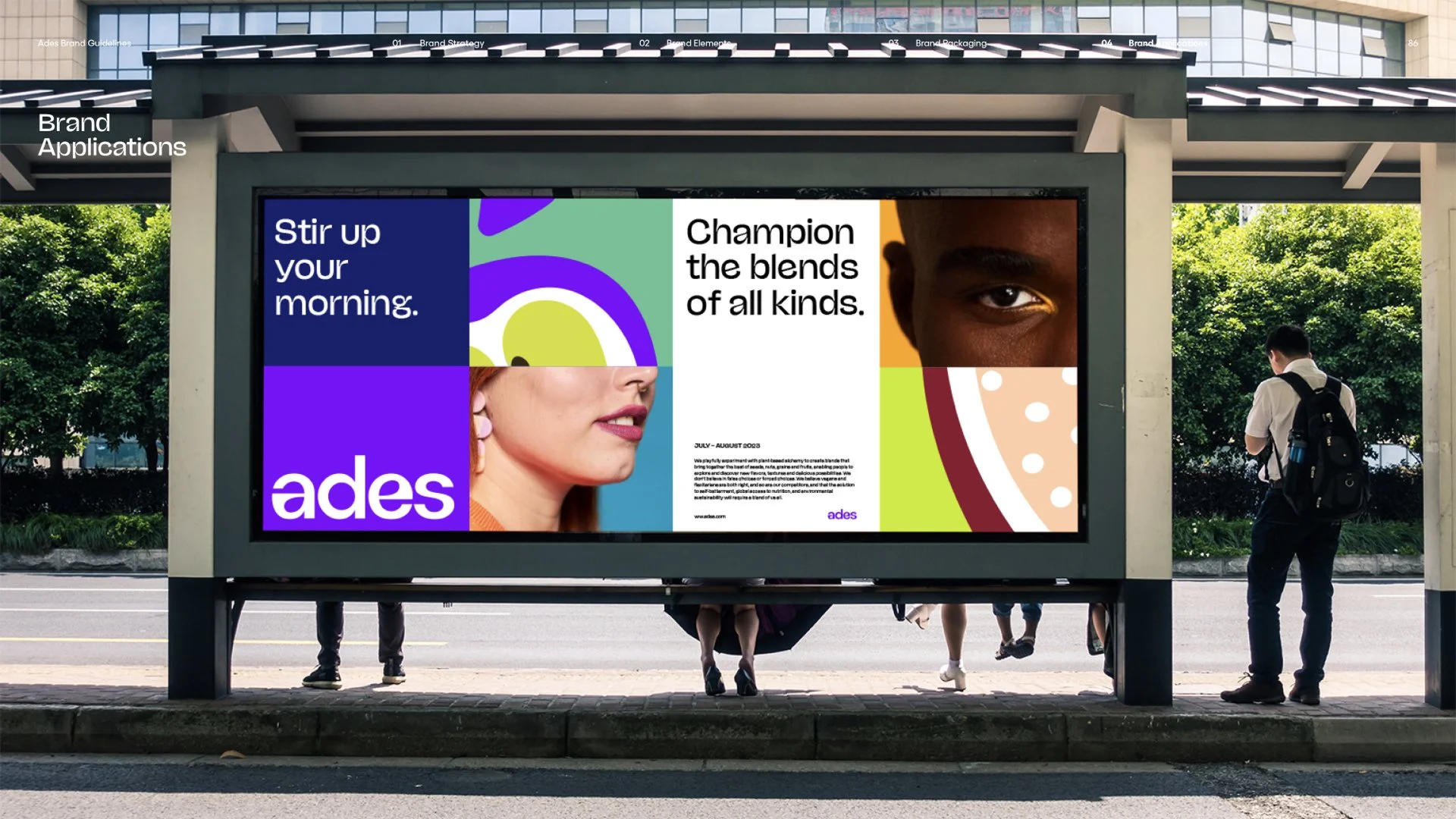
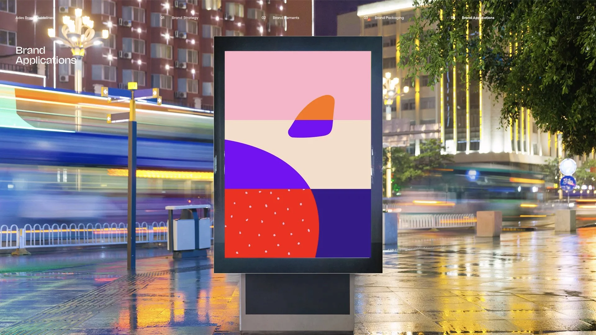
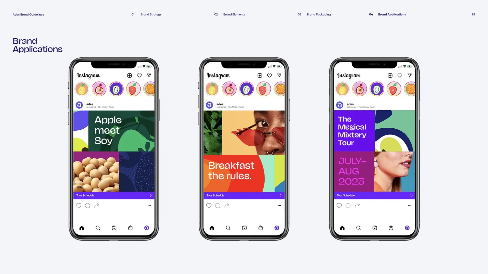
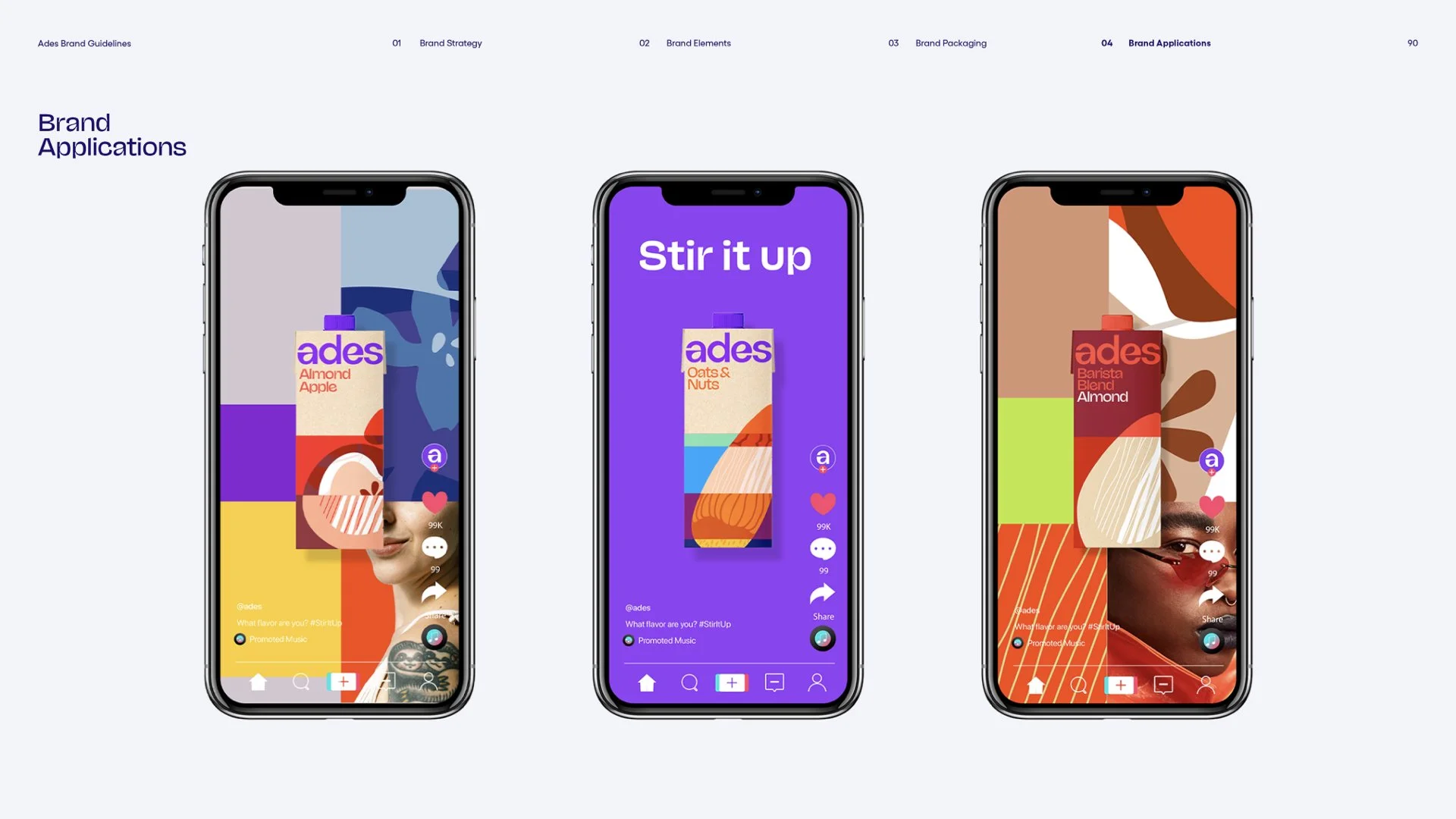
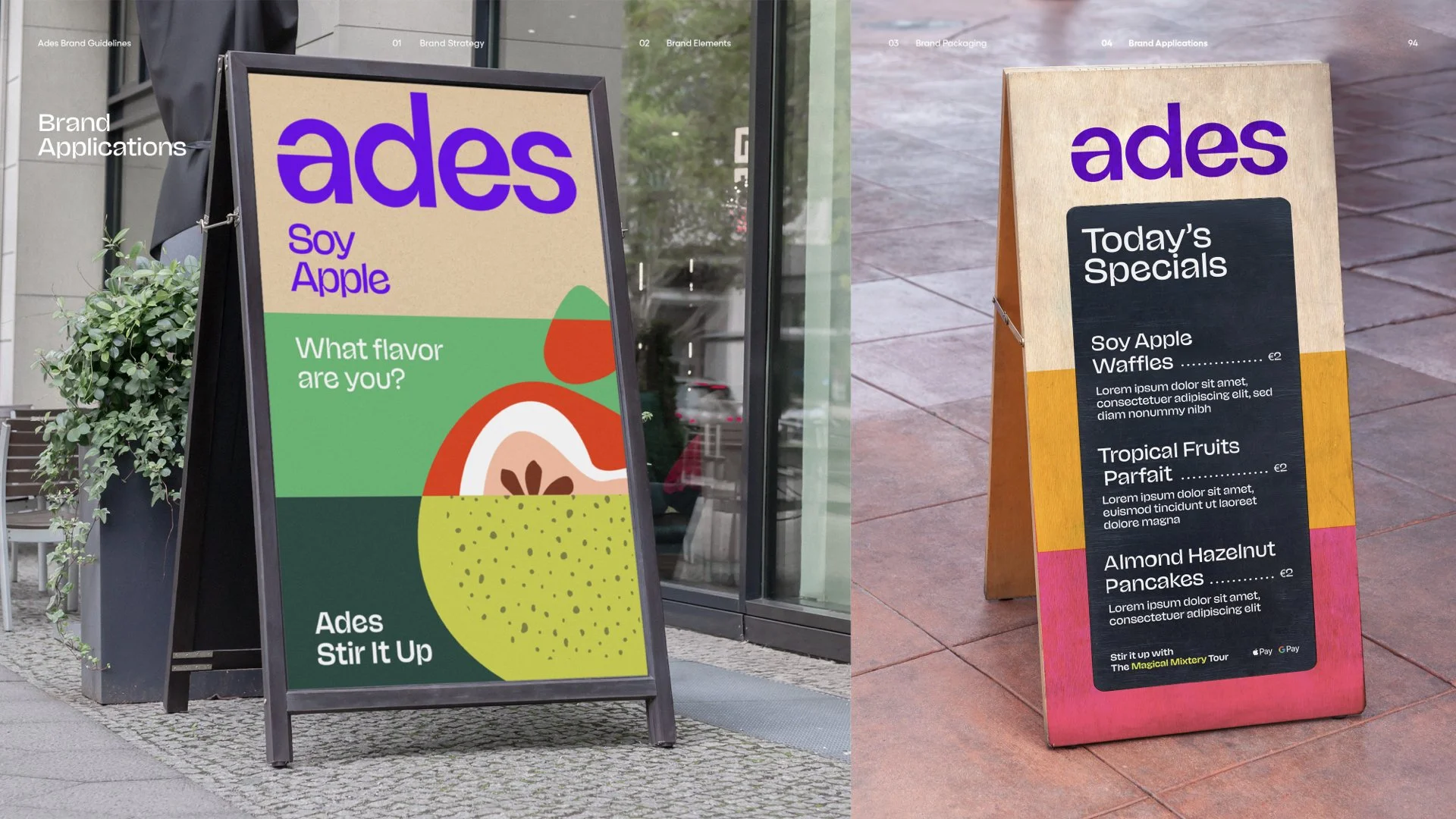
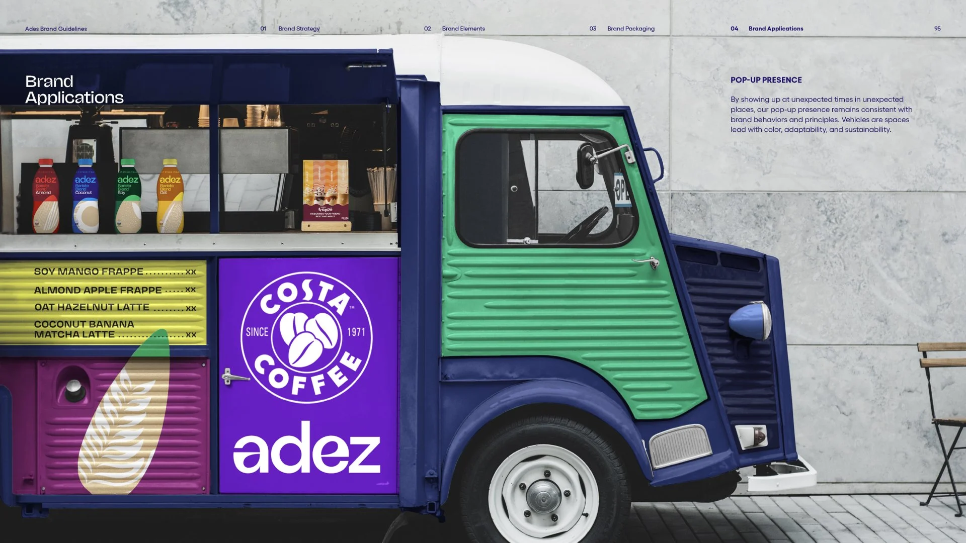
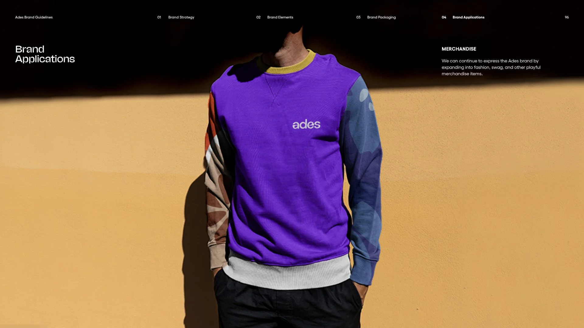
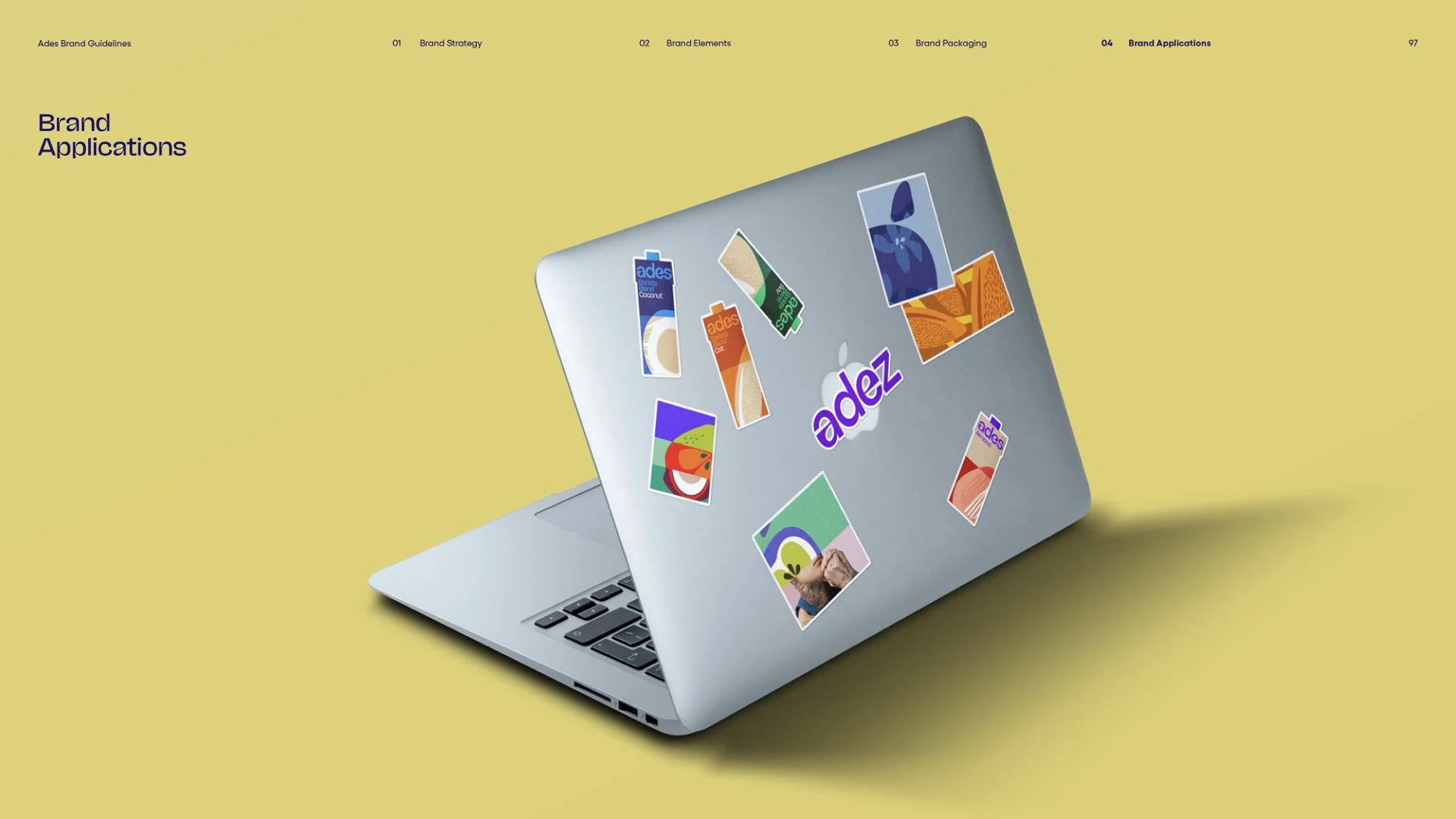
Organic forms break up our gridded framework to make for a dynamic system that embodies an ever-evolving mix of flavors and experiences. Bold colors, shapes, textures, and imagery shift across each horizontal block in order to create compositions that feel imaginative, quirky, and unexpected. These layers work together to establish depth.

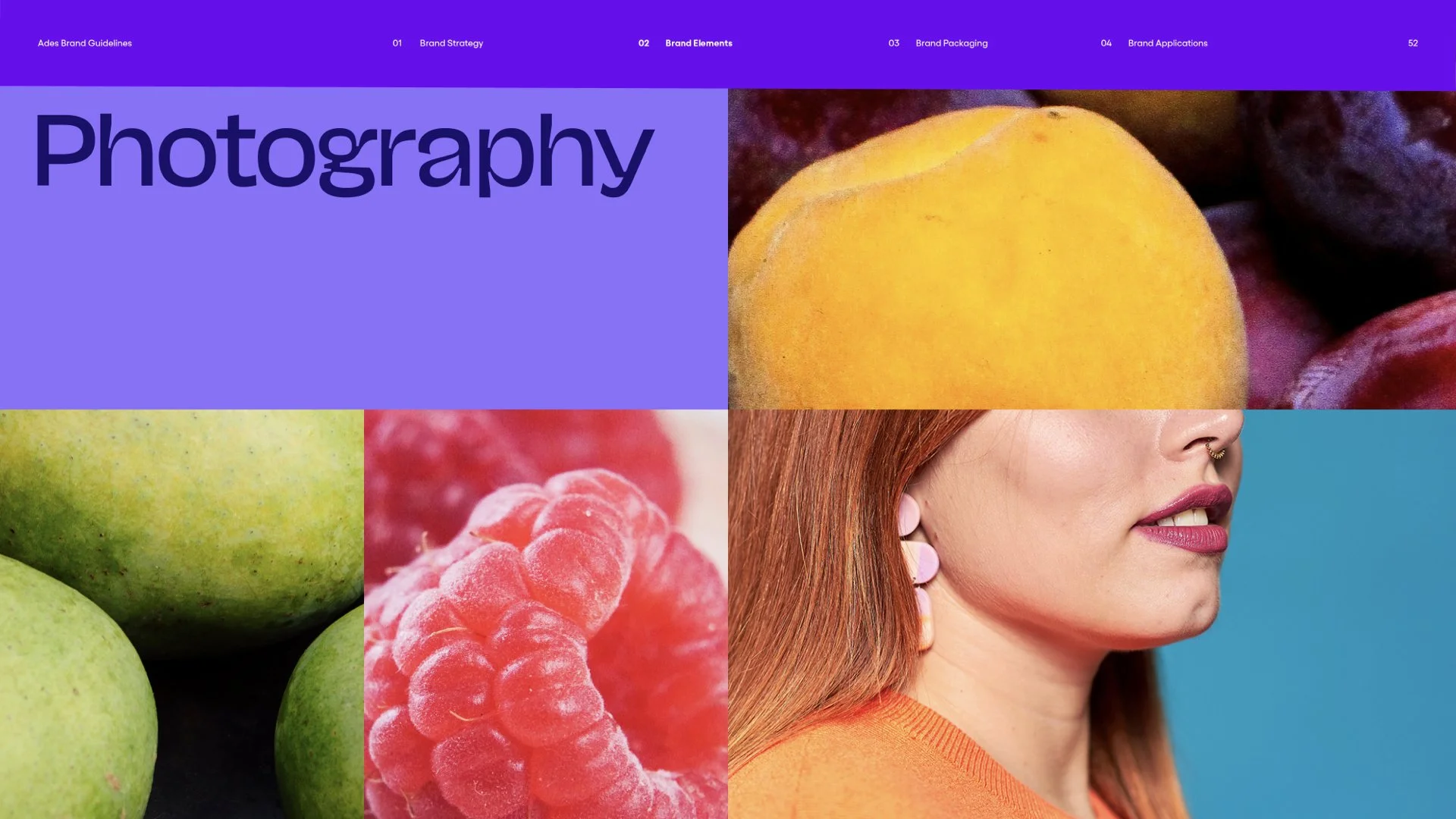
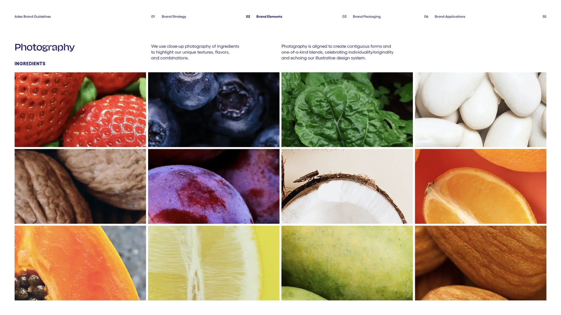
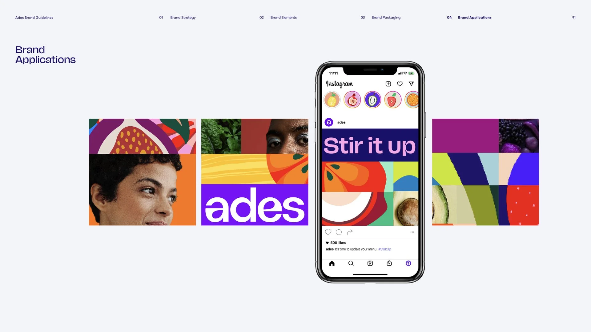
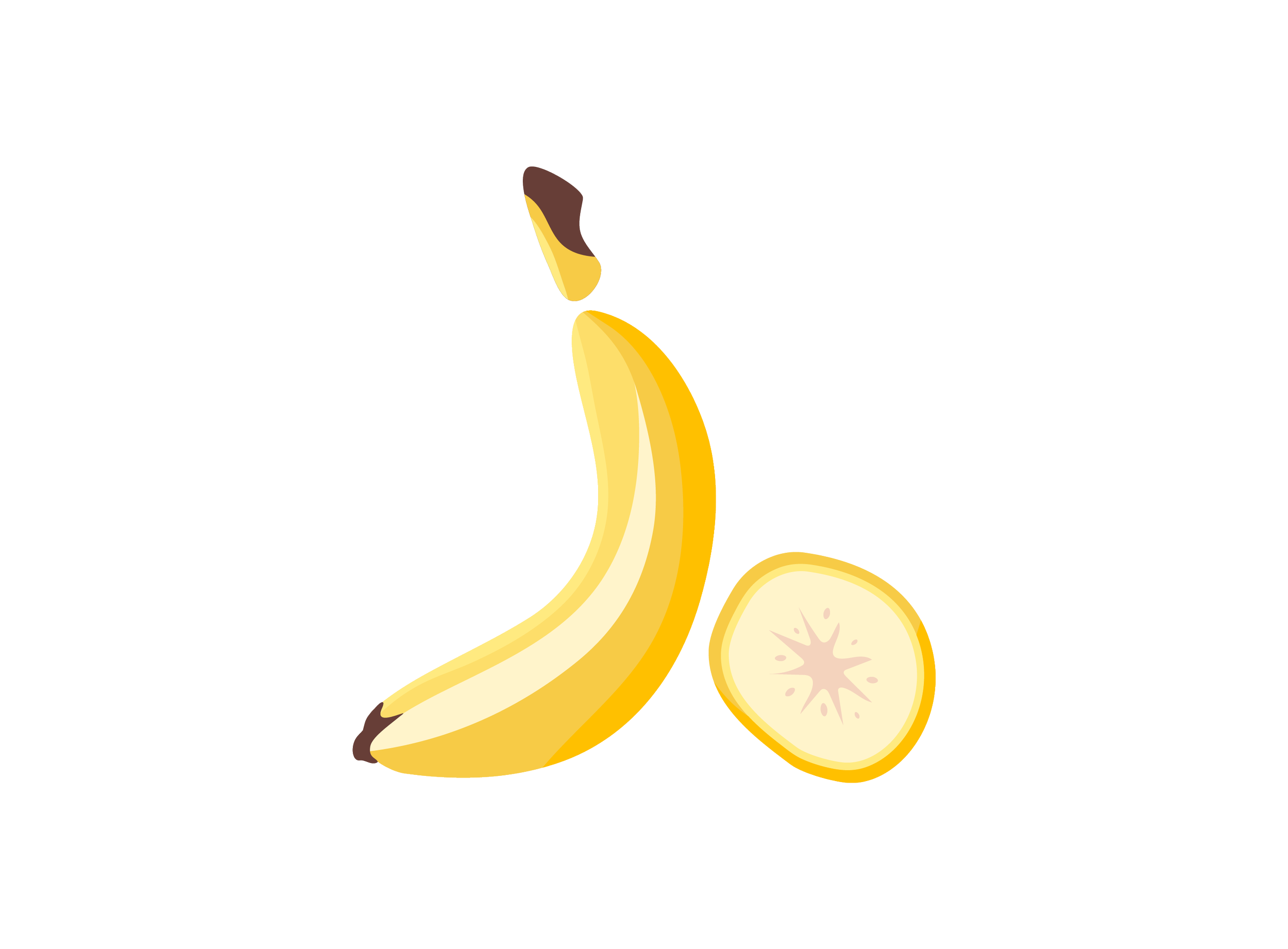
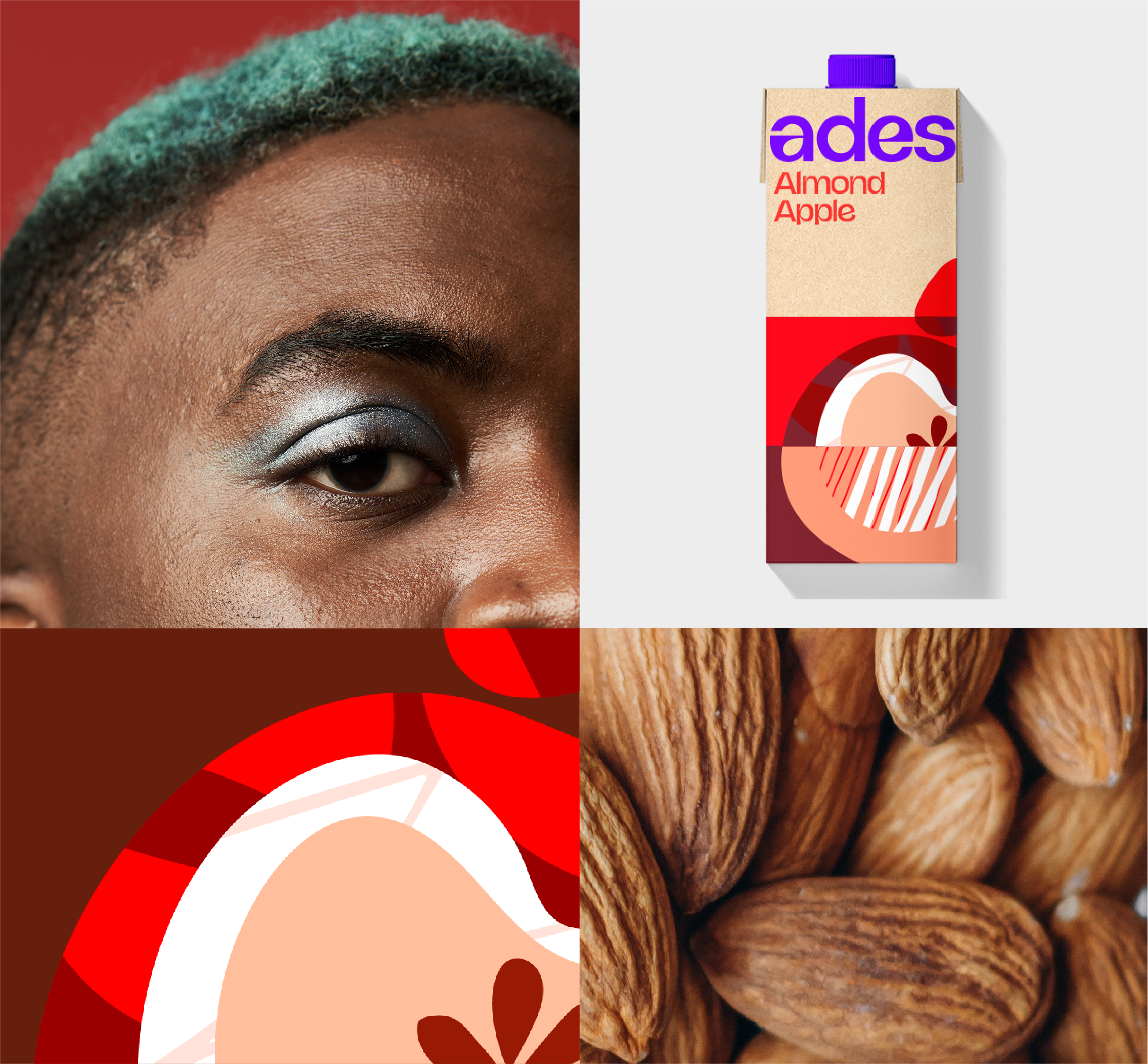
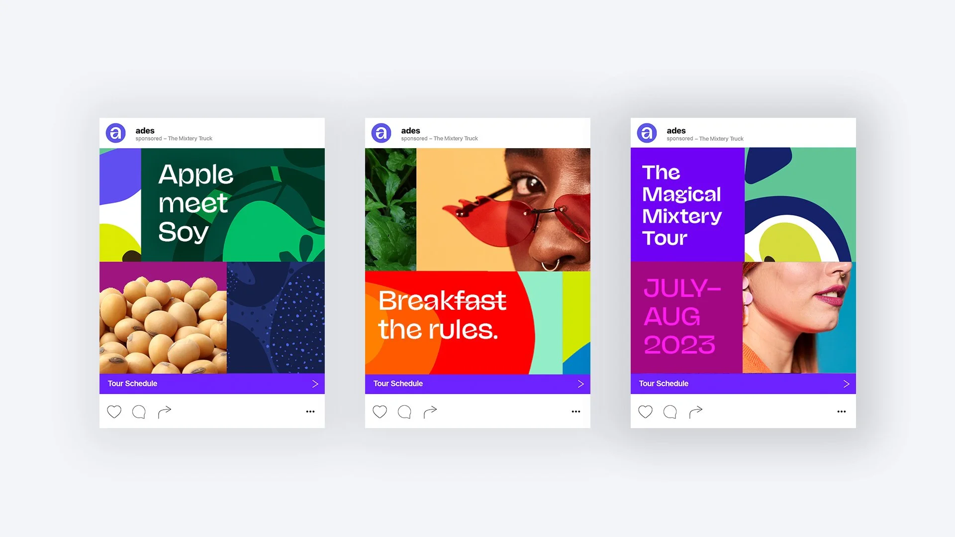
We use close-up photography of ingredients to highlight our unique textures, flavors, and combinations. Photography is aligned to create contiguous forms and one-of-a-kind blends, celebrating individuality/originality and echoing our illustrative design system.

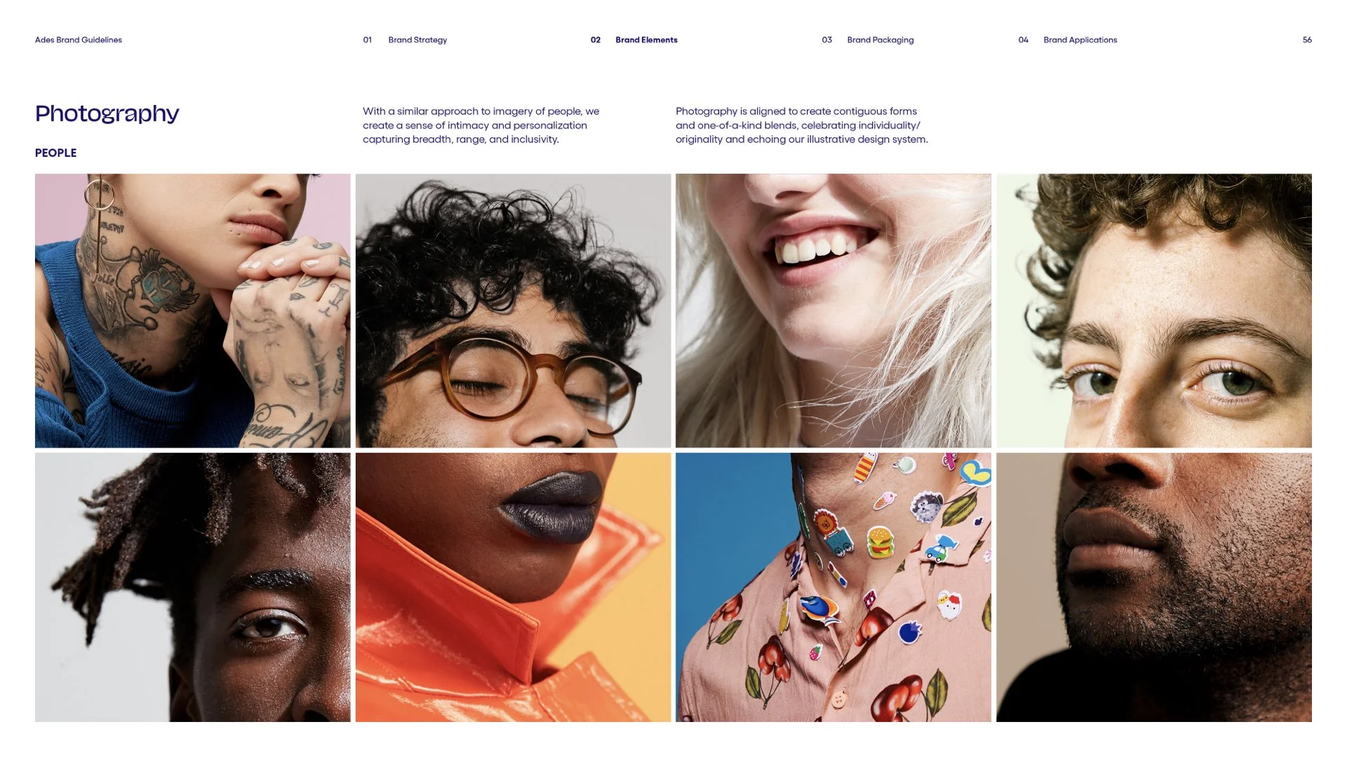
With a similar approach to imagery of people, we create a sense of intimacy and personalization capturing breadth, range, and inclusivity.
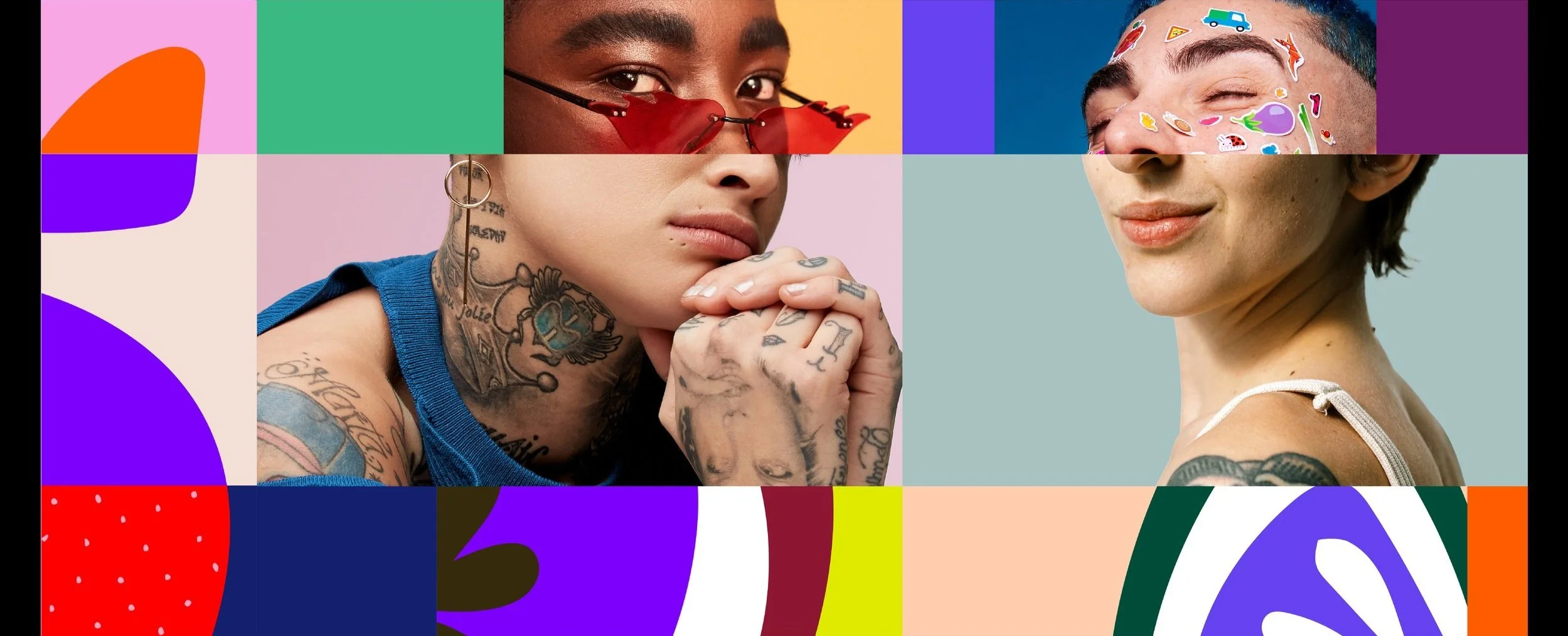
Photography pairs with our bespoke illustrations to create quirky visuals that embody unique combinations and blends of flavors and experiences. Bold colors, shapes, textures, and photography shift across each horizontal block, in order to create compositions that feel imaginative, quirky, and unexpected. These layers work together to establish depth and share our story with the world.


Brand Guidelines